Studio apartments are notoriously difficult to decorate - especially within smaller layouts. The simplest approach is to create a coordinated style that extends throughout the entire home, but that option can restrict the creativity and expressive potential of the occupants. The other option is to create a different theme within each functional area, but this requires careful planning and a unifying design layer to make sure the __home doesn't clash or feel too eclectic. The five studio apartments profiled in this post demonstrate a variety of techniques and styles, proving that creative constraints can lead to inspiring solutions.
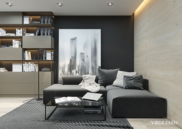
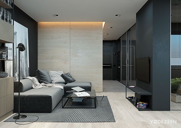
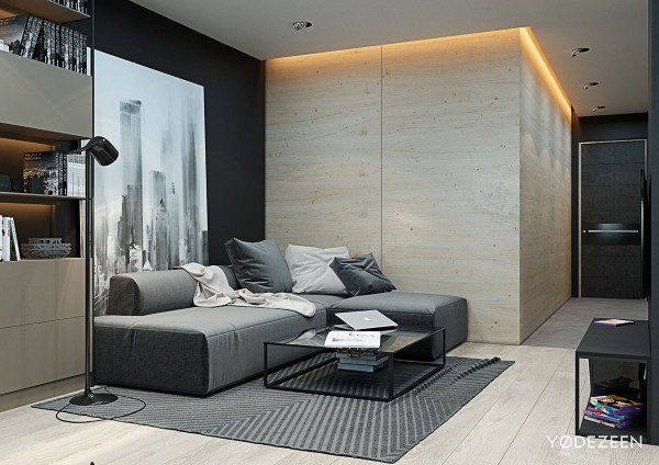
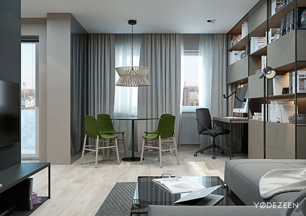
 This first studio apartment from YØ DEZEEN uses a modern monochromatic theme paired with smooth plywood wall paneling. The compact living room arrangement sets the standard for the smart space-saving solutions found throughout the home.
  Division between living spaces is created with a combination of themed decor and built-in dividers. Here, a striped rug helps define the media area.
  The rug’s slightly off-center placement prevents the sofa area from feeling too rigid, allowing for greater communication with the rest of the room.
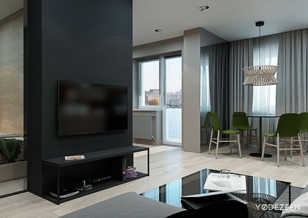
  A freestanding divider creates an implied boundary between the kitchen and living space. It also offers a convenient mounting point for the television, making the media center feel like part of the room.
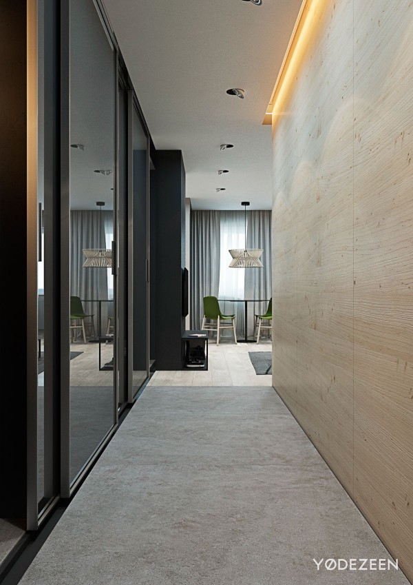
  Another partial divider in the dining room is mirrored to capitalize on the full-length windows.
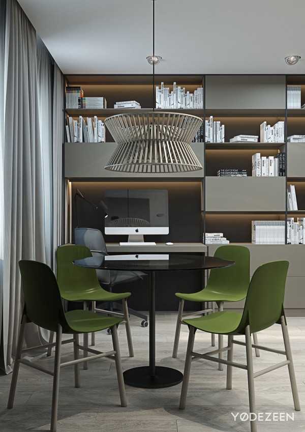
  The workspace features plenty of extra storage to minimize the need for a larger desk. The shelves also double as a display for decorative items to make the living space feel more homey and lived-in.
  Distinctive green chairs give the dining area its own unique attitude – a splash of bright color within a uniform interior design. A wooden pendant light by Seppo Koho helps center the space.
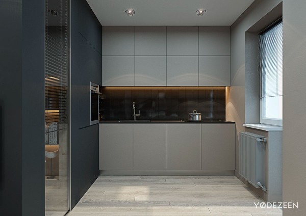
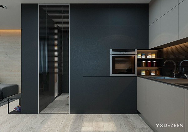
  The kitchen is exceptionally minimalistic. Matte black paneling on the left allows the neutral cabinetry to stand out.
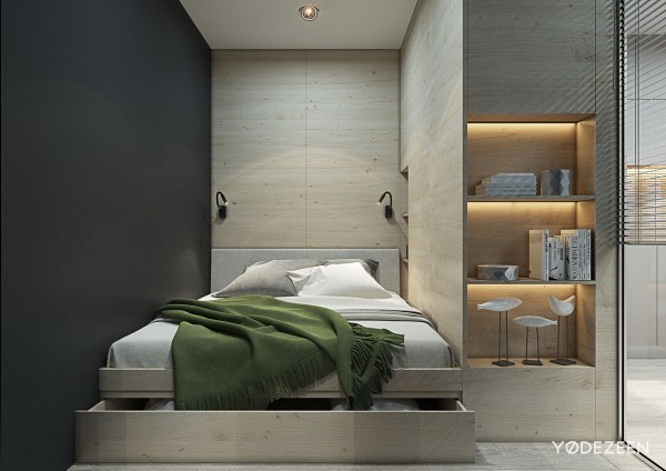
  While originally a true studio layout, the designers gave the bedroom its own annex of sorts. A sliding glass door allows for ample sunlight and the storage wall delivers just enough privacy.
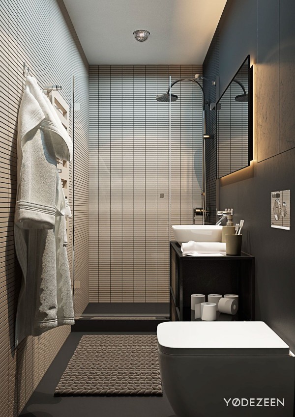
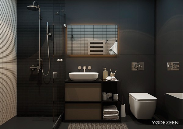
  Low-profile horizontal tiles make the bathroom feel wider, and their uniform arrangement draws attention to the height of the ceiling – a smart choice for a bathroom as narrow as this one.
  Matte black cladding lends the bathroom an especially luxurious appeal.
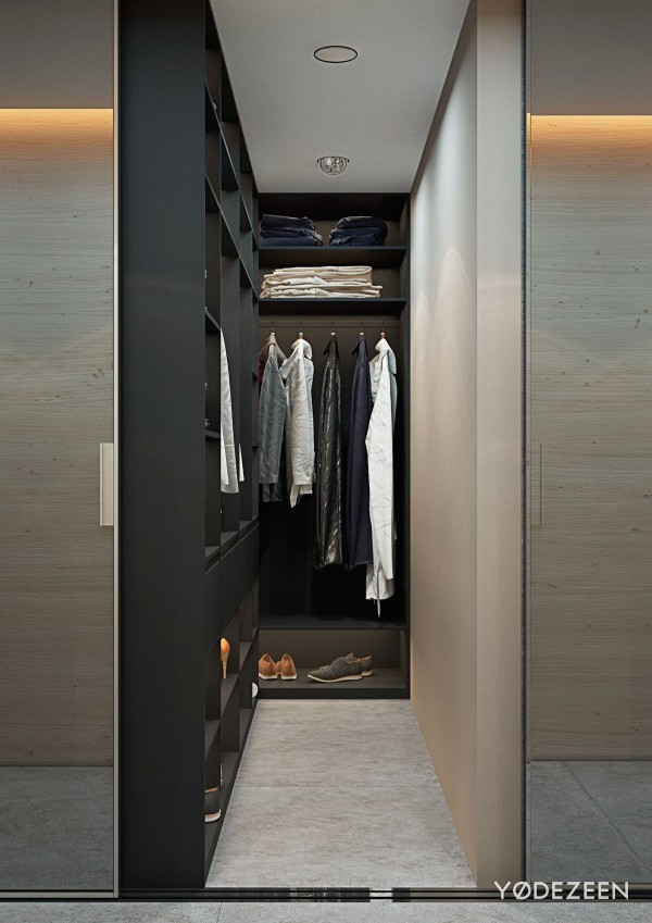
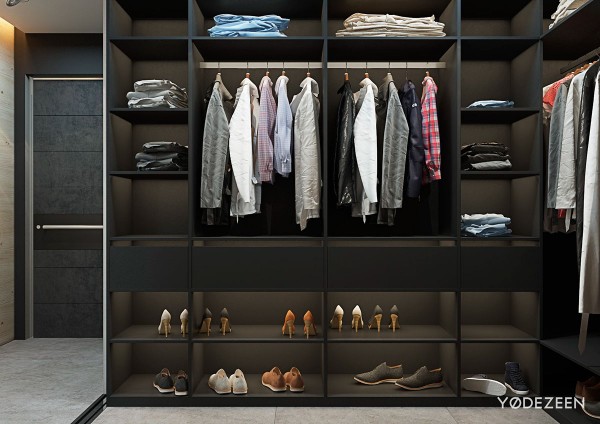
  Sliding glass panels reveal a compact walk-in wardrobe decorated in matte black and cream.
  Smart organization makes the closet feel much more spacious than it really is – niches for shoes, shirts, and hanging clothing covers all the bases.
- 15 |
- Architect: Lugerin Architects
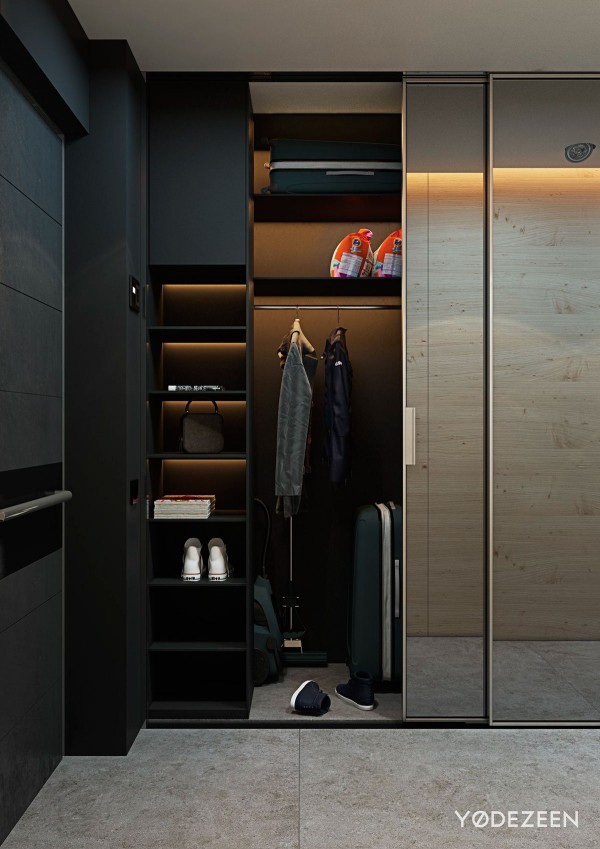
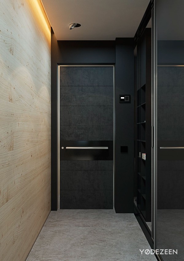
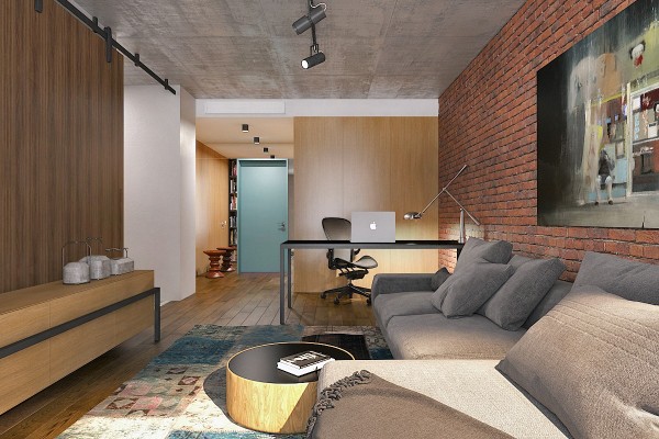
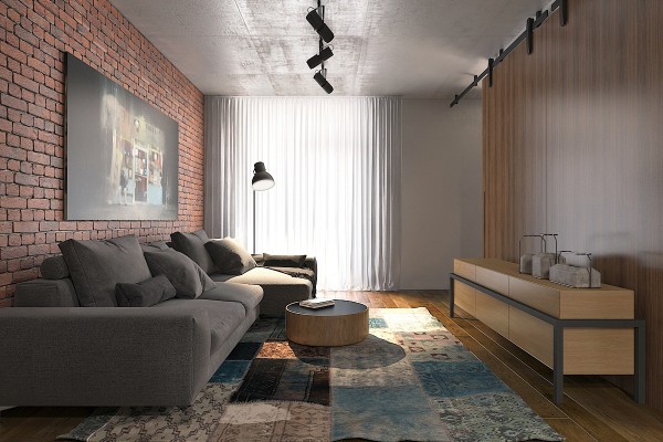
Near the entrance, more sliding mirrors hide a convenient coat closet with everything the occupant needs to head out the door in style. Indirect lighting makes it possible to find any item even in a space as dark as this one.  This next home, by Lugerin Architects, makes fantastic use of highly textured surfaces to breathe life into a relatively small 56-square-meter studio floor plan. Wood, exposed brick, concrete, and textiles come together to create a modern apartment with huge personality and an eclectic vibe.
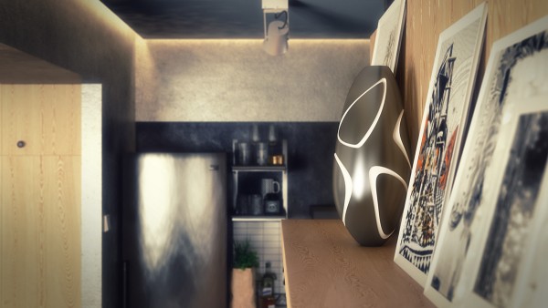
  Weight vases by Decha Archjananun help to unify the concrete ceiling and black metal accents with the natural elements found throughout.
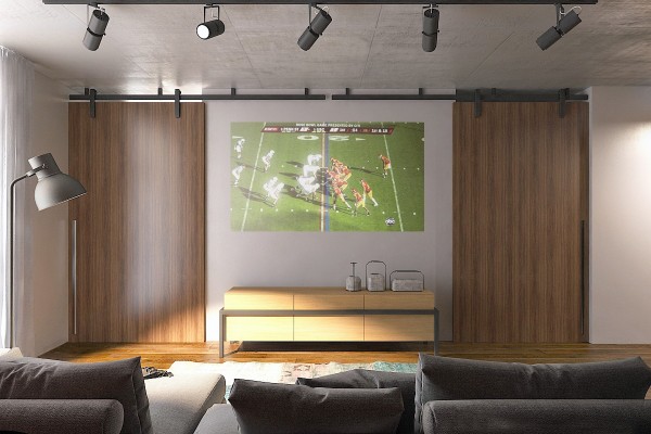
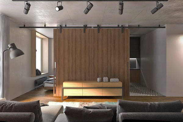
  Wood panels slide together to hide the television and expose the bedroom and kitchen – an inspirational project for anyone who wants to physically divide rooms within a studio apartment layout. Such excellent execution!
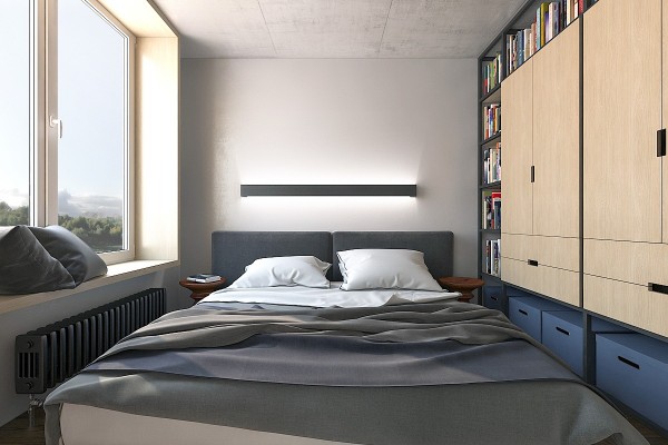
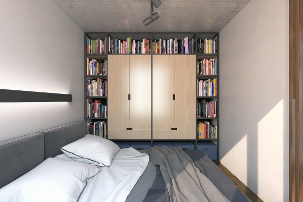
  The bedroom, although quite small, features an abundance of storage built into the dividing wall. Bookshelves offer plenty of material for reading in the morning or before bed, and light wood cabinetry allows convenient storage for clothing. Pull-out baskets organize the lower spaces where drawers and cabinets wouldn’t fit.
  Don’t you just love how the wardrobe seems to float in a sea of books?
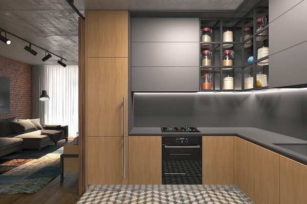
  The kitchen boasts a few clever storage features of its own. Large glass jars in the cabinets provide a safe place to store dry goods while minimizing clutter. They also add a nice variety of attractive colors within an otherwise neutral decor theme. The geometric floor tiles are a cool touch too!
- 25 |
- Visualizer: Henrique Kobylko
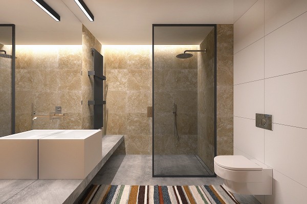
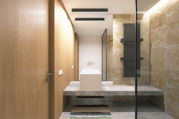
A striped rug in natural colors helps the bathroom stand out from the rest of the home. 
- 28 |
- Visualizer: Henrique Kobylko
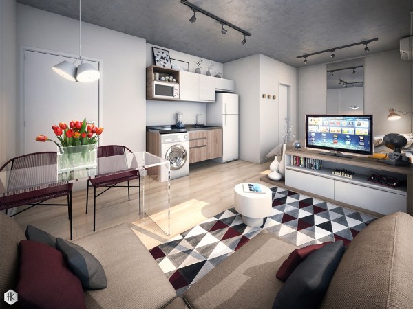
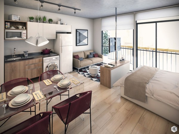
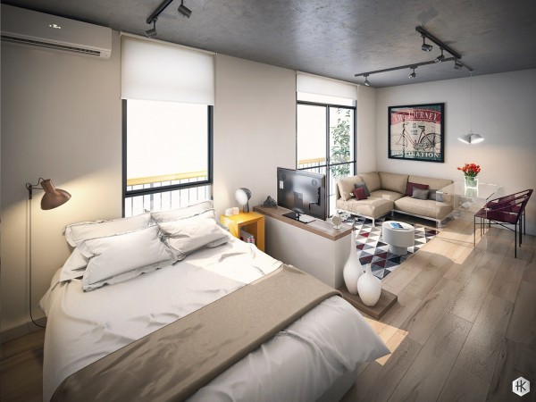
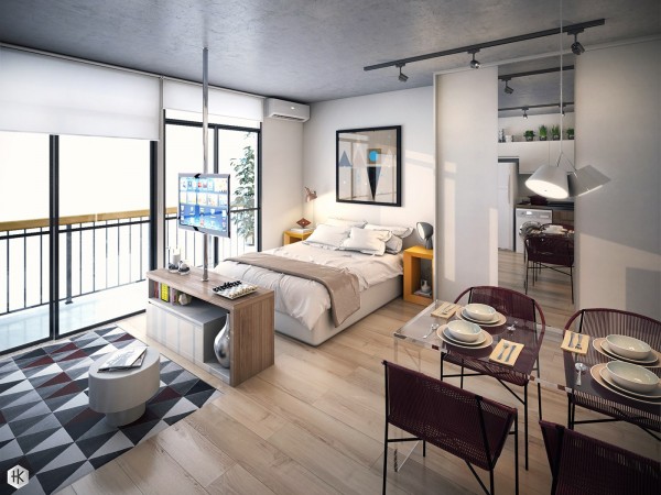
This gorgeous studio offers a more colorful aesthetic than the previous homes. Its interior decor is more or less uniform throughout the apartment – without dividers or interior walls to break up the spaces, pulling off a cohesive theme turned out to be a practical and beautiful choice.  The dining chairs are from the La Central collection by Brazilian designer Guilherme Wentz. The Acapulco-style woven chairs and transparent acrylic table are light-looking and perfectly suited to a small space like this one.
  Burgundy, gold, and bright cerulean accents offer an updated and refined approach to the classic primary color theme.
- 32 |
- Designer: Roșca Vadim
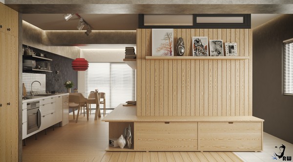
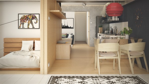
Traditional sensibilities meet modern design influences in this fantastic studio apartment by Roșca Vadim. A large wood-clad dividing unit occupies the center of the home, providing extra storage and decorative shelving, along with a bench row that could serve as seating or a sideboard table depending on needs.  A stylish white bedroom resides inside the central divider. Such a smart use of space!
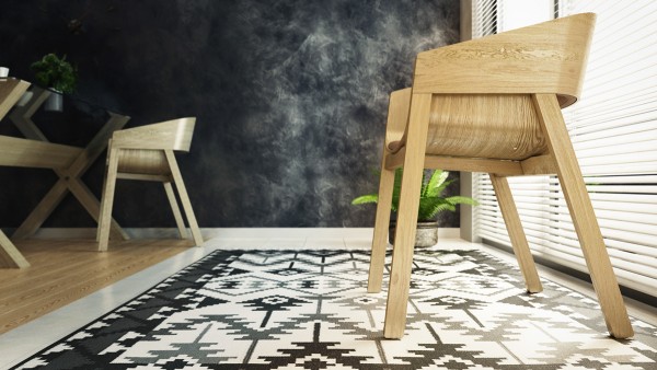
  The dining area features modern elements like a textural black wall, but also incorporates traditional elements like a folk-patterned rug in black and white. The bent plywood dining chairs offer a combination of modern and traditional elements.
- 36 |
- Designer: STUDIO .O.
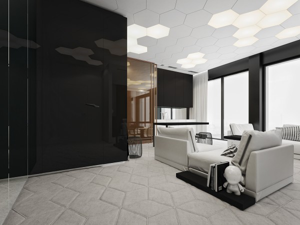
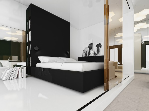
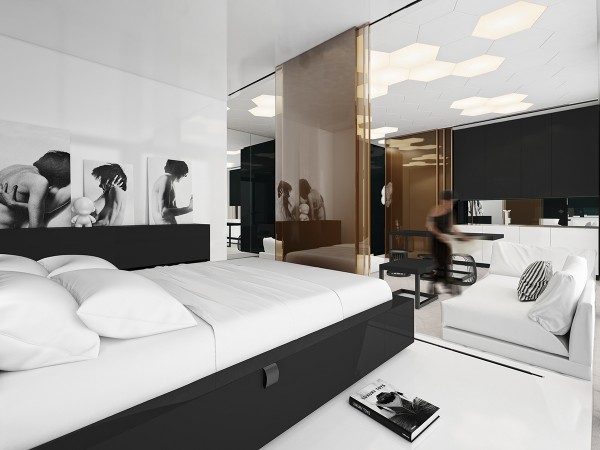
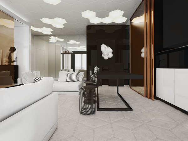
Taking a completely different approach from the previous studio apartment, this space boasts highly modernistic materials and striking geometric themes. Strong contrasts play an important role in the design – reflective surfaces complement soft textural materials, stripes and polygons compete for dominance, and metallics pop out from a backdrop of neutral colors.  The bedroom is defined by a high gloss floor in white. Note how the bed platform and headboard are combined into the same piece of furniture, with a little extra storage tucked into the side.
  A sliding glass wall with a mirrored surface offers some privacy for sleeping residents. The brass-color effect adds a touch of luxury within an already sophisticated interior.
