5 Most Popular Offices of 2016

As the year draws to a close, we're highlighting the most popular articles on InteriorDesign.net. Check out our roundup of the top office stories we've published in 2016, and view our most popular hotels and retail projects.


5. Oppenheim Architecture & __design Adapts Historic Swiss Farmhouse For Muttenz Office


Oppenheim Architecture & Design has bought a historic five-story farmhouse in Muttenz, Switzerland, restoring and converting it to two floors of office space for the OAD staff of 15 and two separate-entry apartments. Throughout, original pine floors were sanded and varnished, plaster walls painted a crisp white and fitted with radiant heating, and new window openings punched out of the stone walls.


4. Rivals of the Companies Behind These 7 Innovative Offices are Green with Envy


Innovative offices produce happy employees—and jealous competitors.


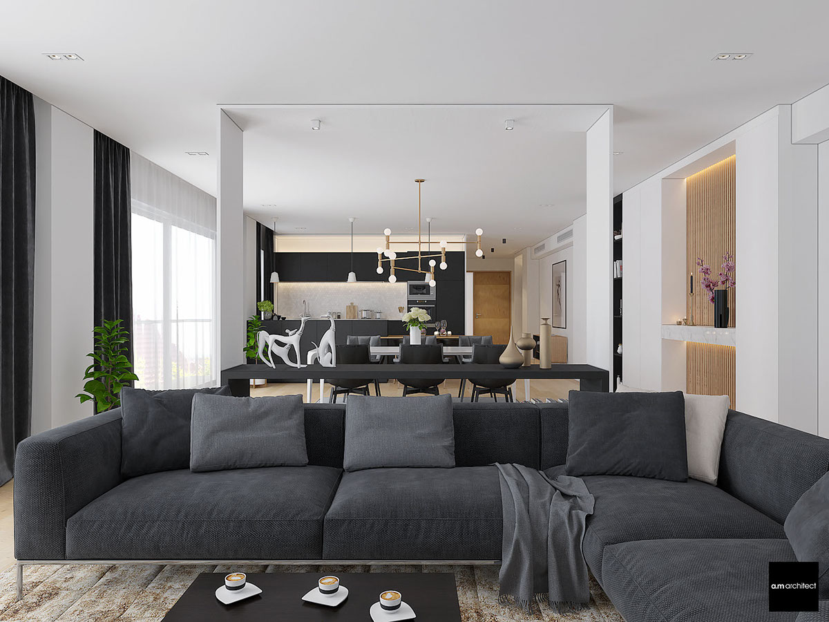
3. Dropbox Headquarters by Rapt Studio Perfectly Captures Company Culture


Workplace projects, as conceived by Rapt Studio, typically have story lines. While the San Francisco headquarters of the digital file-sharing service Dropbox is immense, the plot is tight. “It’s based on a diagram of a radially expanding village with a strong core and smaller nodes,” Rapt account exec­utive and creative director Louis Schump begins. In terms of function, they are key gathering places shared by the Dropbox population.


2. Bold Geometric Forms Take Center Stage in These 6 Forward-Thinking Offices


Forward-thinking offices take many remarkable forms.


1. The New Publicis Office in New York by Clive Wilkinson Has No Assigned Desks


Located on the edge of Times Square, in a cookie-cutter commercial tower, the mammoth North American headquarters of the global advertising agency Publicis combines three existing levels with five new ones by Interior Design Hall of Fame member Clive Wilkinson. The result totals 190,000 square feet. And not one of the 1,200 employees, top brass included, can close a proprietary door.


Light And Charming Decor In A Compact 1-Bedroom Apartment

  • 1 |
The tour opens with a look at the attractive yet compact open living space. While many layout options could have worked, this one adopts a rather unconventional choice by putting the dining table near the window rather than near the kitchen.

  • 2 |
On the other side of the living room, the kitchen feels like its own distinct space thanks to the expansive storage unit that stands in between.

Advertisement

  • 3 |
In terms of decor, this __home combines modern and mid-century elements. The sofa’s low-profile form is a wonderful complement to the low cabinets near the window.

  • 4 |
Because it’s a relatively small open layout living room, this table solution proves very versatile – the window area doubles as extra seating but the residents could pull the table out for formal dinners when needed.

  • 5 |
While the designer could have easily chosen a more minimalistic table (a common choice in compact areas) this one enjoys the best of both worlds by combining simple materials for decorative effect.

  • 6 |
One small window might not seem like enough light for a space this large, especially considering the dark floors but the abundance of white surfaces helps preserve as much light as possible.

  • 7 |
The extra storage can hold cookbooks, decorations, and even includes drawers and storage boxes for spare dishes or large cookware. This type of addition frees up so much space in the rest of the home.

  • 8 |
Bright yellow accents bring retro charm to the kitchen. The other cabinets use the same richly grained wood as the floorboards for a nice cohesive look. While the living room emphasizes minimalism, the kitchen embraces a bold attitude.

Advertisement

  • 9 |

  • 10 |
The unique looking wall clock is a neat addition that does the job without standing out too much.

  • 11 |
Everybody loves chalkboard walls. This one takes an approach that differs from the ordinary recipes or shopping lists by pointing out the location of ingredients much like an oversized label.

  • 12 |
Another small chalkboard accent leaves room for impromptu decoration.

  • 13 |
Elsewhere, the office is small but retains enough floor space to double as a guest bedroom thanks to its abundant storage and space-saving techniques. It uses the same dandelion yellow as the kitchen.

  • 14 |
Most of the furniture – including the bed and the sideboard – have wheels for easy reconfiguration. If the resident wanted to use this room for a large project, it wouldn’t be too difficult to get things out of the way.

  • 15 |
The desk is just too cute! Its anchored to the wall on one side and uses a small sawhorse-shaped structure to support the other. The map-printed box offers a great alternative to the cabinets an ordinary desk would use.

  • 16 |
In the master bedroom, subdued colors and simple fixtures create an environment very conducive to relaxation. The difference between this space and the energetic office is night and day.

  • 17 |
Exposed brick and rich dark wood both feel like very homey and comfortable choices for a space like this.

  • 18 |

  • 19 |
Check out this handy feature! What looks like a decorative panel unfolds to reveal a convenient little desk for light work or writing.

  • 20 |

  • 21 |
The bathroom takes things in a different direction entirely. A variety of tile sizes and tones adds immediate interest, with bright yellow accent pieces to serve as visual anchors for clarity.

  • 22 |

  • 23 |


5 Most Popular Hotels of 2016

As the year draws to a close, we're highlighting the most popular articles on InteriorDesign.net. First up, our roundup of the top hotel stories we've published in 2016. (Plus, view our most popular offices.) 


5. Manca Studio's La Dimora di Metello Hotel Puts Matera, Italy on the Map


La Dimora di Metello is Manca Studio's first hotel. Since municipal regulations in Matera, Italy, were strict, architectural additions were limited to the corridor that connects the guest rooms. Each accommodation is unique, and each has a name, Roman and female. Eumenia and Numisia are the stan­dard doubles. Agapta, slightly larger, is a duplex. The deluxe suite is Metella. “They’re all grotto-type spaces,” Alfredo Manca notes. That translates into walls and arched ceilings carved out of the indigenous volcanic rock.


4. Mark Zeff Riffs on Austin’s Musical Heritage at the Hotel Van Zandt


Mark Zeff looked to the Austin music scene to lay down the baseline for the Hotel Van Zandt by Kimpton Hotel & Restaurant Group. His homage plays out in the lobby lounge with an installation of exuberant birds, made from vinyl records, that flutter out of an old phonograph and, elsewhere, as curated collections of found objects such as vintage radios and microphones. The gig posters in the 319 guest rooms reflect the Austin club scene in the ’60’s and ’70’s, when Van Zandt made his name. His final album, No Deeper Blue, symbolically thrums through the color palette as a moody teal. Riffs on blue are found everywhere  from the lounge’s tufted velvet-covered sofas and chairs to the guest rooms, where the wall covering evokes dreamy watercolor brushstrokes.


3. 7 Tiny Hotels Leave Room to Dream


Art, history, and fantasy are fellow guests at these small hotels.


2. Patricia Urquiola Designs Idyllic Lake Como Hotel Il Sereno


Cross Lake Como to dock at Il Sereno Lago di Como, a modernist-minded boutique hotel by Patricia Urquiola. The Interior Design Hall of Fame member has made her reputation with a bravura use of color and pattern, however this latest hotel showcases her at her most restrained. The reception and the lobby lounge incorporate groups of Urquiola’s distinctive furniture, including her long-standing best sellers for Cassina, where she has served as art director since last year. The color palette for fabrics is “locally sourced,” if you will. Sky blue for the generous sofas is complemented, for their throw pillows, by a leafy green and a moody blue-green recalling the lake.


1. 6 Hotels Around the World are Destinations On Their Own


Hotels around the world offer singular attractions.


Two Modern Minimalist Apartments With Subtle Luxurious Details

  • 1 |
  • Visualizer: Amr Moussa
First, let’s look at a __home that uses its open concept living area in a unique way. There’s not very much outright decor in this part of the house but more decorative details appear the closer you get to the kitchen at the end of the room. A low sofa allows residents to take in the entire space at once and stretches the versatility of the few decorations to their fullest potential.

  • 2 |
The view is streamlined yet elegantly layered, the continuity punctuated low table contained by thin walls to create a “room within a room” effect. One side opens to a beautiful urban view, the other hosts shelves outfitted with a few vases and books.

Advertisement

  • 3 |
A built-in media center keeps things nice and simple. Notice the position of the television – nice and low, a focused choice.

  • 4 |
The black background has two benefits. First, it doesn’t distract the eye while viewing. Second, it allows the electronics to blend in unobtrusively while powered off.

  • 5 |
Tasteful sculptures line the central table, with ample space for books underneath. If one were to pull up a chair, it could make a nice place to work on a laptop while catching up on a favorite show.

  • 6 |
And the dining arrangement is just as beautiful. It employs a pretty clever aesthetic technique with the nearby shelves displaying an inverted take on its stark black and white color theme.

  • 7 |
Patricia Urquiola’s stylish Husk Chair lines the large setting, with a Lambert et Fils Atomium Chandelier illuminating the table from above. The brass lighting fixture is one of the most obvious luxury touches in a room that mostly employs understated elegance.

  • 8 |
The kitchen’s matte cabinetry makes a wonderful backdrop to the white table and the simple pendant lights. Small tiles bring character to the backsplash without stealing the spotlight or distracting from the overall composition.

Advertisement

  • 9 |
Extra dining space occupies this fantastic extension from the island. It serves as extra workspace when not being used as a breakfast table, and surely makes a nice little place for guests to chat while the host prepares drinks or snacks.

  • 10 |

  • 11 |

  • 12 |
Upstairs, the black and white bedrooms continue the sharp high-contrast theme.

  • 13 |
This comfortable space includes small brass details just like the living room. The bedside lamps are from the IC Collection by Michael Anastassiades.

  • 14 |
The small wall between the bed and closet creates a small pseudo-hallway, a purely symbolic boundary that still allows sunlight to continue toward the functional areas on the other side.

  • 15 |
And the walk-in closet arrangement is certainly enviable, especially if you’re serious about staying organized. There’s a niche or a drawer for every accessory.

  • 16 |
A little built-in vanity occupies the space between two sections of shelves and drawers. It has everything the resident needs for an effective one-stop morning routine.

  • 17 |
Like the dining chairs, this piece is also the work of Patricia Urquiola, called Tabano. It’s paired with a lovely adjustable floor lamp to easily adjust lighting intensity for dusk or nighttime reading.

  • 18 |
The other bedroom makes use of all the same materials as the first, but this time with an even more minimalistic approach. The headboard wall is especially impressive, taking the familiar textured panels from the last bedroom and bringing it to scale.

  • 19 |
The reading nook is extra cozy. An iconic Jieldé lamp provides focused or ambient lighting in turn, easy to swivel upward if the resident needs to seek out books on the handy shelf to the left.

  • 20 |
The master bathroom isn’t shy about using higher end materials. Marble tiling makes the sink stand out and even makes a subtle stand at the edge of the mirrors.

  • 21 |
In the reflection, you’ll see that the modern wood paneling makes another appearance. Like the marble, it finds balance in small details like the edge of the pendant lampshades.

  • 22 |
And who wouldn’t love this split shower and bathroom arrangement? A full window occupies the left, with a ceiling window preserving privacy on the right.

  • 23 |

  • 24 |
  • Visualizer: Anna Malyk
This second apartment takes a more curated approach to luxurious design. Rather than opting for high-end materials or bold architectural elements, this space makes its grand statement with sculptural furniture and accessories. While the large-scale artwork and frames contribute their own decorative appeal, the furniture itself is the star of this show.

  • 25 |
One of the most impressive investments includes the lighting choices by Michael Anastassiades, their sweeping lines generating an immediate sense of movement and energy.

  • 26 |
The palette remains especially subdued. Light wood floors, greyscale furniture, and pristine while walls serve as the perfect background for the stylish objects within.

  • 27 |
Despite the limited palette, color blocking does play an important role. A divide between wood and white defines the kitchen and dining, with the bulk of the grey sofa serving as a strong anchor that directs the eye toward the social area.

  • 28 |