Two Modern Minimalist Apartments With Subtle Luxurious Details

- 1 |
- Visualizer: Amr Moussa
- 2 |
Advertisement
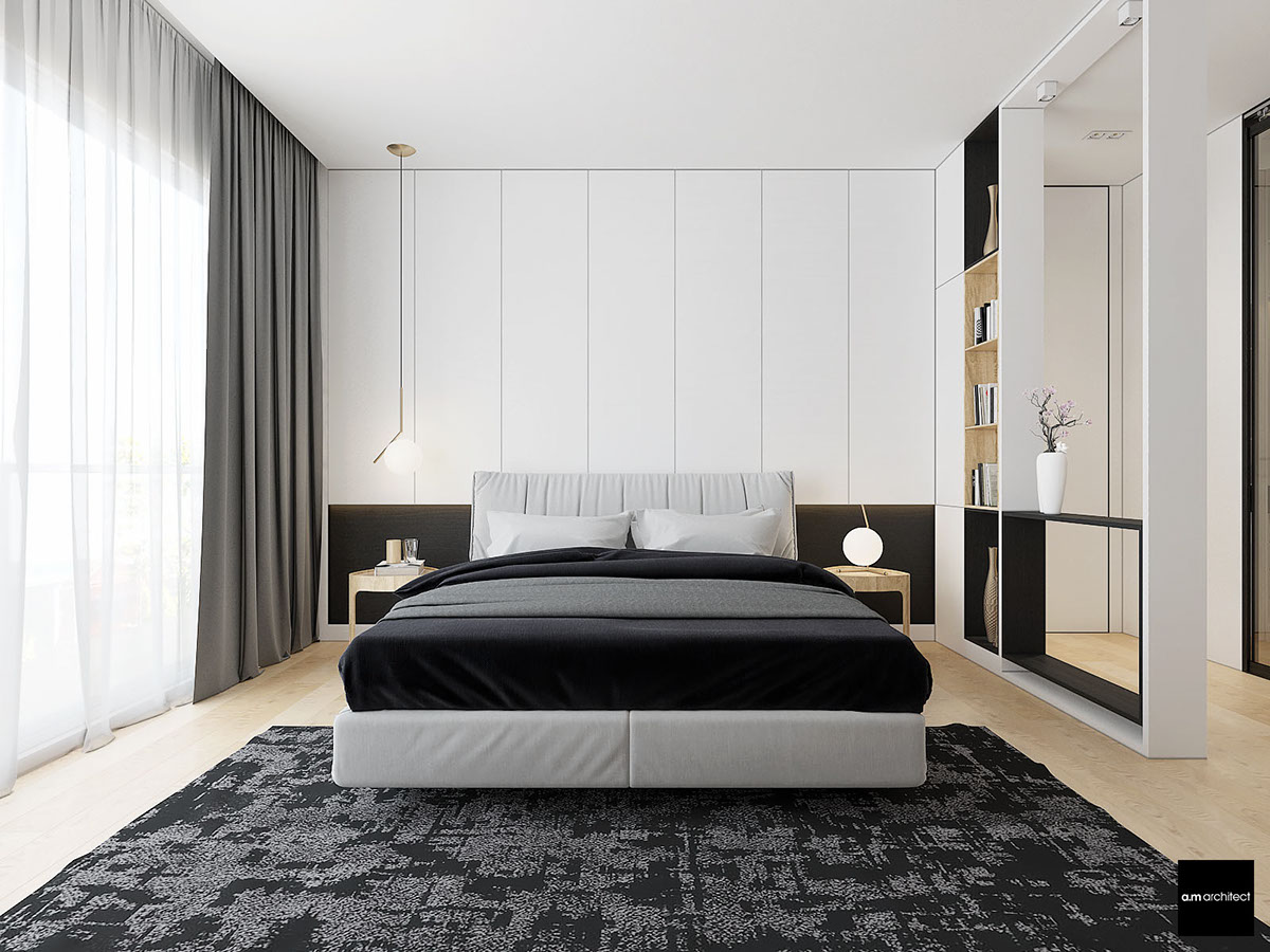
- 3 |
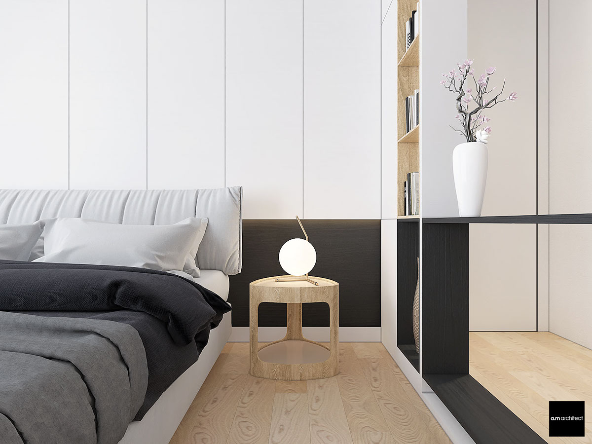
- 4 |

- 5 |
- 6 |
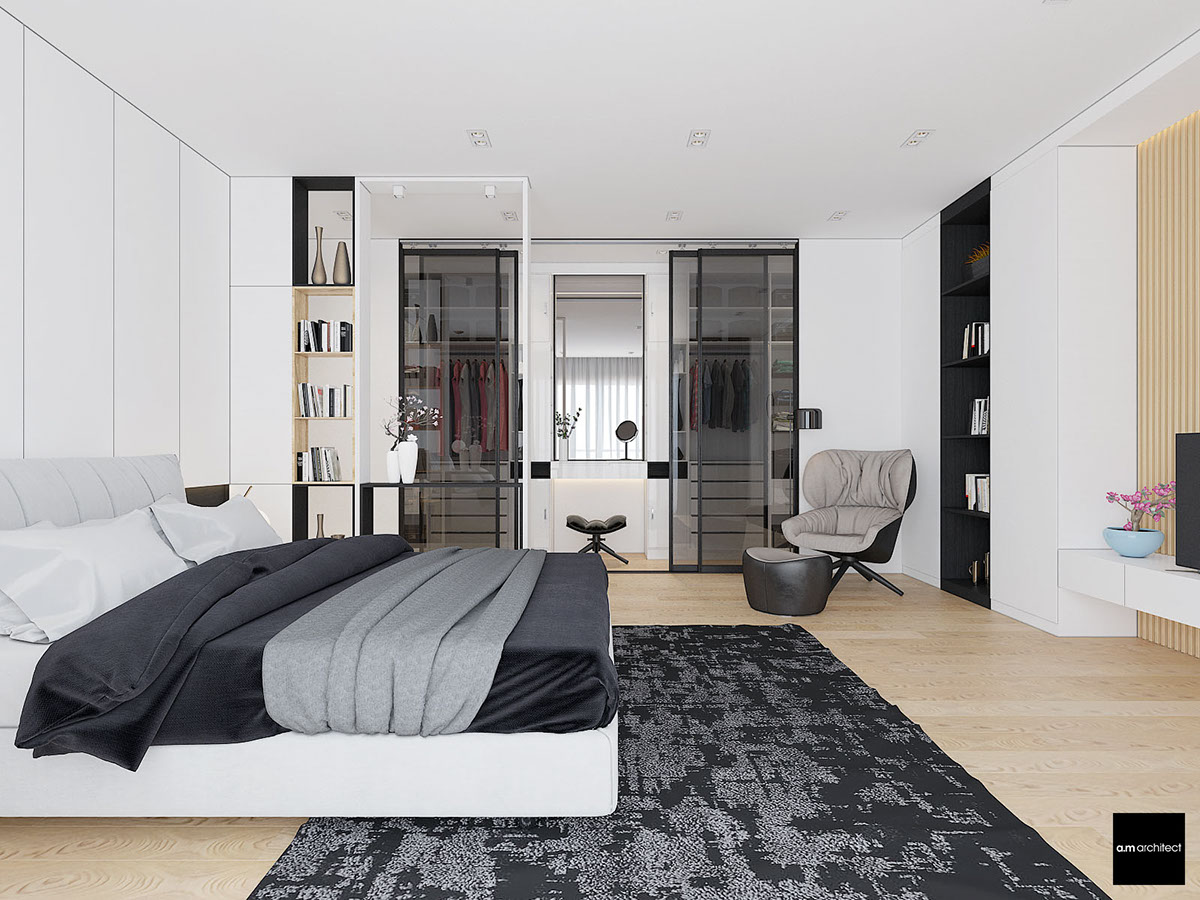
- 7 |

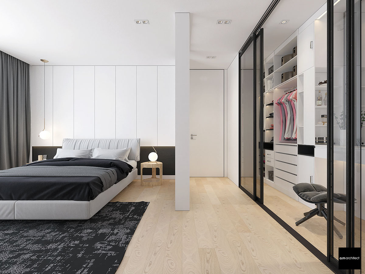
- 8 |
Advertisement
- 9 |
- 10 |
- 11 |
- 12 |
- 13 |
- 14 |
- 15 |
- 16 |
- 17 |
- 18 |
- 19 |

- 20 |
- 21 |

- 22 |
- 23 |
- 24 |
- Visualizer: Anna Malyk
- 25 |
- 26 |
- 27 |
- 28 |
Written by admin
![]()
