At LinkedIn San Francisco Office by Interior Architects, Graphics Lead the Way

Talk about immense. As in 26 stories, totaling 440,000 square feet. An enviable terrace adds another 3,000 for a true outside draw, weekends and holidays included. That’s the count for LinkedIn’s office in San Francisco. The professional networking operation occupies a brand-new shimmery black glass tower, leased just as the architects at Thomas Phifer and Partners broke ground.


> Project Resources


Interior Architects __design director Neil Schneider and director of environmental graphics Julie Maggos, both senior associates, were involved from the outset—you might say even earlier. Already under their belts were LinkedIn headquarters in nearby Mountain View as well as offices in Chicago, New York, Toronto, and São Paulo, Brazil. So the pair are undeniably steeped in the client culture. But this latest project is no copy-and-paste job. “We did things we never did before,” Maggos says of phase one, 345,000 square feet on 18 levels.


This was her most extensive LinkedIn environmental graphics program yet. In fact, graphics were the project’s primary ordering device. They not only provide way-finding and define neighborhoods but also establish a narrative. Here’s the story: The protagonist is San Francisco itself—its glorious history and quirky nuances. “Every floor’s meeting rooms have a theme,” Schneider adds. For example, there are old-time bars (including Bustop Saloon and Little Shamrock), trendy coffee roasters (Blue Bottle, Four Barrel, et al.), musicians (Joplin, Tupac), movies shot locally (Princess Diaries, for one), and neighborhoods (Mission to Pacific Heights).


Ties to authors and poets—beats and beyond—take the form of quotes that appear on vinyl wall covering in one of the six libraries, where staffers can contribute a favorite book. Since video games loom equally large in the urban culture, IA gave employees a way to channel their not-long-ago youth via a “pixel wall”: Rotate its multicolored cubes to re-create, say, the Pac-Man icon. The city’s parks get their due with a wall of artificial turf, meant for posting selfies. Maggos and Schnieder always eschewed the obvious, with nary a glimpse of the Golden Gate Bridge.


Each level’s theme is introduced by a wall-mounted installation just off the elevators. Floor numbers, giving a salute to San Francisco’s Victorian architecture, are backlit cutouts in stacks of crown molding. Another way-finding device takes cues from street art’s vibrant palette, used for color-coding.


For office levels, IA devised four floor-plan types. Meeting rooms mostly hug the perimeters. Pantries, providing foosball tables in addition to snacks, appear on every other level. Wellness areas and support spaces pop up in different locations amid the height-adjustable workstations for the 2,800 staffers. Employee expression figures heavily throughout. Typical are writable walls, spaces for personal artwork alongside pieces by emerging local talents, and dedicated walls for announcements or team innovations.


The lower three levels depart from that scenario. Reception is an expanse of white terrazzo, its coolness tempered by wooden paneling. Behind the desk rises a blackened-steel wall into which a huge map of the city is etched for tie-to-place. A company logo displayed on a video screen can morph to reflect current events and interests. During LGBT Pride week, for instance, the rainbow flag’s colored stripes filled the letters of LinkedIn, while the background remained the corporate electric blue.


A terrazzo staircase joins reception to the level above, which is packed with perks. “Wellness was a particular concern,” Schneider says. Ergo the full gym, with its exercise studio, cardiovascular and weight machines, and locker rooms, plus private rooms for massages. From the gym, a corridor connects to the multipurpose room, which can accommodate everything from all-hands meetings to client events. Maggos used the corridor’s long sight lines to play a game with perception. To someone walking along, the blue letters and shapes painted on the walls, floor, and ceiling appear to be random. But stand on a particular spot, marked by a camera icon, and the jumble resolves itself into LinkedIn’s buzz phrase, “Focus on what matters.”


Taking over the entire third level is the cafeteria, where menus, global in scope, are offered gratis for breakfast, lunch, and the occasional dinner. However, that’s not all for food, wellness, and chillaxing. Meriting a separate shout-out are the amenities up on 17. A juice bar, the Pulse, serves restorative concoctions beneath a mural rendered in different shades of green moss, and a glassed-in corner lounge feels like it’s outside. Actual outdoors is available on the adjacent roof terrace, home to the branding pièce de résistance, a steel LinkedIn logo standing 4 feet high and 18 wide. The steel is perforated for graphic interest, sure, but also in deference to views extending all the way to the San Francisco–Oakland Bay Bridge.


Project Team: Carolyn Tucker; Colin O’Malley; Adrienne Harbarger; Michelle Hoffmann; Ruben Gonzalez; Kevin Lieberman; Nicholas Mosher; Amy Ehara; Anne Nilsson; Cara Rooney; Meghan Van Noort; Amanda Eggleston; Christine Lai; Gary Bouthillette; Megan Howell: Interior Architects. Moss: Display Consultant. Louie International: Structural Engineer. Mission Bell: Woodwork. American Terrazzo Co.: Terrazzo Contractor. Swinerton: General Contractor.


> Project Resources


> See more from the November 2016 issue of Interior Design


Black & White Scandinavian Interiors That Explore The Dark Side

  • 1 |
  • Source: Entrance
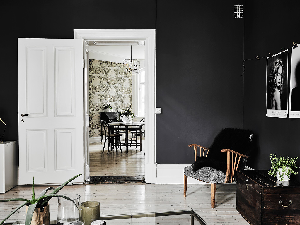
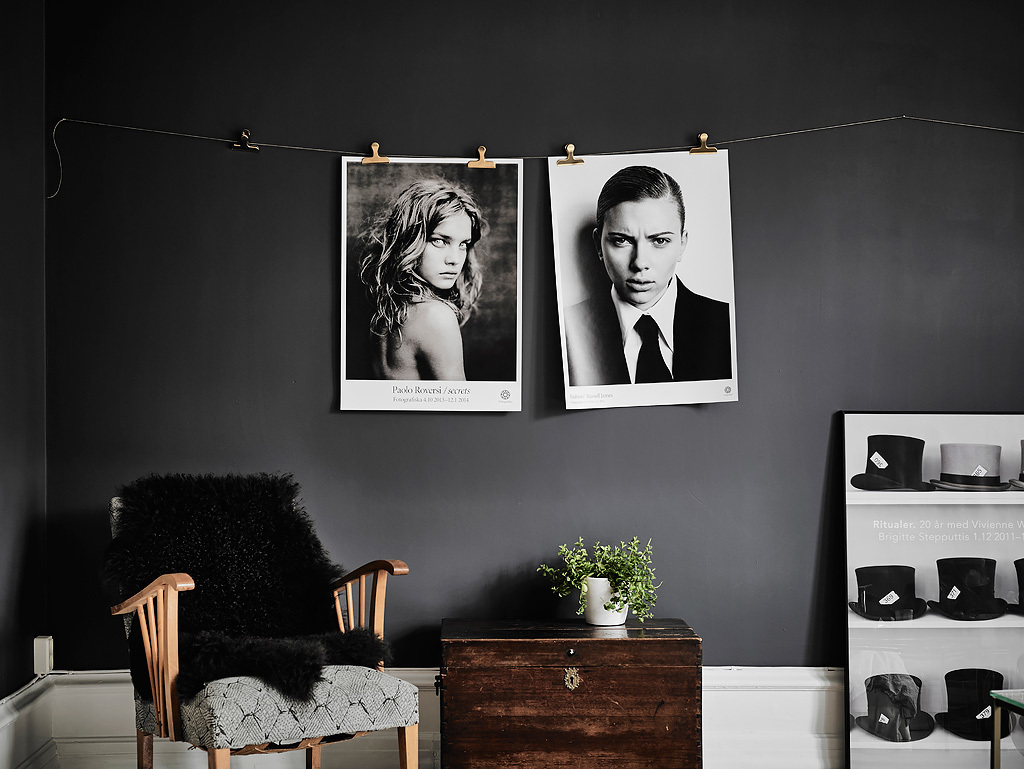
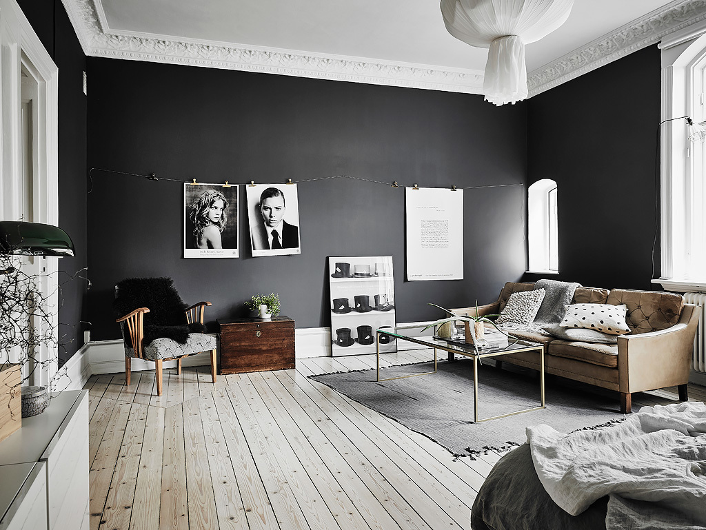
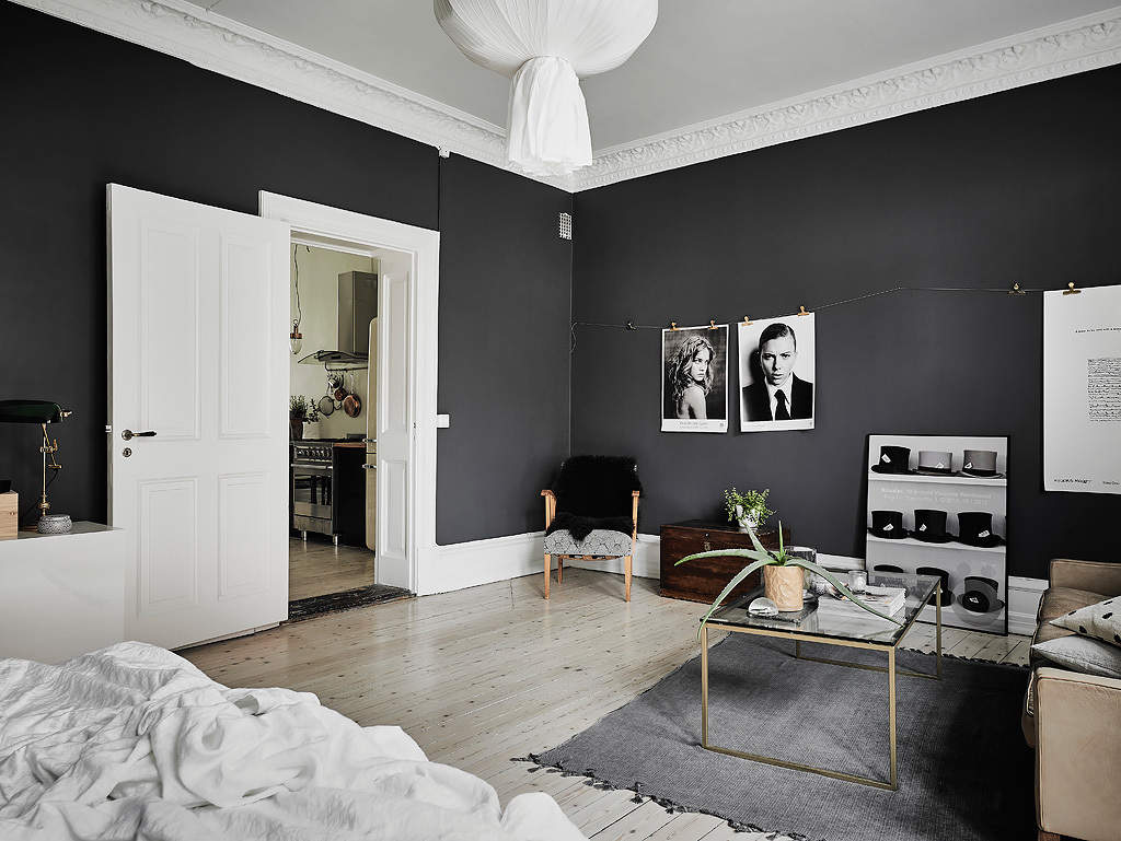
Our first black-and-white, Scandinavian space evokes film noir. Measuring a small 57sqm, it takes advantage of existing plaster decorations and woodwork by using bold, dramatic colours. The living space shows this best, with impactful black encasing the walls. Large-scale monochrome photographs hang off a string line, matched by a case of top hats near the bottom. Different-wooden chairs are softened by black throws and pops of life, while white accents emerge in door frames and illustrated ceiling coves.

  • 2 |

Advertisement

  • 3 |

  • 4 |
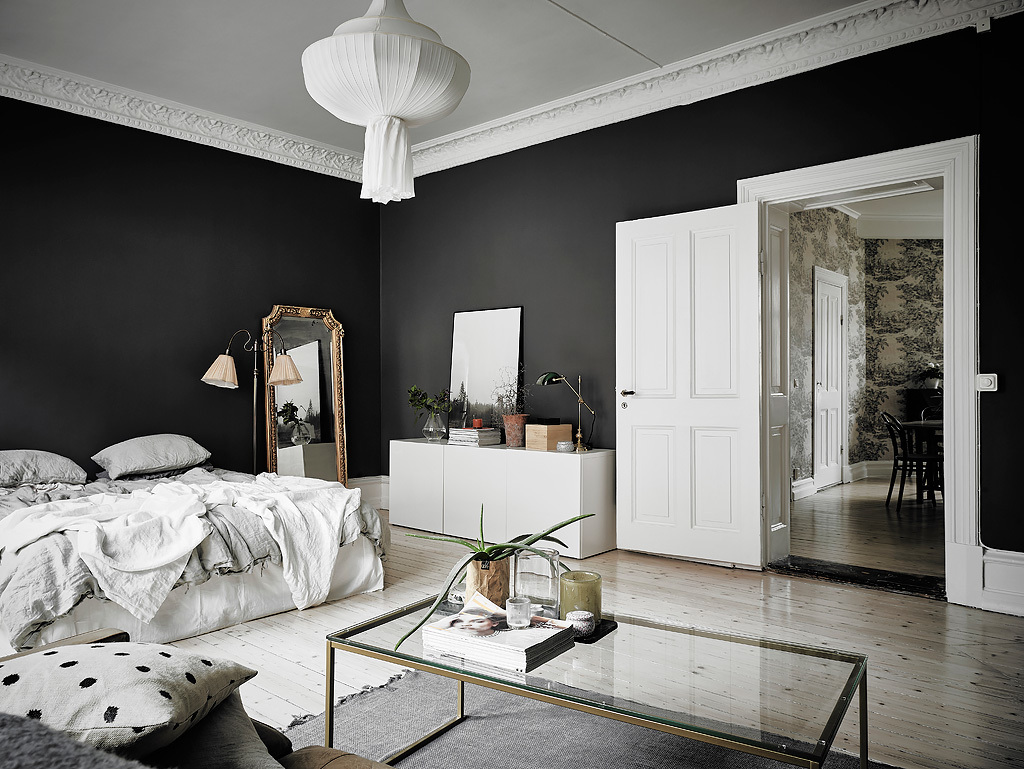
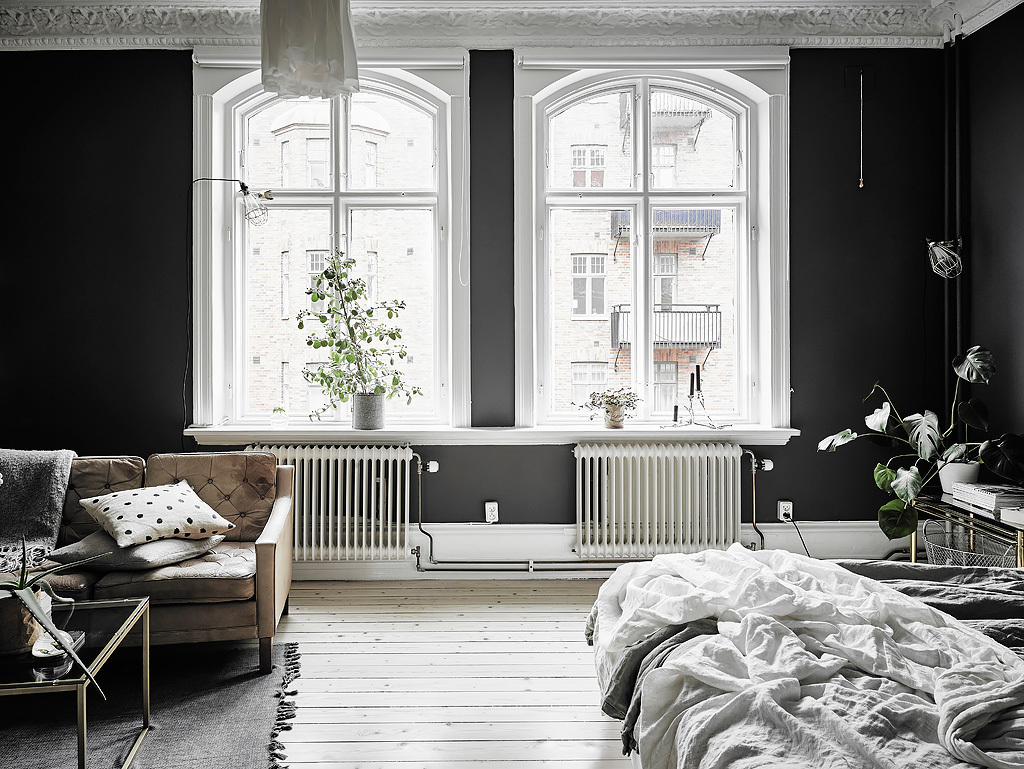
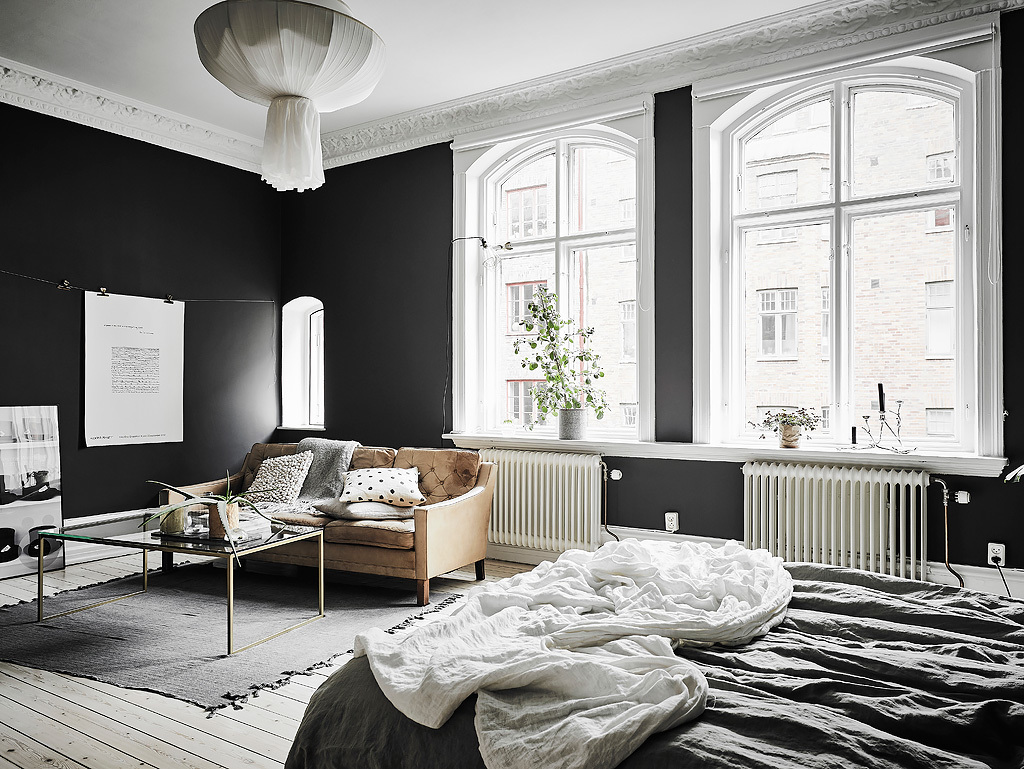
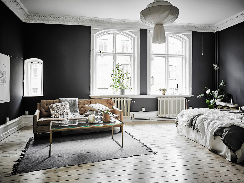
Standing out against the black, the room’s finest features glow in white. Two arched French windows let in the day, a white banquet lantern the night. Pops of white appear in heated railings, orchids, a ceiling and chest of drawers. A light tan couch and gold-rimmed glass table offer subtle comforts.

  • 5 |

  • 6 |

  • 7 |

  • 8 |
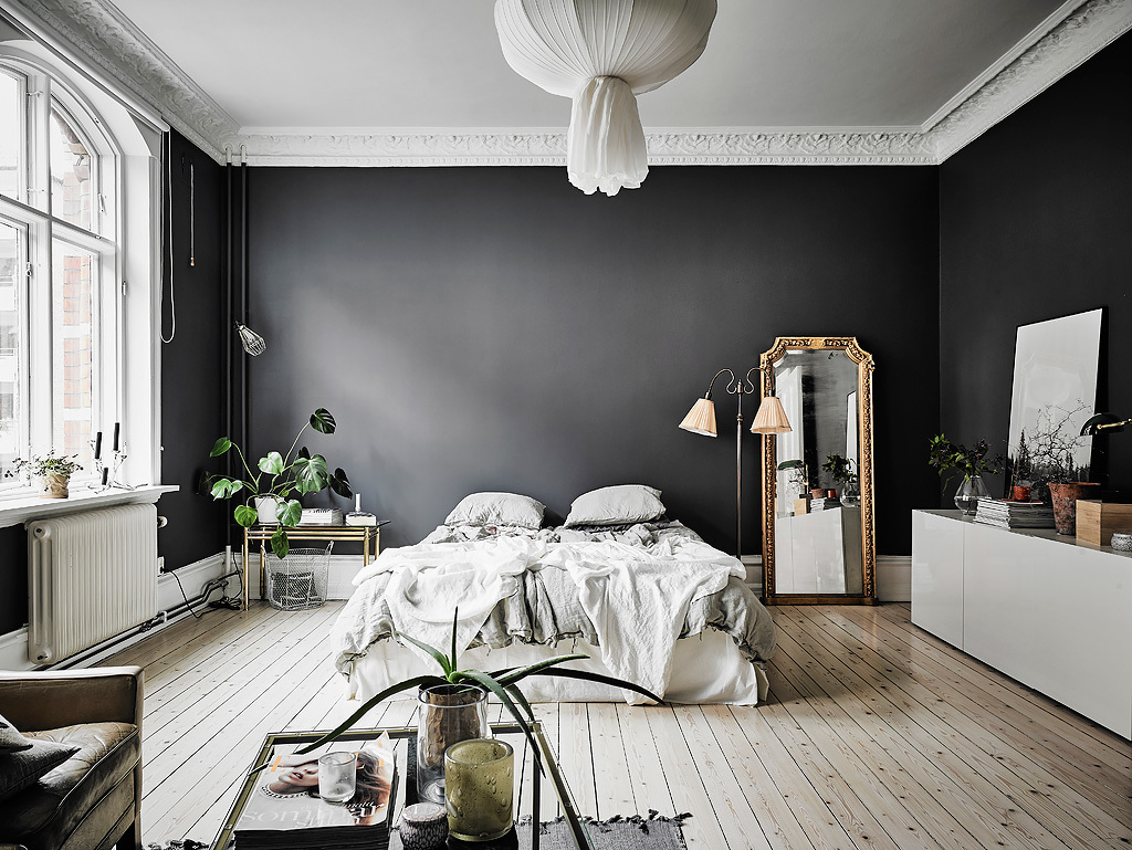
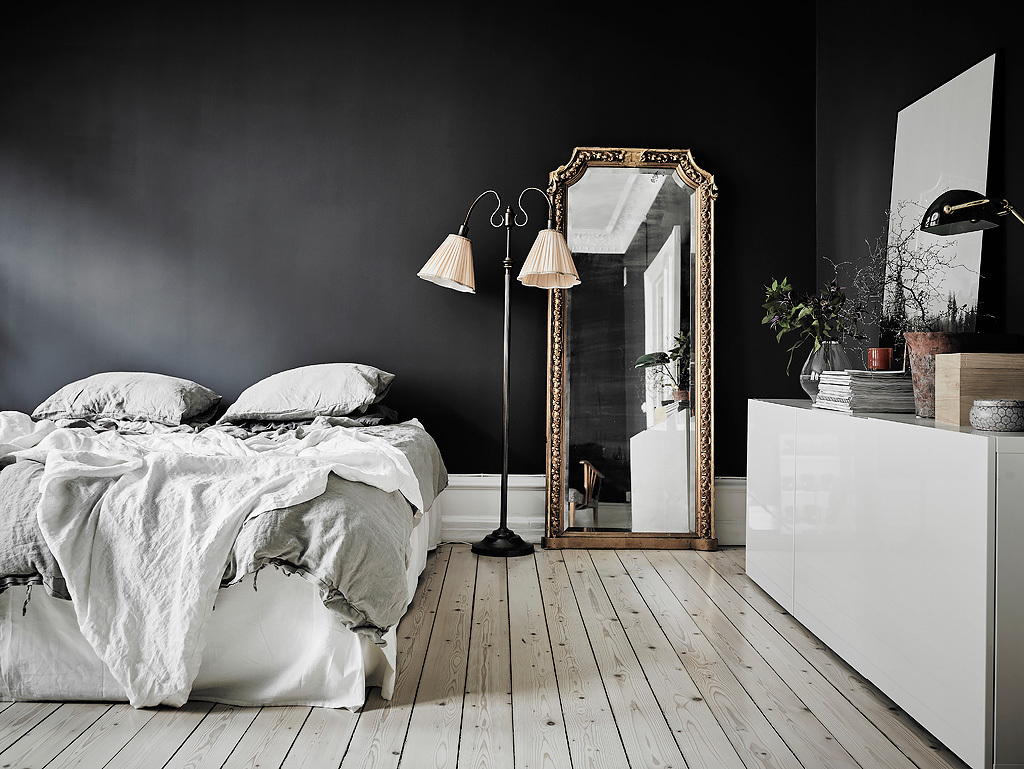
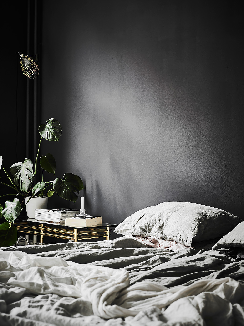
The bedroom carves its own space to the side. Relaxed grey and white bedding drape between a full-length gold mirror, standing flower lamp and lounge-reminiscent glass table. Orchids stem beside the bed, while a bonzai plays on a chest of drawers. A large black space above the bed affords room for thought and a clear path to the next room.

Advertisement

  • 9 |

  • 10 |

  • 11 |

  • 12 |
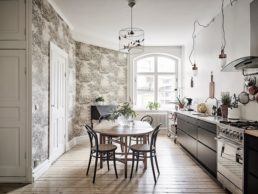
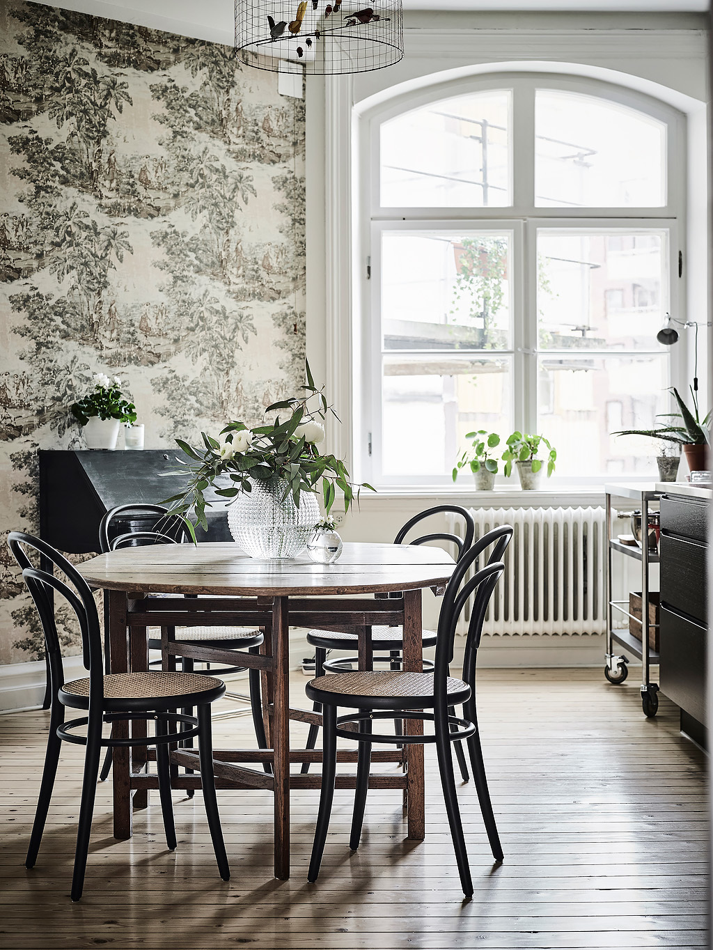
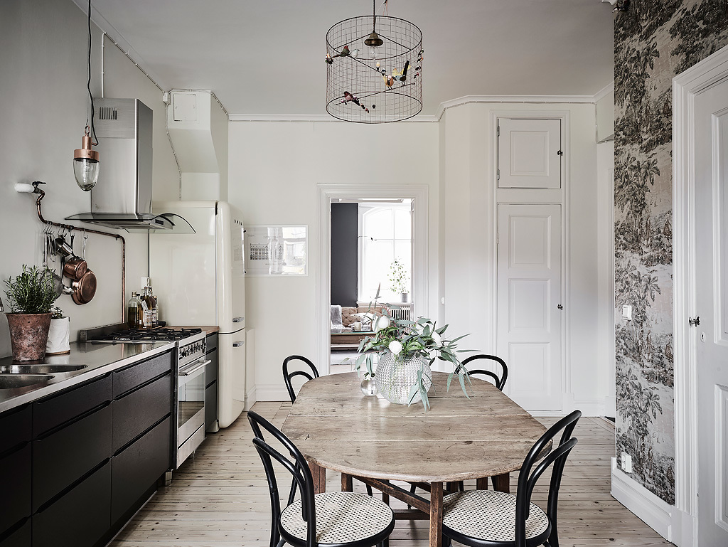
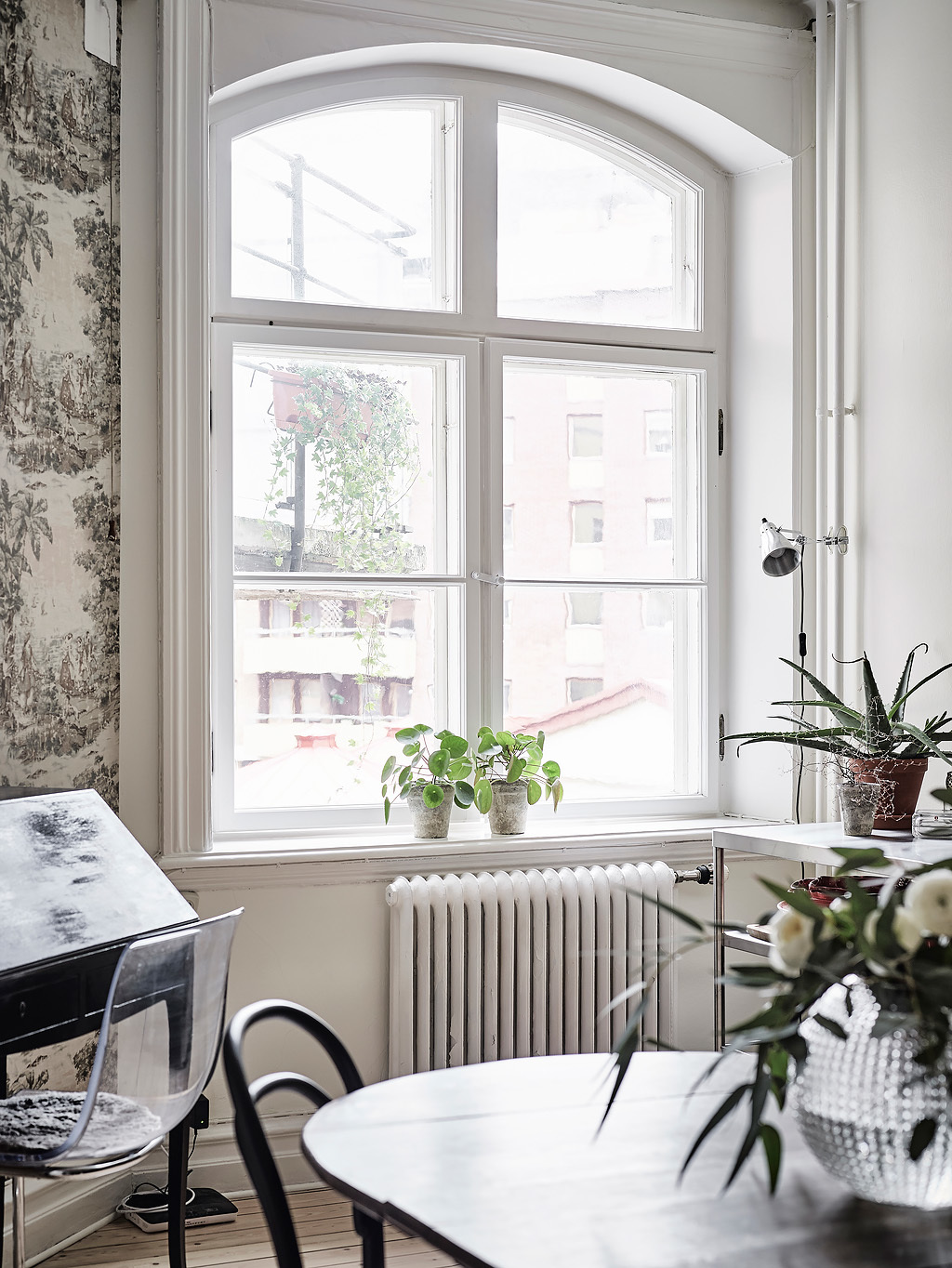
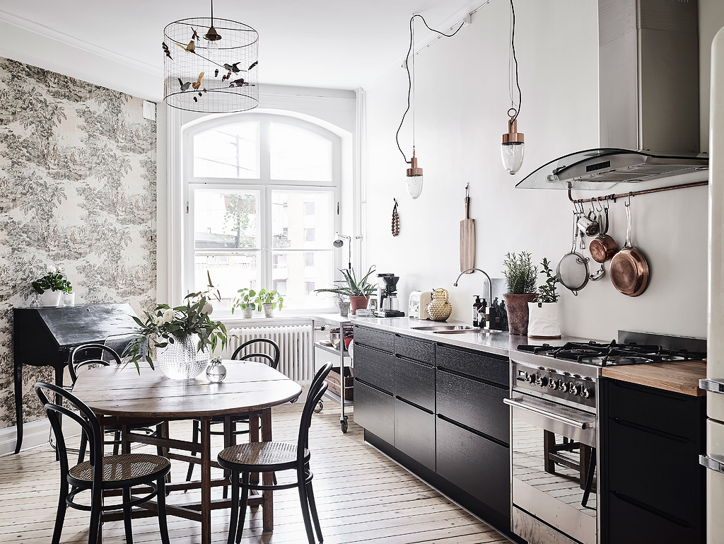
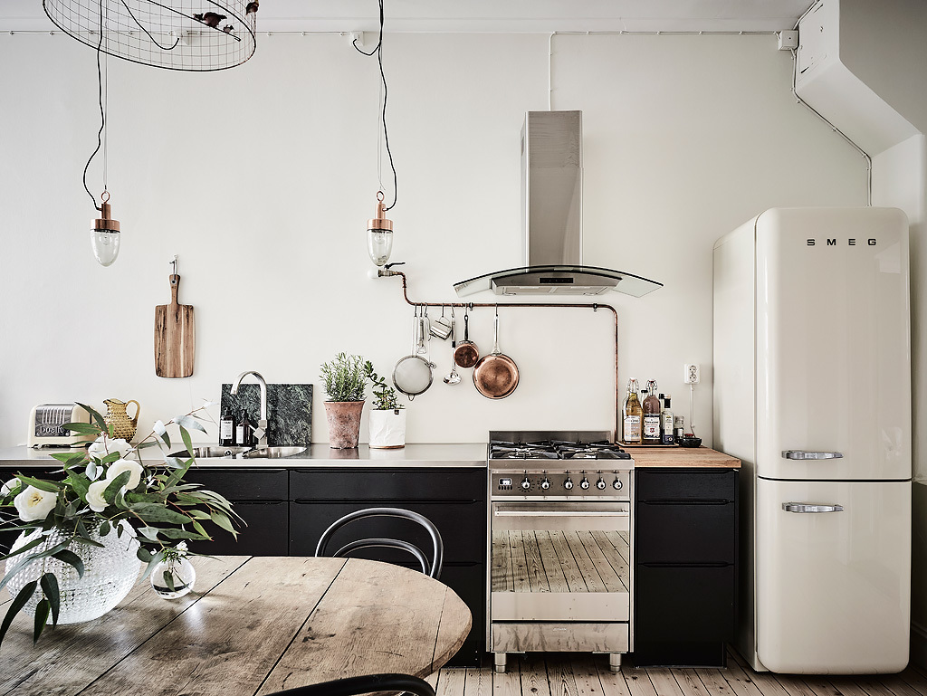
The kitchen and dining room brighten in lighter grey and white tones. Featuring a black-and-wood side bench, a curved grey-fern wall adds muted interest. As a classic round wooden table holds potted life, supporting plants chime in from radiators and windowsills. A bird cage holds a light and nature’s sounds.

  • 13 |

  • 14 |

  • 15 |

  • 16 |
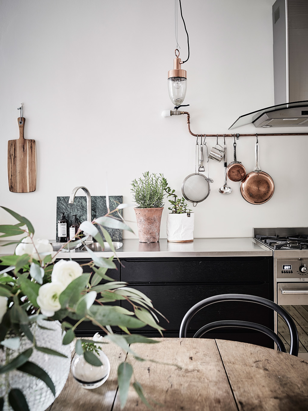
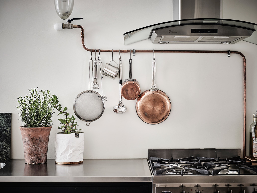
The focal point of the room, the French window makes the space large and dark features bright. Streaming onto the bench and wooden table, a mixture of woods appear the same. Illuminated white shows off copper pots, pans and a glossy SMEG. Draped cone copper lighting completes the look, retaining a relaxed, Scandinavian feel.

  • 17 |

  • 18 |

  • 19 |

  • 20 |

  • 21 |
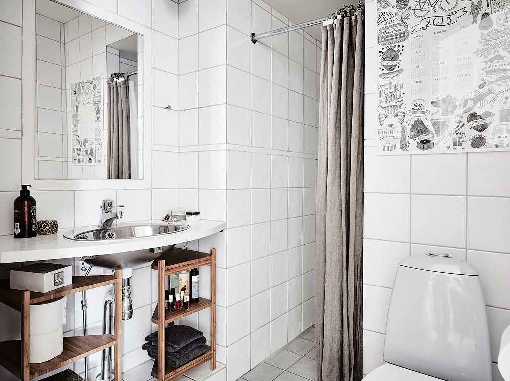
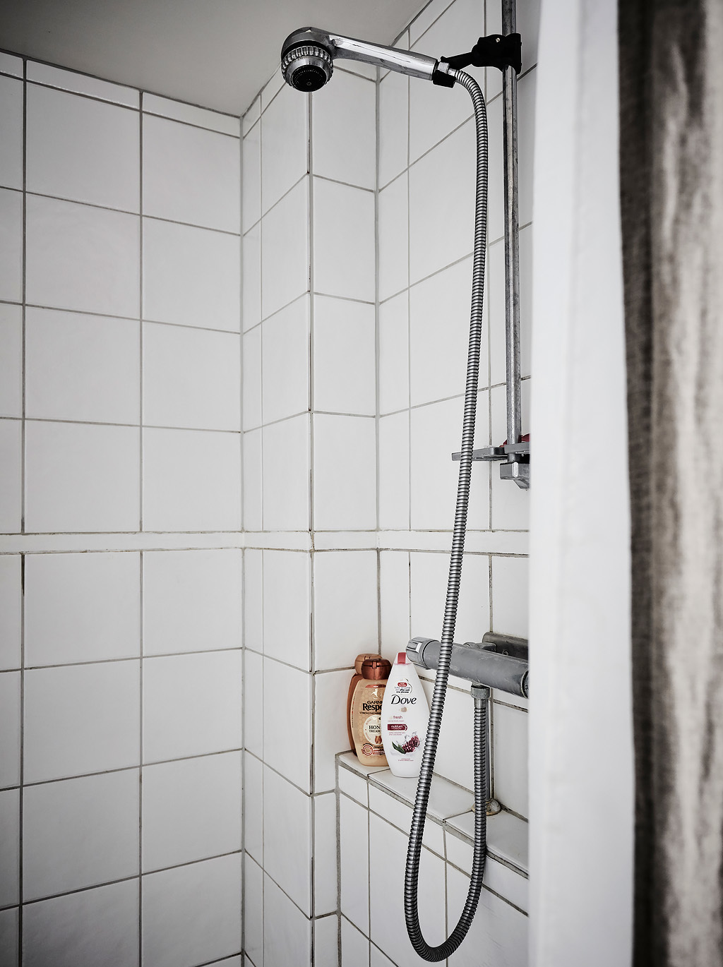
The bathroom flickers in grey, black and wood, surrounded by white tiling. A simple standing basin is made eclectic by two wooden shelving units underneath. Pops of grey shine in a silver chrome sink and shower, grey curtain and newspaper-style print art.

  • 22 |

  • 23 |

  • 24 |
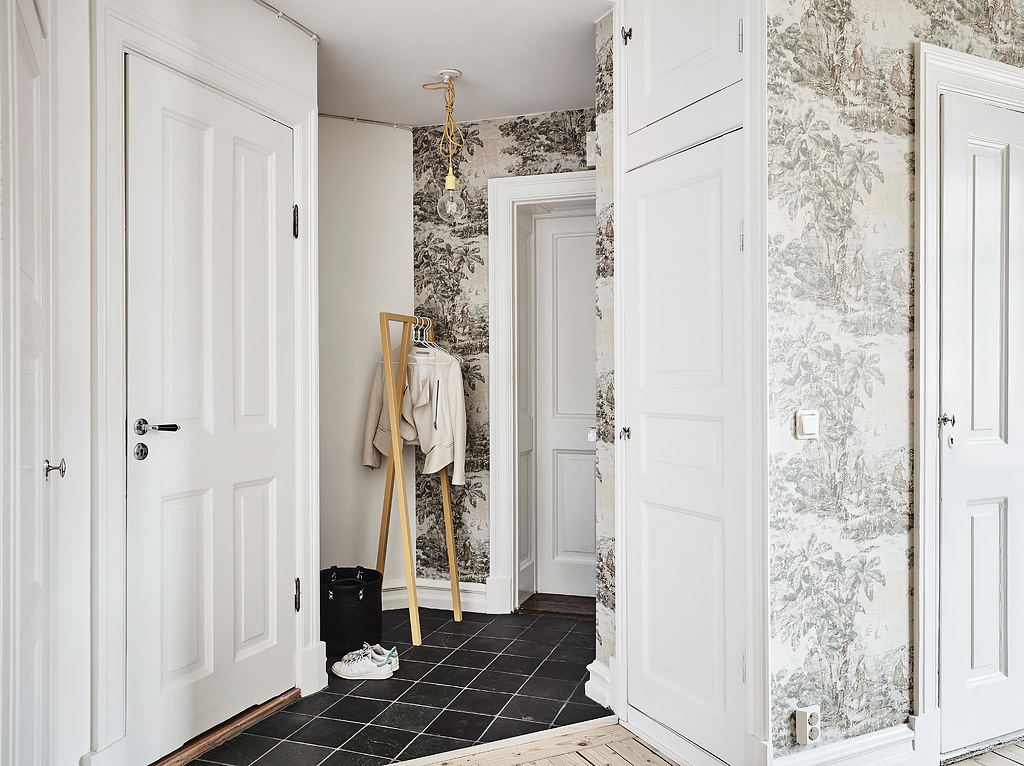
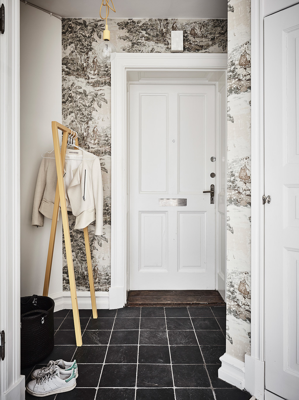
The way out is shrouded in greenery, mirroring the kitchen. Using the same grey-and-white ferns, white French doors sit above wooden floors and contrasting black tiling. A simple wooden frame hangs the coats.

  • 25 |

  • 26 |
  • Visualizer: aTng 糖
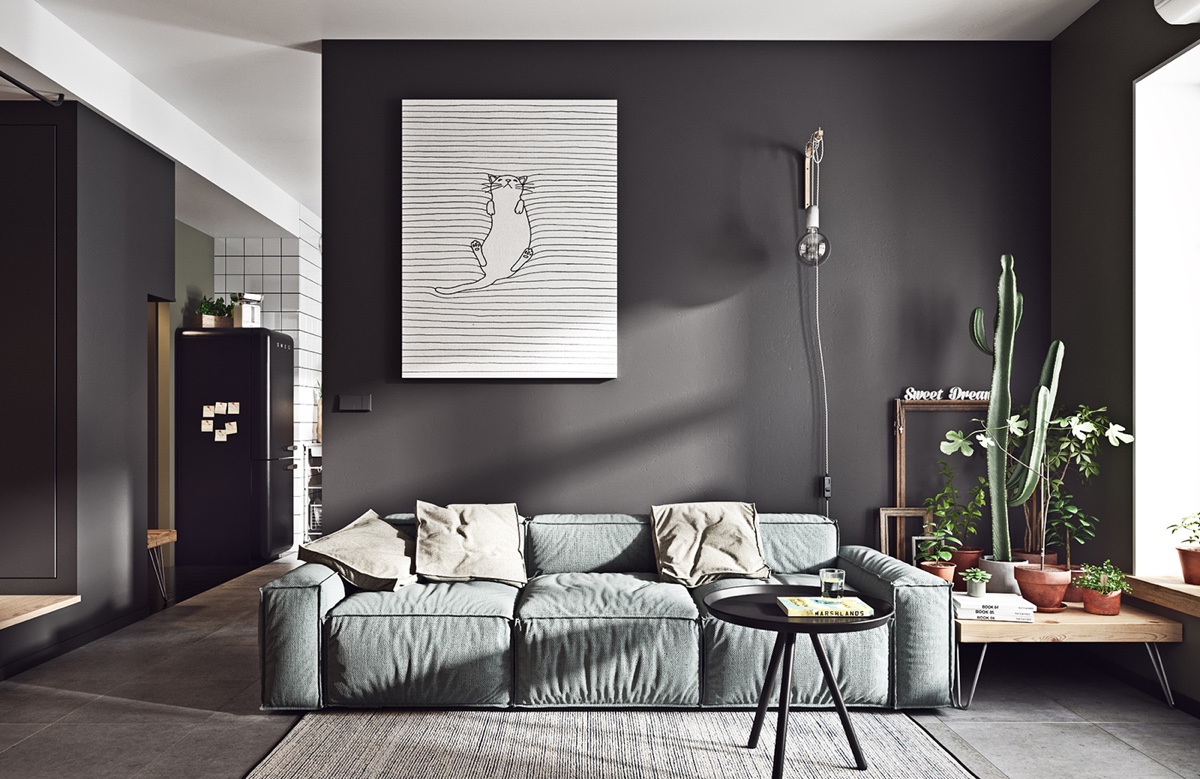
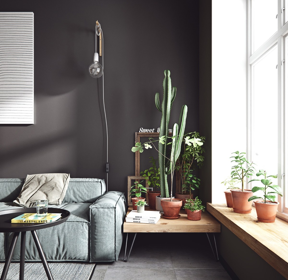
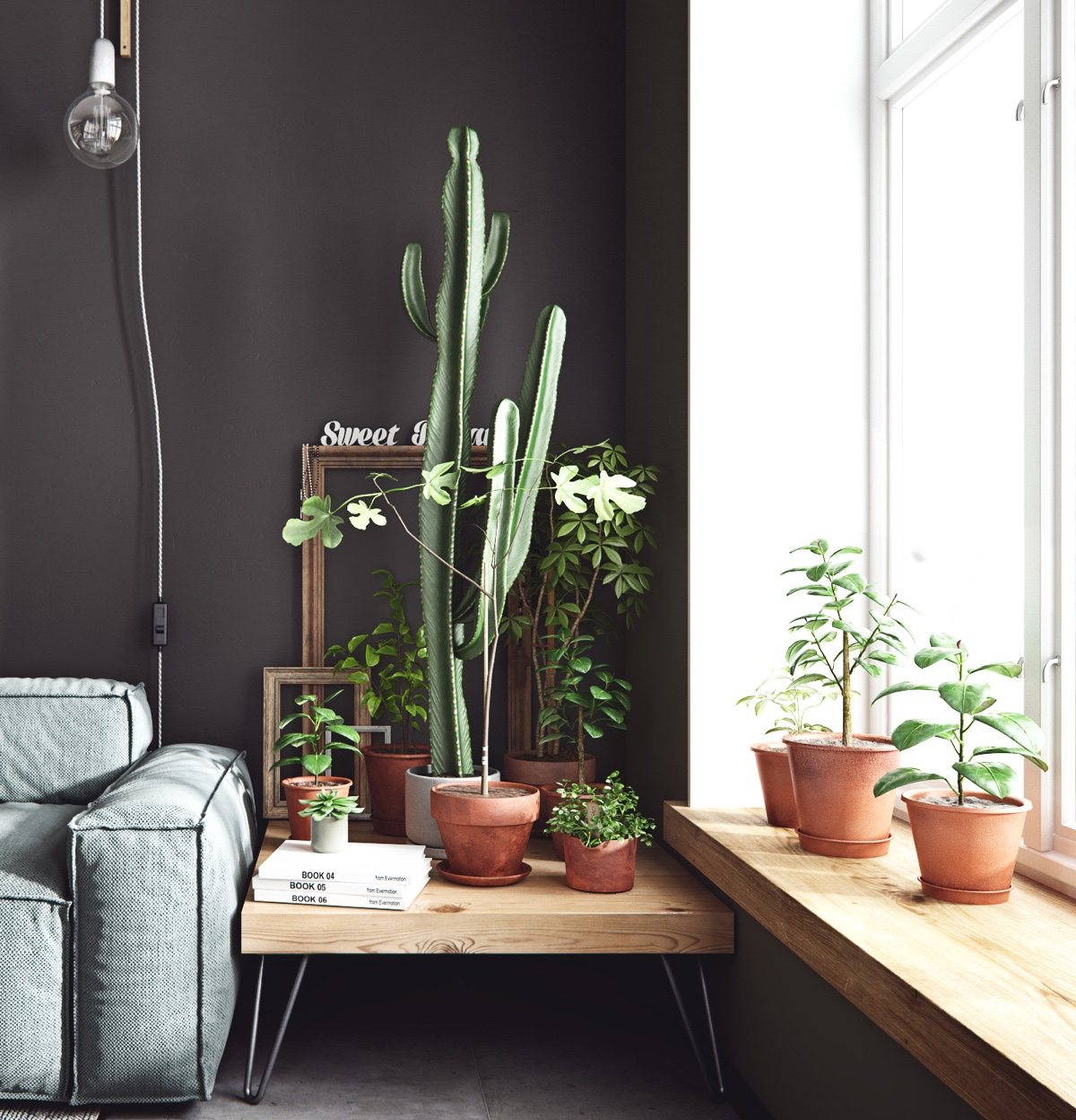
Our second space splits black walls across living, dining and entrance areas. The lounge shows dark criss-crossing a feature wall and back corridor panels, as a simple cat illustration focuses the eye. A range of South American cacti on a low wooden table keep a square linen couch company. A white window to the side lights up rope lighting, a woollen rug and coffee table characters.

  • 27 |

  • 28 |

  • 29 |
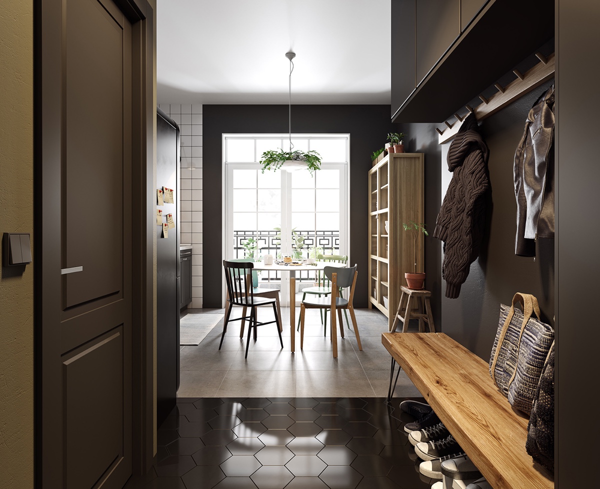
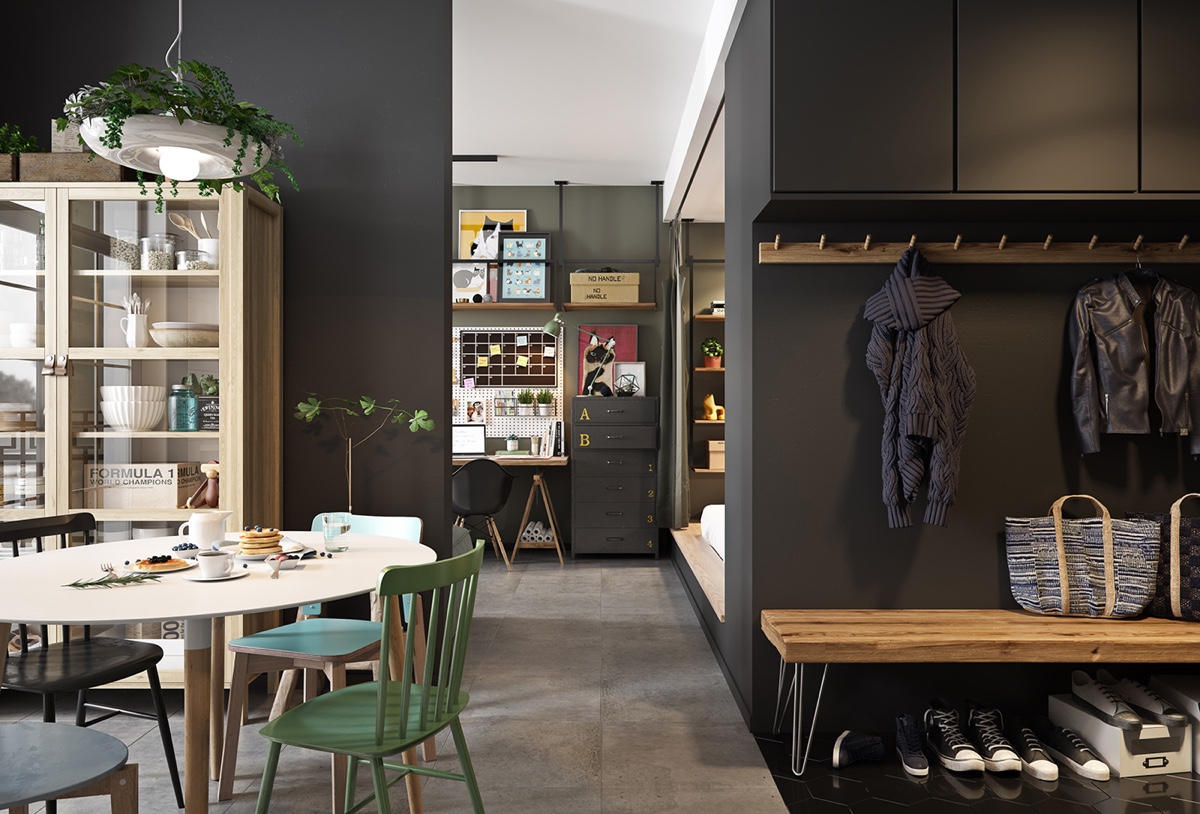
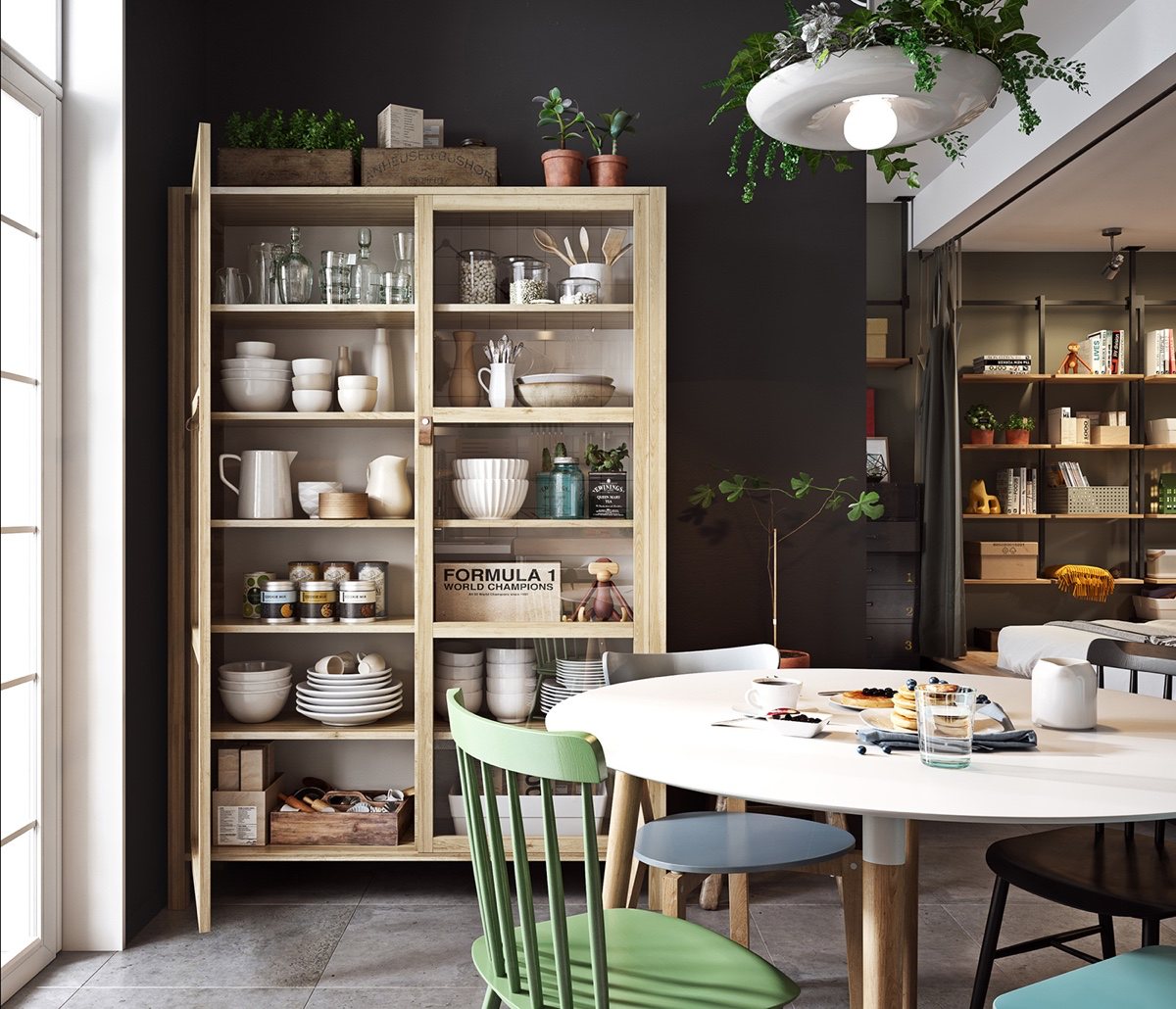
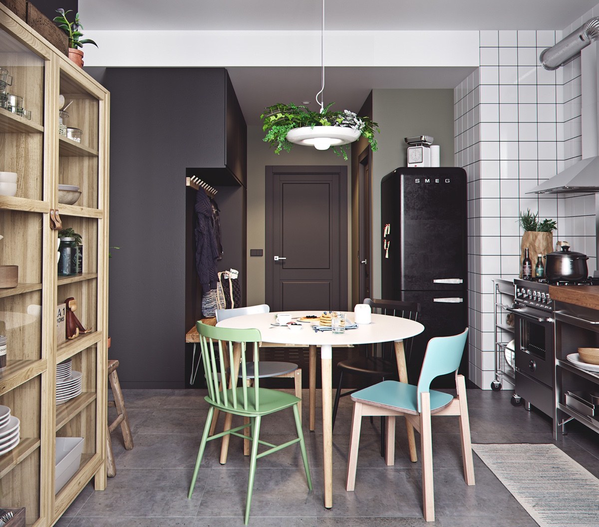
Around the corner, black fuses with chocolate covering the floor and wall. A wooden seat, hanging coat rack and rough wooden cabinet lead towards white French doors, inviting in the sun. A simple white-wooden table gathers round pastel chairs. Hanging vines drape over the dining room lamp, designating a place to eat and relax.

  • 30 |

  • 31 |

  • 32 |
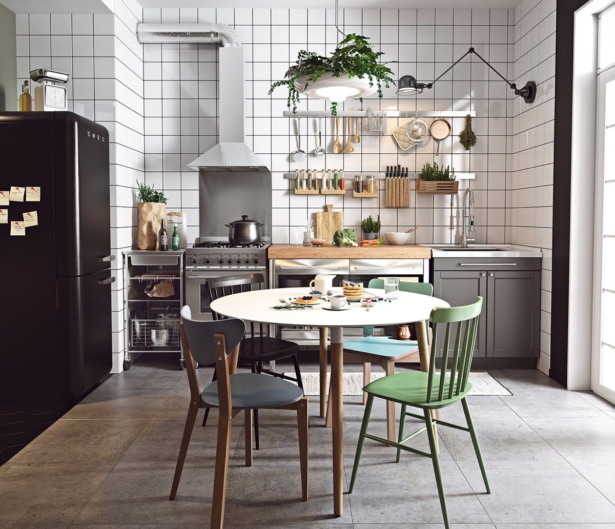
Slate tile floors lead to another view – the kitchen. White splashback tiles oppose black-painted walls, adding contrast. Grey cabinetry follows the floor colouring, as black and wood adorn benches, lights and a SMEG.

  • 33 |

  • 34 |
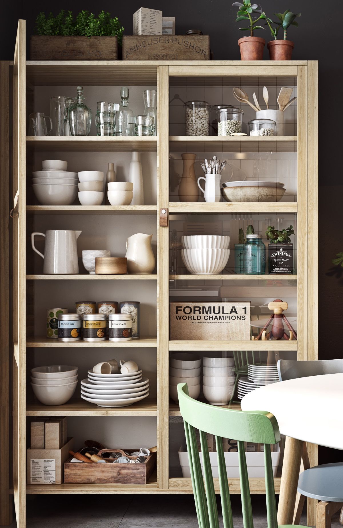
Like any good Scandinavian classic, the kitchen lets the little elements shine. Kitchen chrome refracts light in a stove and extractor fan, pots and spoons, while wooden pieces create contrast with coloured spices. The wooden cabinet shows off porcelain, glass mason jars and stones, while the dining table acts as a white meal canvas.

  • 35 |

  • 36 |

  • 37 |
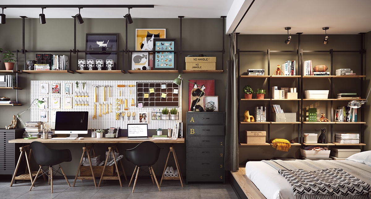
Around another hallway corner, a surprise awaits. Long, wide and eye-catching, an office and bedroom space opens itself up to Scandinavian and monochrome influences. To the right, a bed lies in white and grey, as wooden shelving holds books and pot plants. The left shows a large bench space, drilled-hole utility wall and classic black filing cabinet. Using tones of wood, and black and white interspersed with yellow, the space looks like a tool station but acts like an office. Closer inspection reveals kitschy cat paintings, a range of letter sets and everyday handyman tools in a working space for two.

  • 38 |

  • 39 |

  • 40 |


Etsy Headquarters Embrace Laptop Culture and Local Makers

Many technology companies permit employees to work wherever they want, unconfined to an assigned cubicle. But Etsy takes that libertarian notion to an extreme. At the crafty tech giant’s headquarters in Brooklyn, New York, there’s an unheard-of ratio of 1:1 task chairs to lounge seating. Forget hot desking. “We call it not desking,” Etsy capital projects manager Justine Chibuk says.


> Project Resources


Sure, coders tend to stay rooted at their dedicated maple-topped workstations, but seemingly everyone else is roving. You’ll find staffers lap­topping at communal tables in the pantries that supplement the Eatsy cafeteria, having confabs in sun-drenched areas alongside lush plant walls, and crunching spreadsheets in the garden. Some seating areas are placed inside Etsy-crafted “maker huts”—think giant tea cozies that can be tethered to the floor and ceiling. Employees needing a break can recline on the library’s ombré braided rug, meditate in the glass-fronted “breathing room” on the wellness level, chill on the roof decks’ benches, or stitch a stocking for Santa in the maker space, which is equipped with a sewing machine and a letterpress.


Little of that could have occurred previously, when employees were spread out among various suites in another building. A major upgrade in every way, the new HQ designed by Gensler consolidates the 500 staffers in a single location. Nestled in the “tech triangle” between bridge on-ramps, the nine-story, 225,000-square-foot structure is actually two buildings, erected in 1927 and 1949 and joined to serve as a Jehovah’s Witness printing plant. “The space was in surprisingly good shape,” Gensler __design director John Mulling begins. “It was basically an empty shell with beautiful concrete floors that we left as is.” Mulling even preserved the green-painted window frames.


The project was unusual for many reasons, from the square footage devoted to amenities to the degree of client involvement. “It was highly collaborative, with multiple visioning sessions, a protracted predesign phase, and lots of working out problems together, live,” he continues. To keep everyone on the same page, he established four criteria against which to vet every proposed element. Would it celebrate the making process? Embody the idea of controlled chaos? Tell a meaningful materials story? Bring the outdoors in?


On top of that, Etsy requested that at least 50 percent of the furnishings be produced by its own sellers. With the exception of task seating in office areas and training tables in the Etsytorium, almost every piece of furniture and light fixture was crafted by one of 10 local studios. Genlser was instrumental in helping the makers, many of them one- or two-person outfits, as they navigated the production process. “It was like a crash course in scaling up their businesses,” Chibuk says.


Specification was complicated by the pursuit of Declare certifications. Every component and material, from cabinetry stains to fire-protection spray, had to comply with super-strict ecological and health protocols. At the project’s inception, only a dozen Declare products even existed. Now, Gensler is pursuing certification for 28 designs developed here. “We have a bigger goal of sharing those resources with others in the hope that we can make an impact on the commercial interiors industry,” Etsy corporate communications specialist Arianna Anthony states.


More than 250 pieces from the site’s sellers are throughout, which meant Mulling had to concentrate on reducing the potential for visual cacophony. “Etsy is a very expressive culture,” he says. “It was vital to develop a platform, a framework, for that expression.” So he slated specific areas for permanent or rotating installations: display cases, feature walls, even a staircase’s blackened-steel cabling. All the artful touches result in a sense of delight and discovery that’s heightened by the curved and angled circulation routes. “I don’t think we have one right-angle meeting in the entire project,” Mulling says. “One of the first floor plans we presented was very orthogonal, and the Etsy team’s faces just fell. Integrating enough crooked lines to make them happy did prove a space-planning challenge, but it was also a good throwdown!”


As a B Corp, certified for its environmental and social consciousness, Etsy was furthermore look­ing for the space to embody company values. Among them are the belief that employees should have a life outside the office. For all the thought and attention lavished on the headquarters, Anthony says, “We encourage people to actually leave the building.” A novelty in the tech world.


Project Team: Amanda Carroll, John Mulling, Stephanie Lan, David Briefel, Rocco Giannetti, Maddy Burke-Vigeland, John Budesa, Sofia Juperius, Arielle Levy, Sam Adkisson, Kate Kelly, Zach Kuehn: Gensler. Hillman Dibernardo Leiter Castelli: Lighting Consultant. Active __design Group Engineering: Structural Engineer. AMA Consulting Engineers: MEP. Modern Woodcraft; Modworxx: Woodwork. JRM Construction Management: General Contractor.


> Project Resources


> See more from the November 2016 issue of Interior Design


AvroKO Masterminds the Micro Hotel With Arlo Hudson Square

How’s this for a scenario? A hotel brand makes its debut by hiring a __design firm that’s relatively new to the hotel genre, despite being a restaurant specialist extraordinaire. And the property is in New York, possibly the most cutthroat market in the U.S. if not in the world. Recipe for disaster? Not at all, as it turns out. The point man on the interiors of the Arlo Hudson Square, AvroKO chief creative officer Matthew Goodrich, found the leap into unfamiliar territory invigorating, even though, he admits, “It’s like opening on Broadway without ever having performed anywhere else.”


> Project Resources


The Arlo Hudson Square and the slightly smaller Arlo NoMad are owned by Quadrum Global. And both are part of the growing micro-hotel trend, offering value prices for tiny guest rooms intended less as a place to spend time than as what Goodrich calls a “launching pad” to explore an exciting city. “The exchange is that there are much larger public spaces to meet the needs of guests who might otherwise have stayed up in their own rooms.”


Addressing the givens of the 11-story building by Gene Kaufman Architect, which also collaborated with AvroKO on the 1 Hotel Central Park, Goodrich had to grapple with the size of the 325 guest rooms, an average 150 square feet. “One of the first things we did was to tape them out,” he recalls. “They looked so tiny.” He asked himself, “What can we eliminate? What is most important to have?” The answer was rooms that feel fitted, like a luxury train compartment or a ship’s cabin. There’s an almost Japanese sense of efficiency. However, a key reason for the scheme’s success is that it isn’t solely subtractive. “If we’re going to reduce the size, we have to offer pluses,” he states. “We have to seduce you.”


In almost all the rooms, the entry point is actually the bathroom. The integral sink-vanity is out in the open, but its stone composite material “doesn’t scream bathroom, like glaring white porcelain,” he notes. Opposite the sink, a single sliding door fronts a separate enclosure for the shower and toilet, making the setup seem less piecemeal. The top and bottom of the slider are furthermore transparent, so sight lines extend as far as possible. Beyond the bathroom, a wall-mounted desk folds out. Some rooms have an ingenious bunk bed with flat-screen TVs installed at the footboards. “Everything does as much work as it can,” Goodrich continues. In other rooms, the king-size bed fits right against the window, with zero clearance on three sides, since research predicted that many guests would be single travelers. Regardless of the bed style, there’s storage underneath for suitcases, as in any tidy New York apartment.


The hotel’s public spaces, meanwhile, are intended to be useful for something more than just grabbing a drink. They should encourage personal connections, he says, just like two of the greatest high-culture communities: “Our inspirations were the MacDowell Colony and Black Mountain College.” He also commissioned local artists to produce unique installations. In reception, for example, shelves are lined with hundreds of archive boxes painted a yellow that’s a mixture of taxi cab and National Geographic, and guests are encouraged to fill the boxes with notes about the hotel expe­rience, creating a sort of time capsule.


In keeping with the idea that the common areas had to offer more than the usual hotel fare, no expense was spared on the furniture. “This project includes the highest level of furniture I’ve ever gotten the opportunity to specify,” he adds, pointing to the library’s Jens Risom chairs. With the custom designs, sunny practicality comes through in the details. The penthouse bar’s booths are separated by perforated aluminum screens that can be removed to reconfigure the space for events.


For finishes, he says he tried to avoid today’s clichés: “We weren’t going to use all black-and-steel. There are a lot of crisp, lighter surfaces.” Though he did employ some trendy reclaimed Douglas fir strips, he also worked in a paler elm veneer. As for the considerable amount of bright white tile, it manages to look inviting rather than antiseptic. Pale gray polished concrete flooring brightens up the lobby, which he calls “very much a day space but one that that works beautifully at night, too.” A cabinet is chock-full of vintage globes that occasionally come out to rest on the bar counter, helping you plan your onward journey.


Project Team: Kristina O’Neal; William Harris; Adam Farmerie; Greg Bradshaw; Lexie Aliotti; Penelope Fischer-White; Kimberly Jackson; Jacquelyn Morris: AvroKO. Brian Orter Lighting Design: Lighting Consultant. Ettinger Engineering Associates: MEP. Cheng Meng Furniture; Mesh Fabrication: Woodwork. Get Real Surfaces: Concrete Contractor. Silver Hill Atelier: Mural Contractor. Barone Management; Shawmut __design and Construction: General Contractors.


> Project Resources


> See more from the November 2016 issue of Interior Design


Mixed-Use Building in Denver Makes a Statement on a Budget

Named for a “middle of town” location in Denver, MoTo is a six-level, 82,000-square-foot building encompassing 64 apartments, plus retail and parking. But there’s nothing middle-of-the-road about the design. “It deliberately contrasts with the generic residential projects around it,” Gensler senior __design architect Nick Seglie explains.


Lending a dynamic street presence, upper levels are stacked in an offset fashion and clad with corrugated painted steel in alternating vertical and horizontal orientations. The cedar of overhangs warms the industrial palette, which also includes board-formed concrete for the base. Varied window sizes and placements create further interest.


You’d never guess that Seglie worked on a very tight budget, delivering statement architecture without the high price tag. “All it takes is vision and effort,” he says. He took the challenge and ran with it, winning the __design Excellence Award for a large built lifestyle project.


> See more from the November 2016 issue of Interior Design


A Beautiful One Bedroom Bachelor Apartment Under 100 Square Meters (With Floor Plan)

  • 1 |
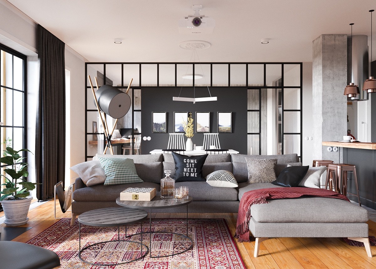
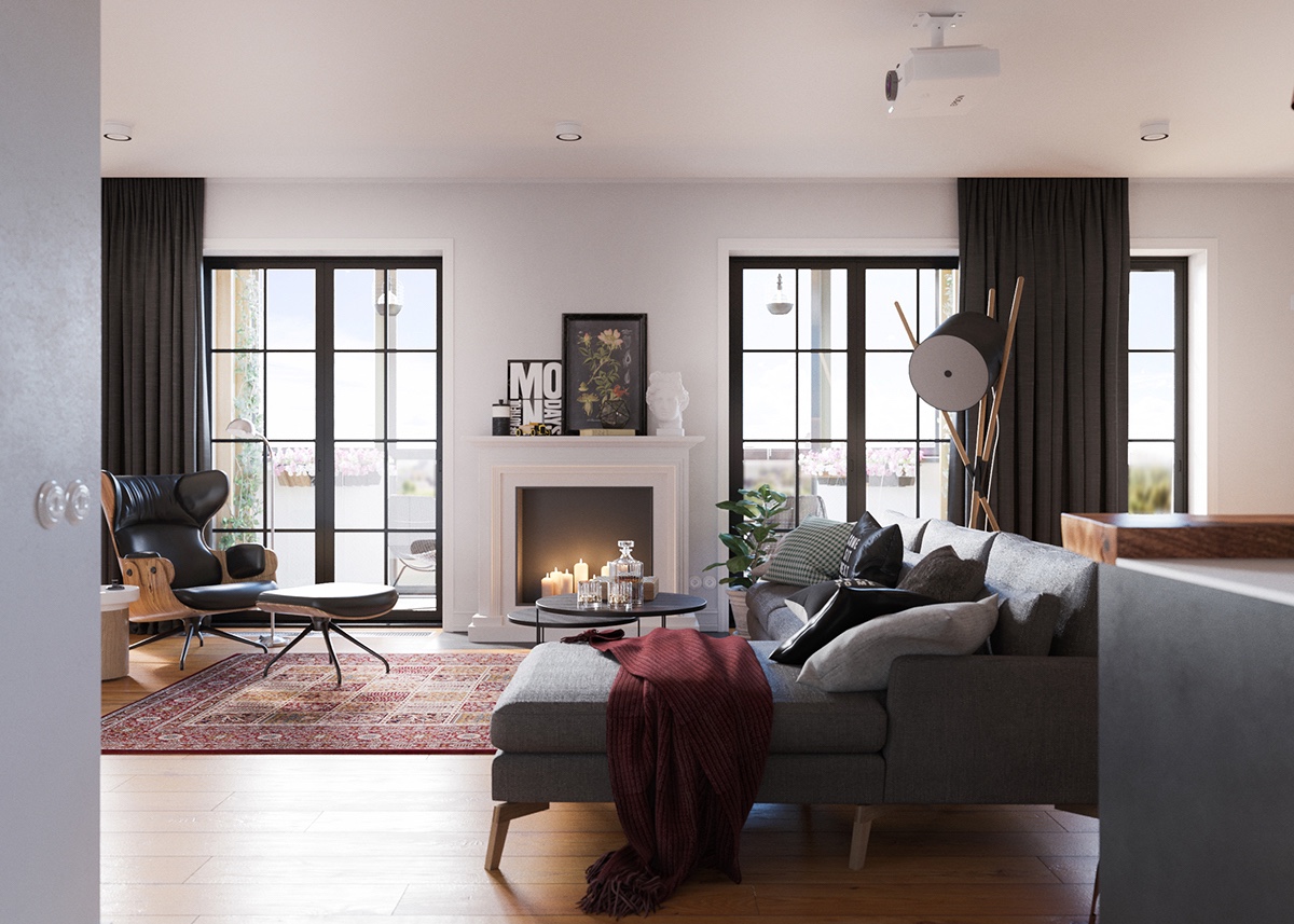
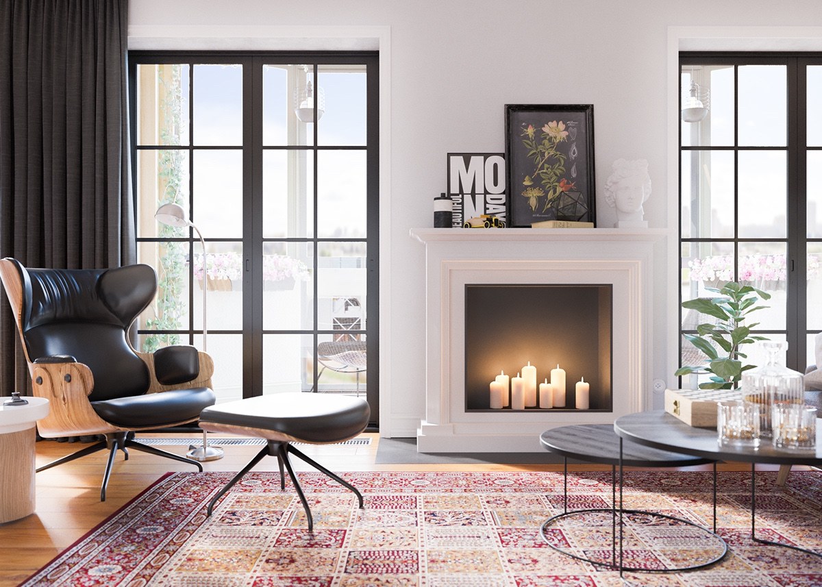
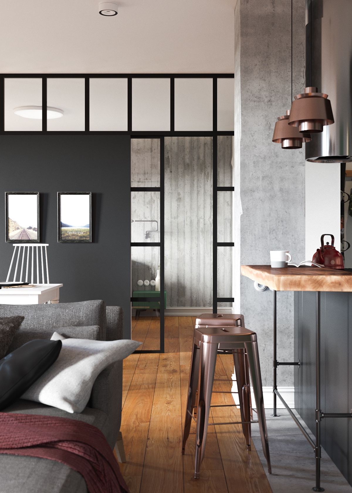
The tour starts with a look at the living room outfitted with its variety of textiles and patterns. Features like the rug, warm wood floor, and even the ceiling medallion speak to classic influences, while concrete wall accents and contemporary furniture help push the boundary forward.

  • 2 |
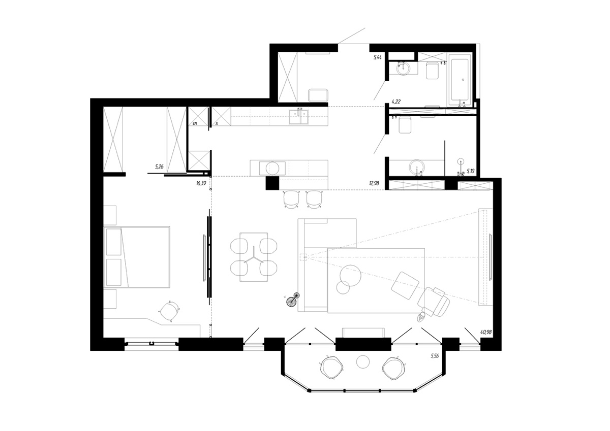
While the decor is certainly eye-catching, the layout is very innovative as well. It’s actually an open layout studio in most ways – the bedroom hides behind the partial black wall in the background.

Advertisement

  • 3 |

  • 4 |

  • 5 |

  • 6 |

  • 7 |

  • 8 |
Eclectic decor enhances every surface, a nice change of pace from the minimalism that remains so dominant today.

Advertisement

  • 9 |

  • 10 |
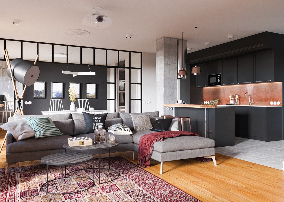
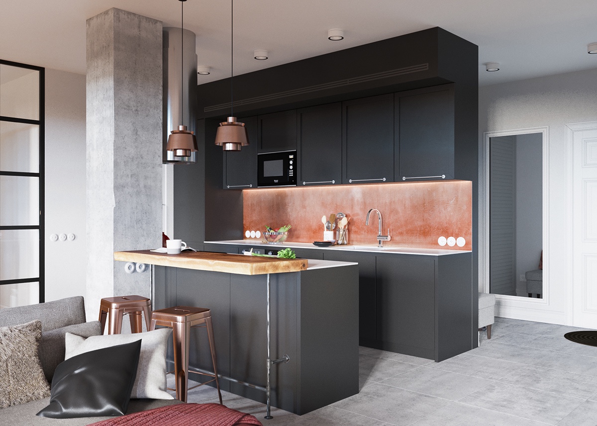
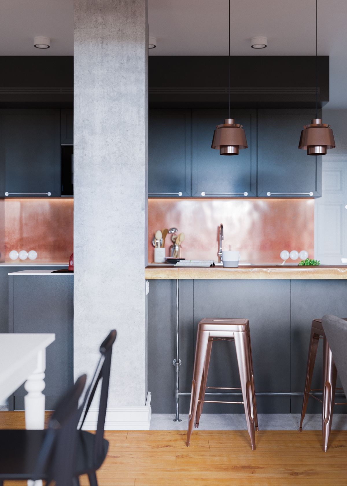
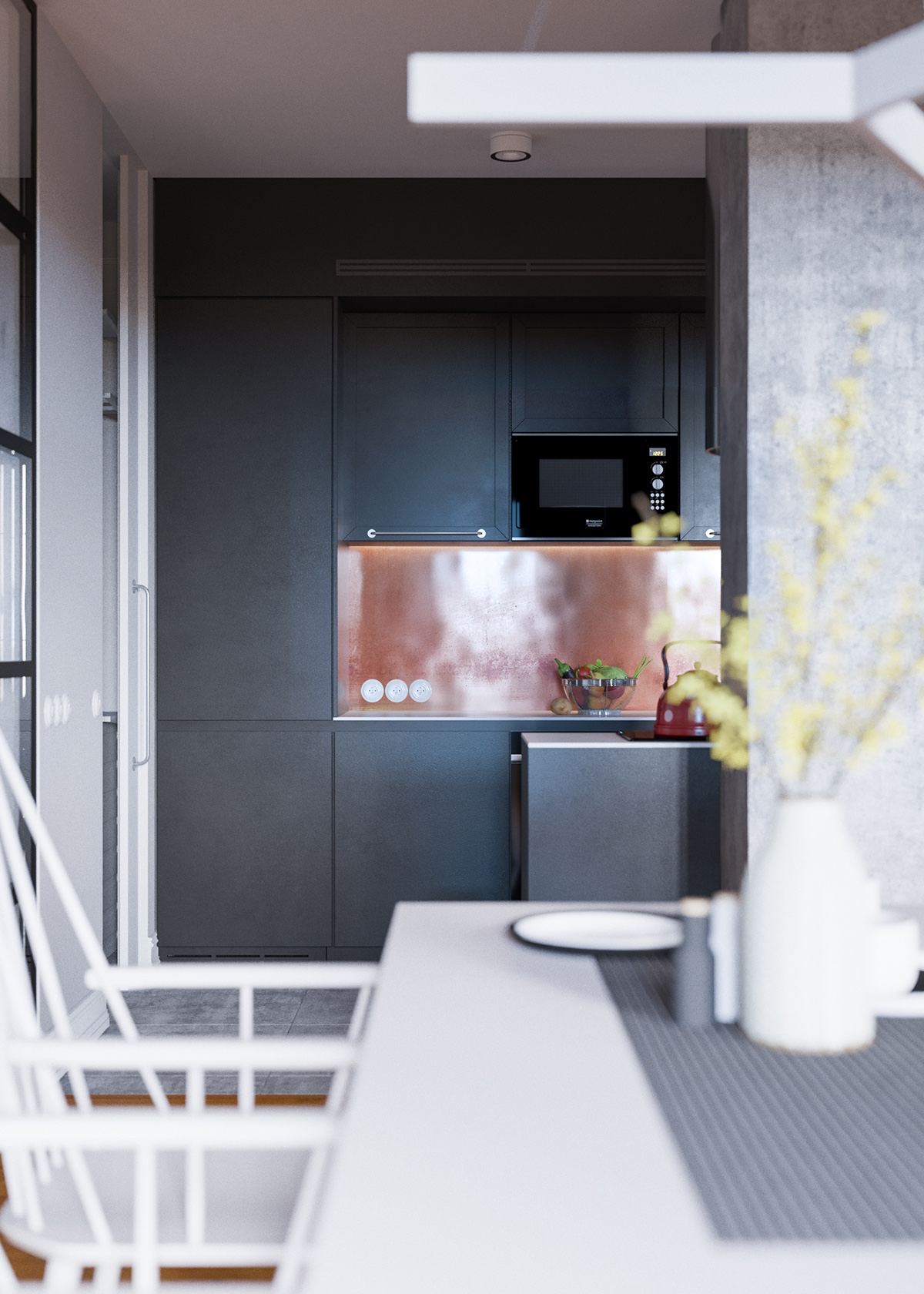
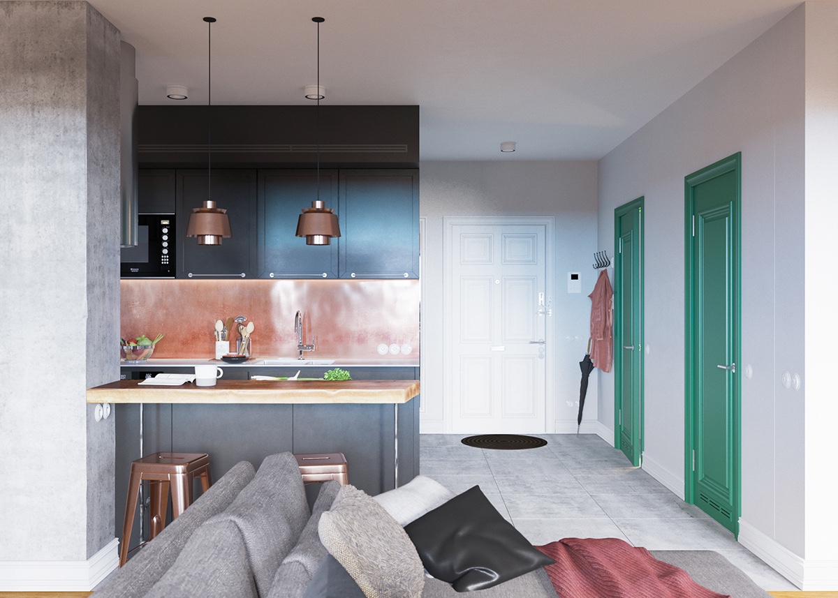
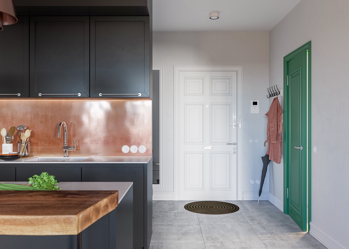
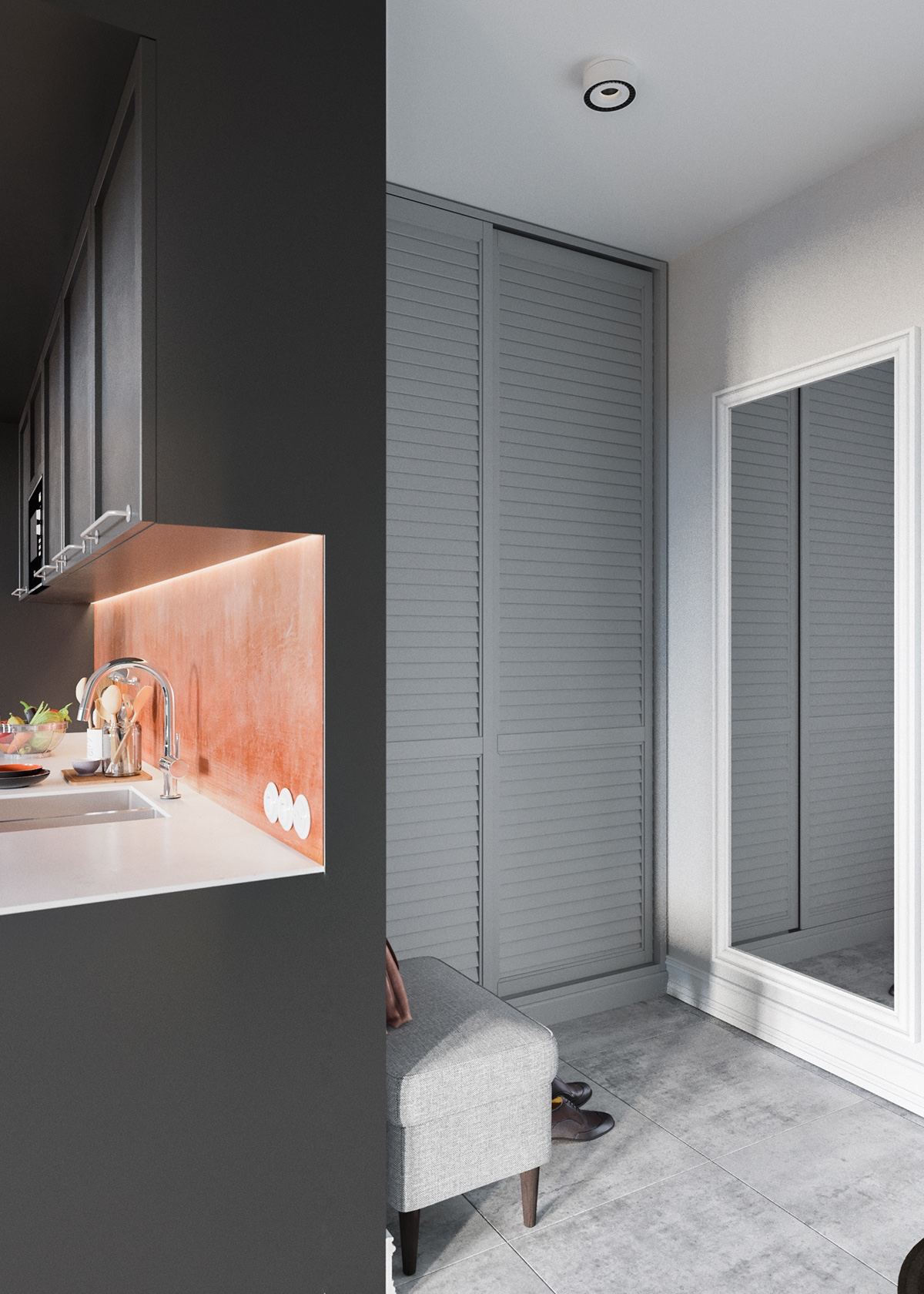
Copper tones and slab wood bring a classic counterbalance to the exceptionally modern kitchen. While the rest of the interior uses cool concrete, the kitchen is a central point of warmth fitting for the heart of the home.

  • 11 |
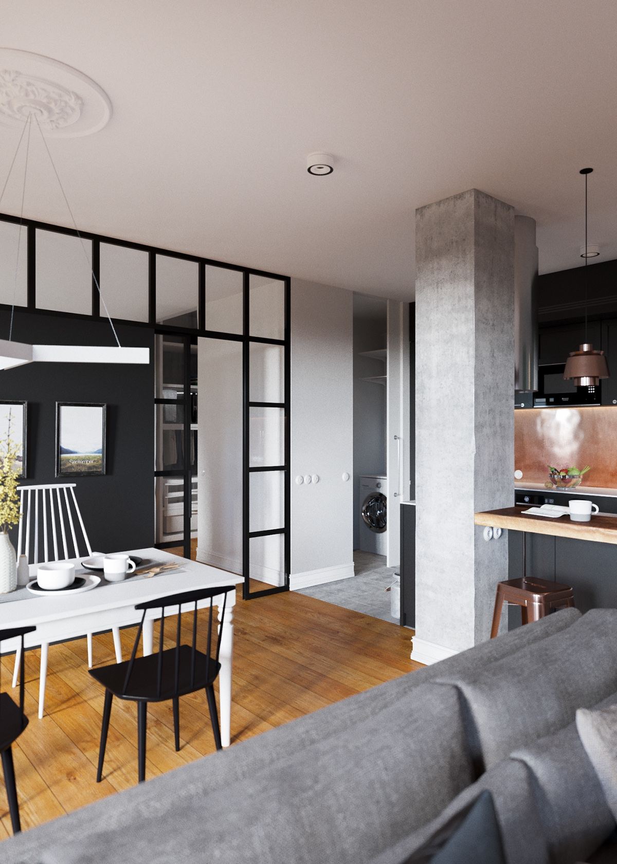
The position of the range hood is a smart and interesting choice. It hides behind a concrete pillar despite having its own decorative merit, its influence on the rest of the room limited.

  • 12 |

  • 13 |

  • 14 |

  • 15 |

  • 16 |

  • 17 |
Subtle Scandinavian influences rule the dining area. This style of chair is a classic that made a comeback to the modern design lexicon in a huge way.
  • 18 |

  • 19 |
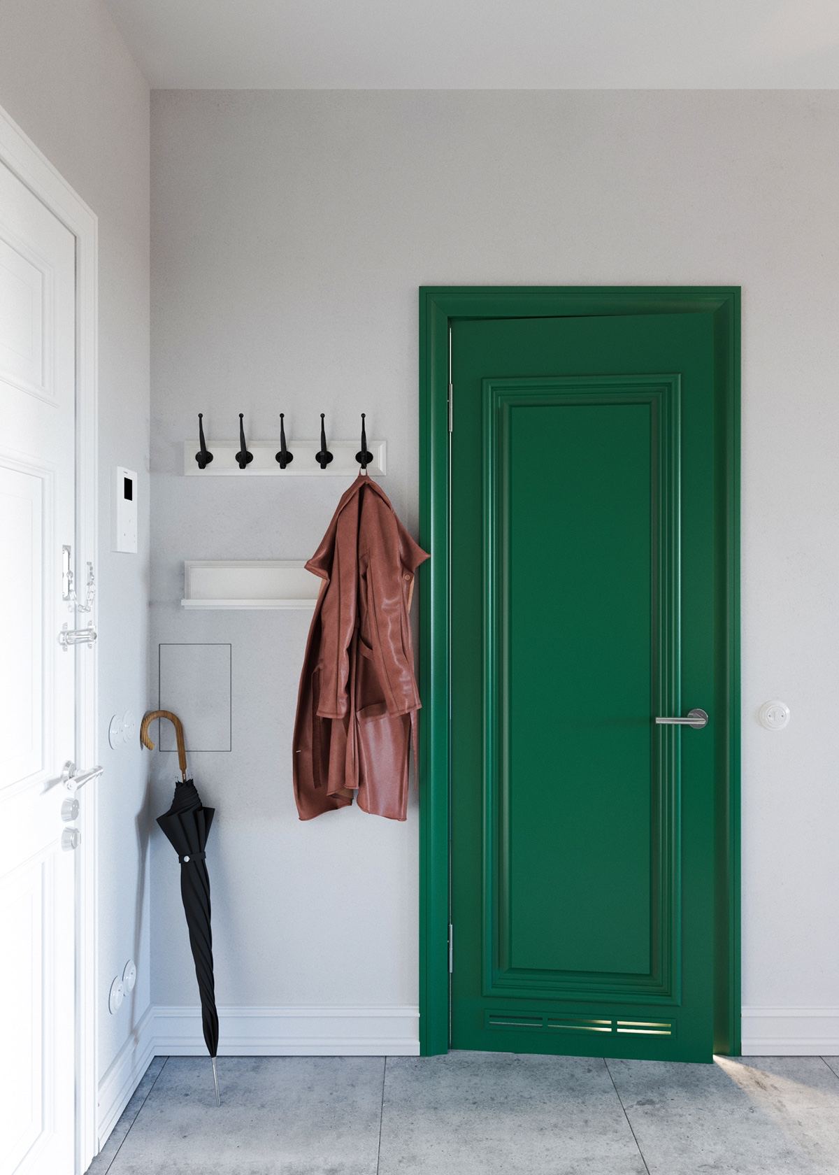
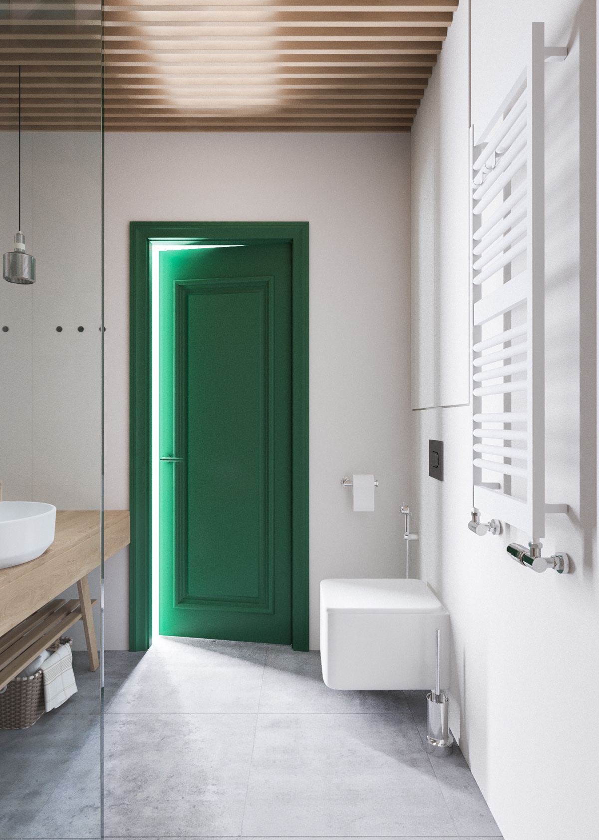
The entryway is especially cute! The front door is especially classic, but the interior doors update their attractive panel design with a fresh coat of seafoam green.
  • 20 |

  • 21 |

  • 22 |
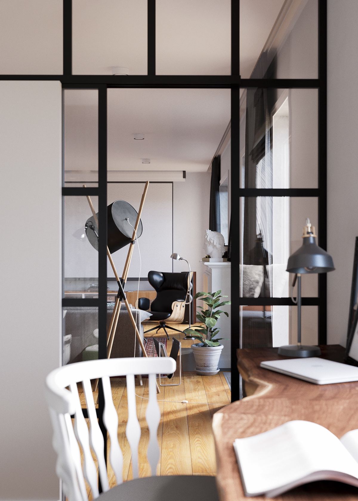
Bright and airy, the bedroom shares its natural light and energetic atmosphere with the kitchen thanks to sliding pane glass doors.

  • 23 |
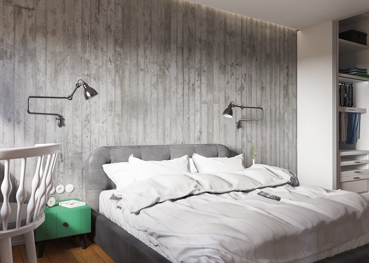
Like the rest of the home, it uses a mixture of industrial and cottage chic decor influences. Almost everything offers at least a small touch of vintage charm – most notably the lamp and little green side table.

  • 24 |
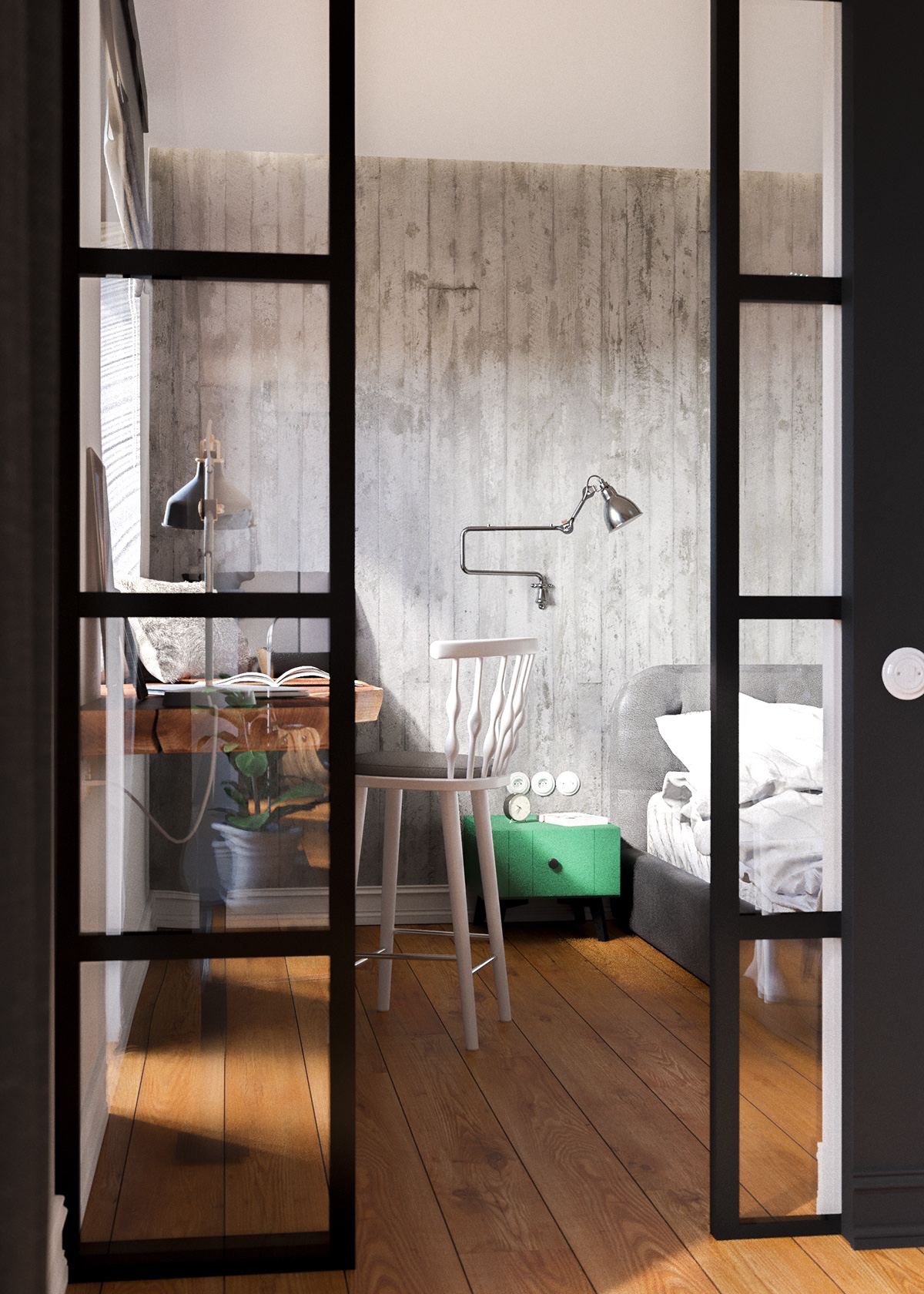
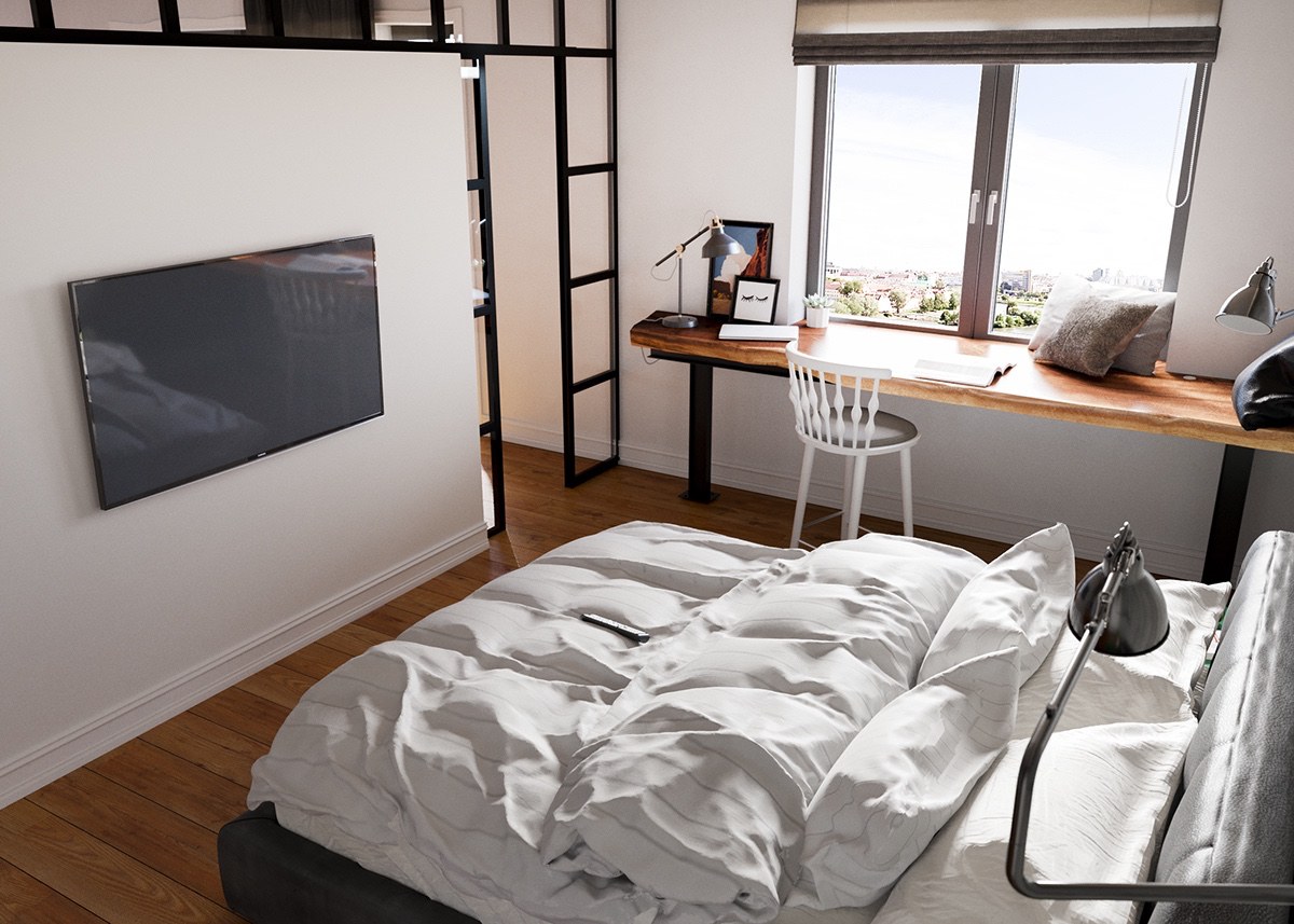
The writing desk occupies a coveted spot near the window, made from the same live edge wood as the breakfast bar in the dining room. The quirky stool is from Patricia Urquiola’s Nub collection.

  • 25 |

  • 26 |

  • 27 |

  • 28 |
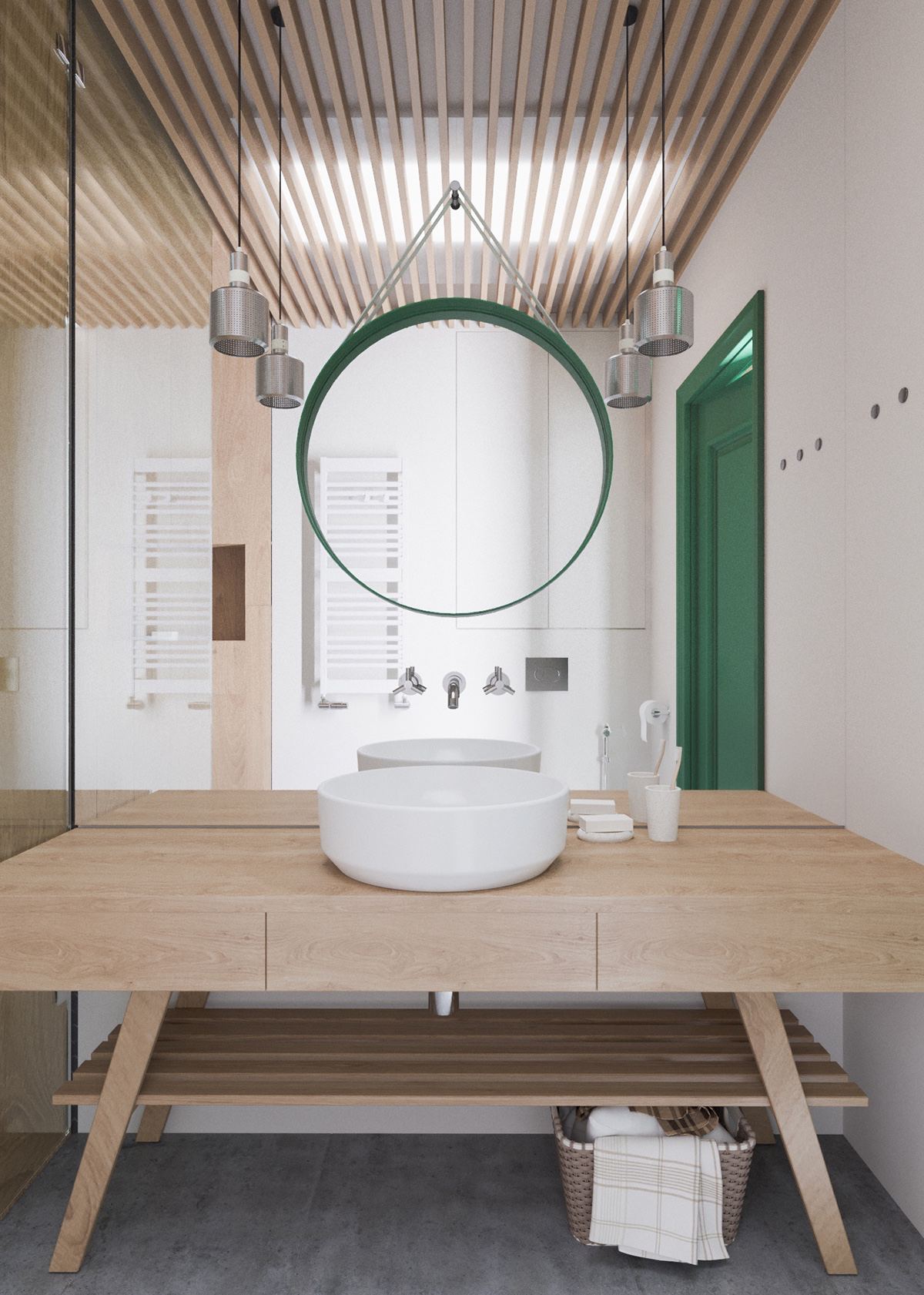
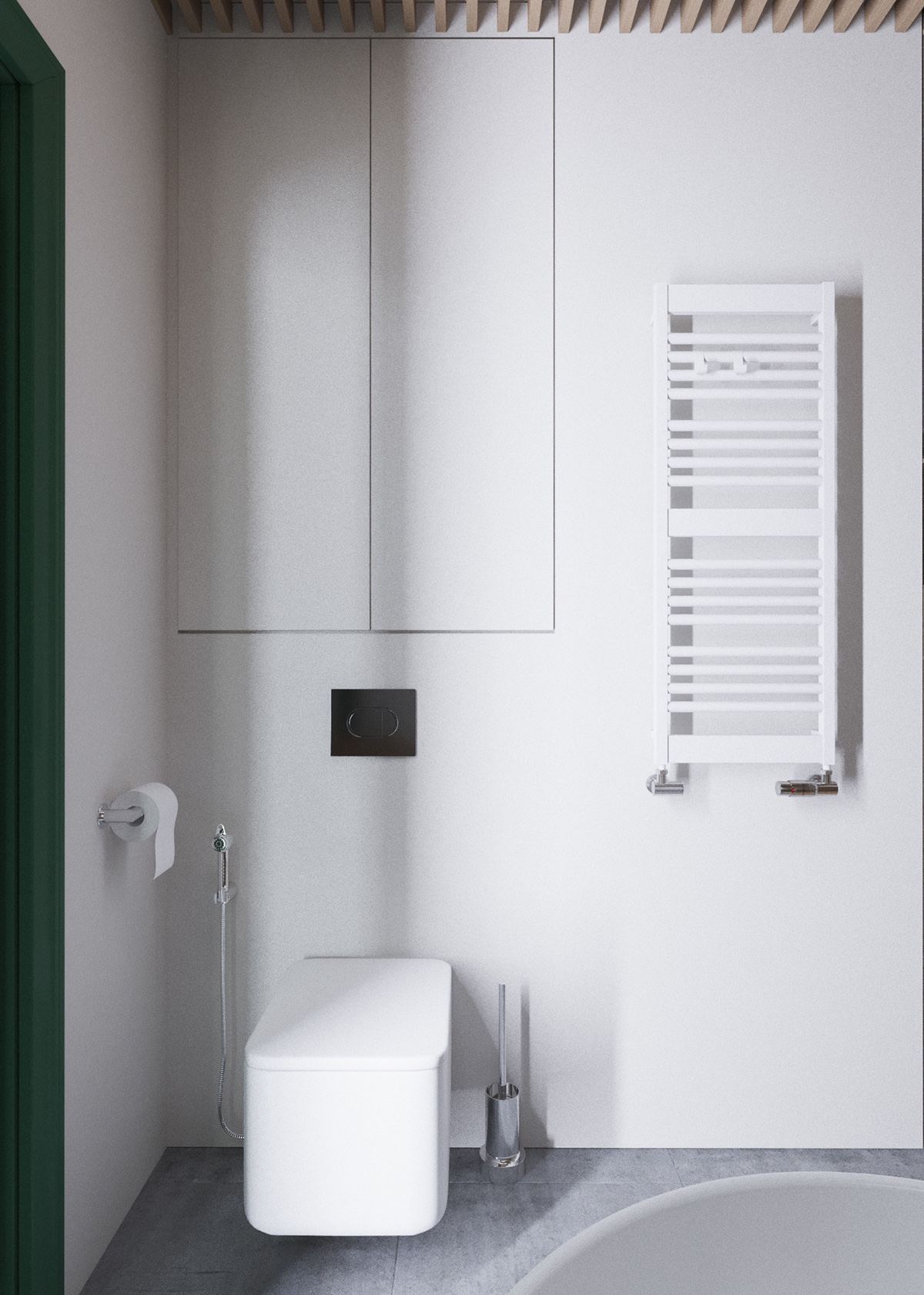
Both bathrooms feature a similar theme, with their primary differences coming from arrangement and detail. This one is relatively straightforward.

  • 29 |

  • 30 |

  • 31 |
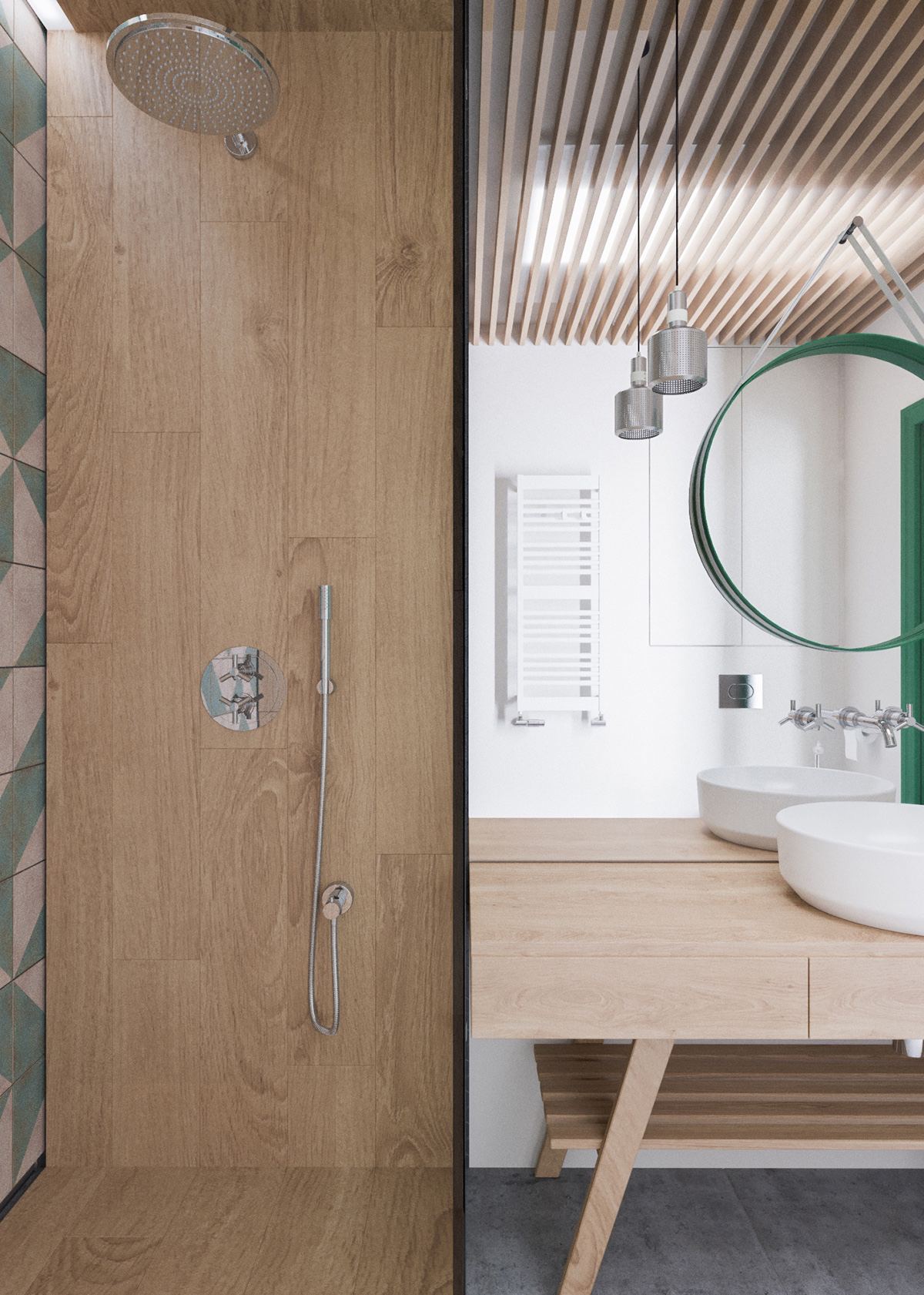
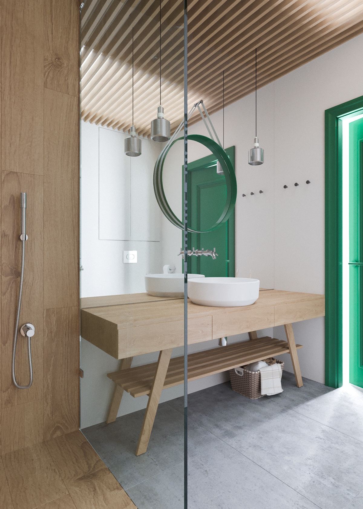
The second bathroom takes a more innovative approach to furniture such as the bench-like wooden vanity.

  • 32 |

  • 33 |
Wood-effect shower cladding is always an unexpected and delightful choice. This type of fun detail really embodies what the home’s style is all about.

  • 34 |

  • 35 |

  • 36 |
Are you looking for more apartments designed with bachelors in mind? Check out this classic style retreat or this dark and sophisticated bachelor pad.