Small Home Designs Under 50 Square Meters

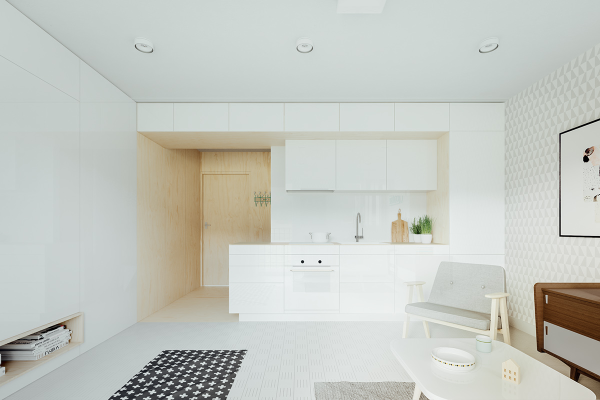
- 1 |
- Designer: Piotr Matuszek & Gosia Czarny

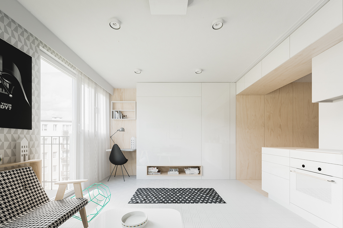
- 2 |
- Designer: Piotr Matuszek & Gosia Czarny
Advertisement
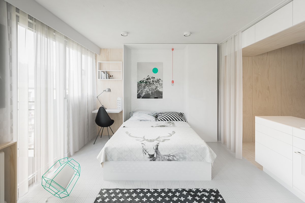
- 3 |
- Designer: Piotr Matuszek & Gosia Czarny
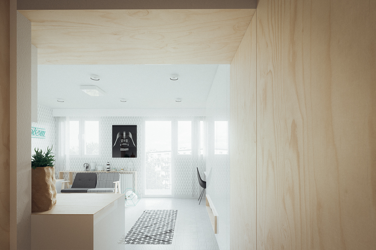
- 4 |
- Designer: Piotr Matuszek & Gosia Czarny
- 5 |
- Designer: Piotr Matuszek & Gosia Czarny
- 6 |
- Designer: Piotr Matuszek & Gosia Czarny
- 7 |
- Designer: Piotr Matuszek & Gosia Czarny
- 8 |
- Designer: Piotr Matuszek & Gosia Czarny
Advertisement
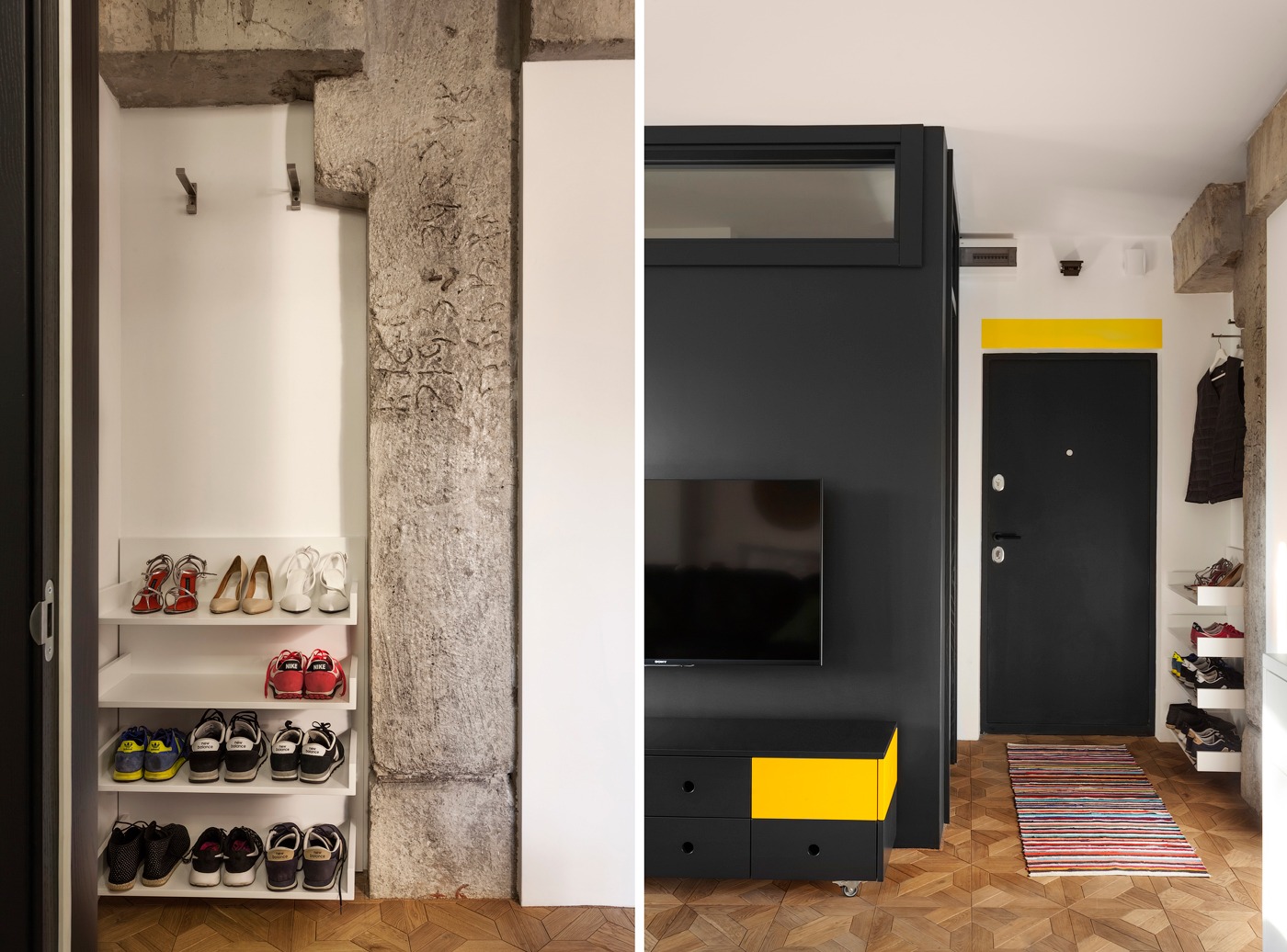
- 9 |
- Designer: Piotr Matuszek & Gosia Czarny
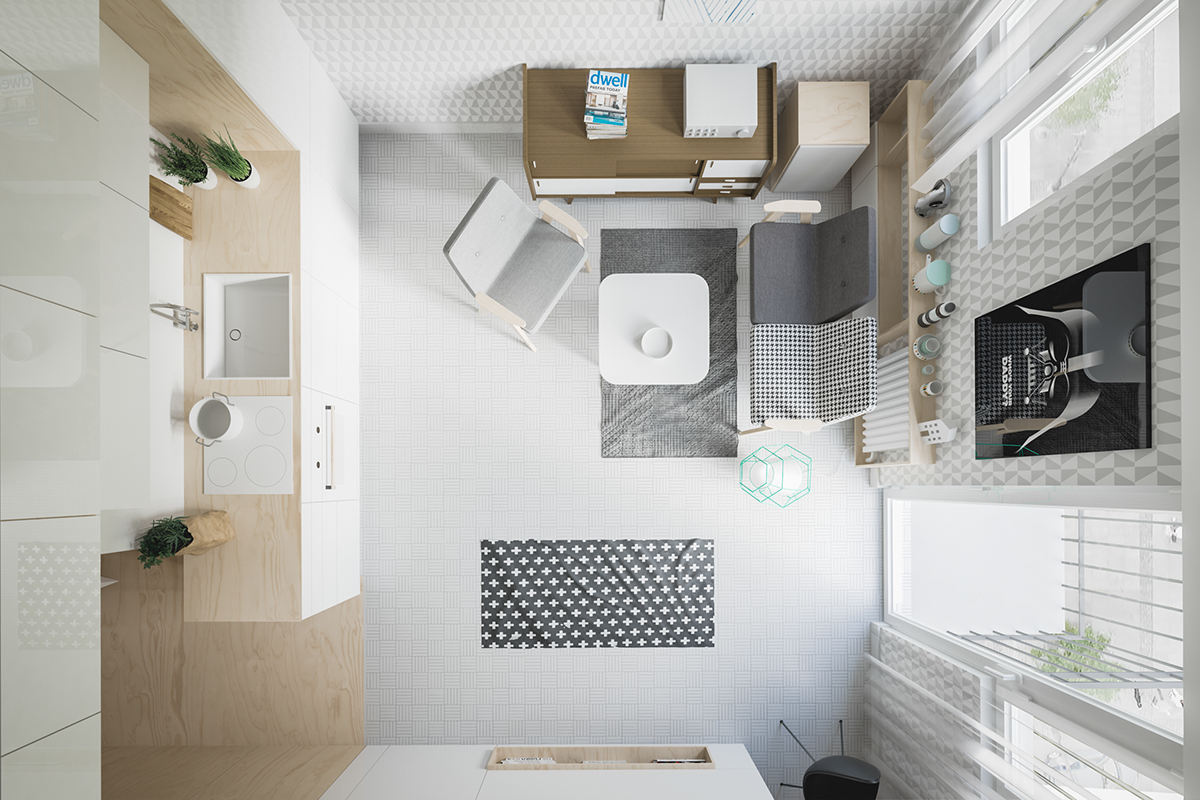
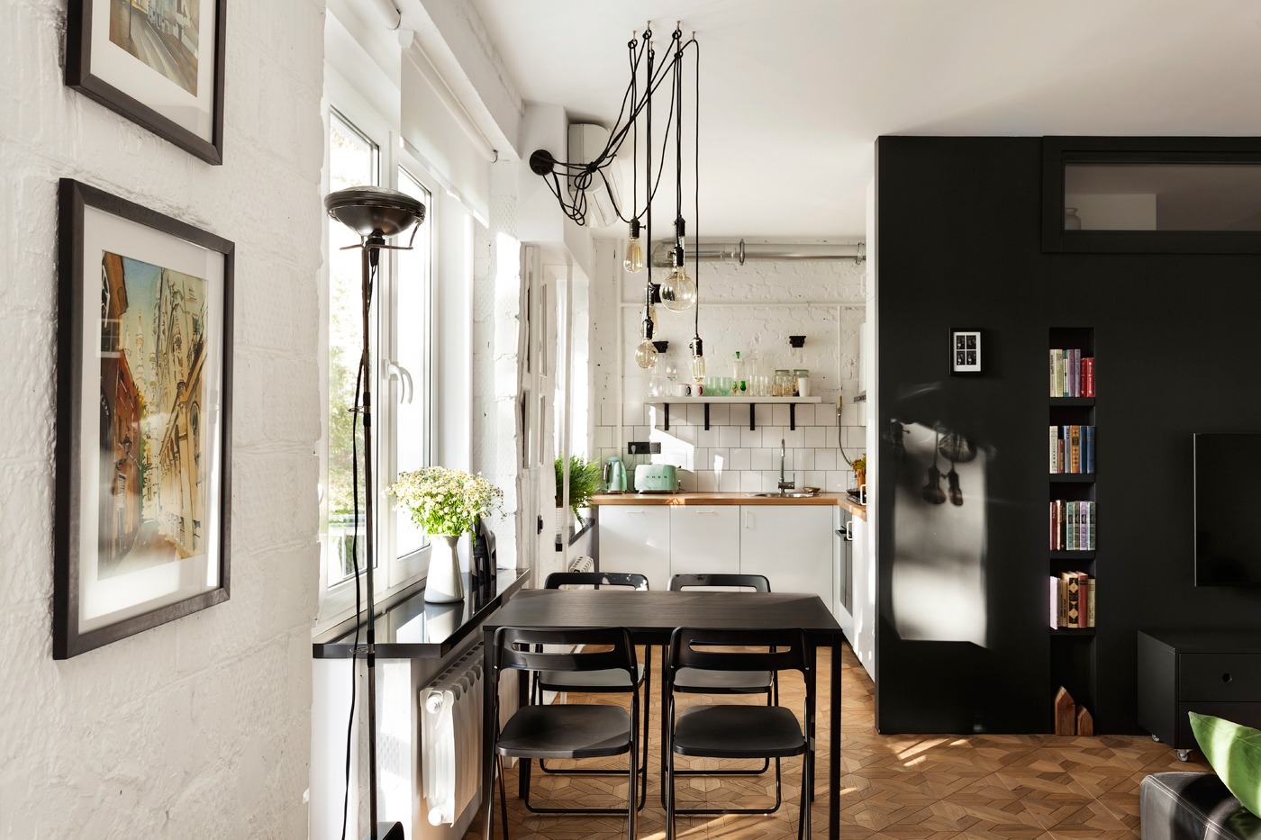
- 10 |
- Designer: Solo Design Studio
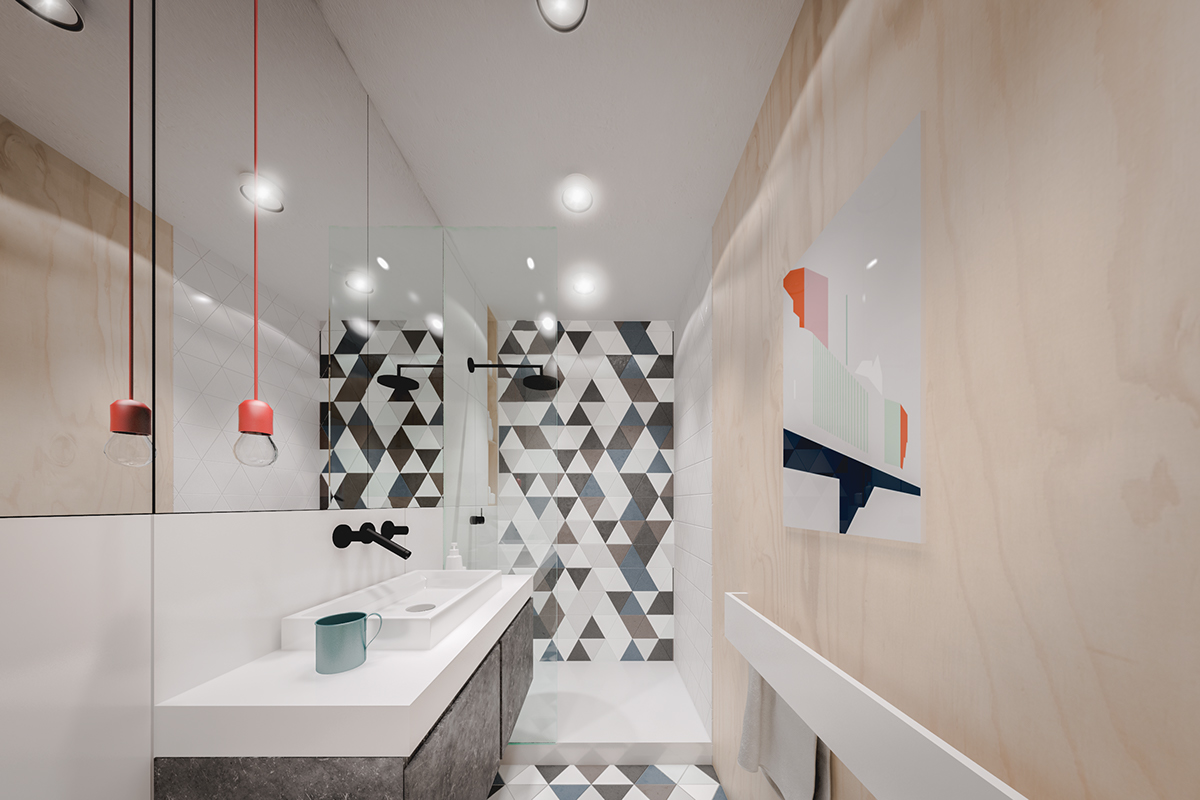
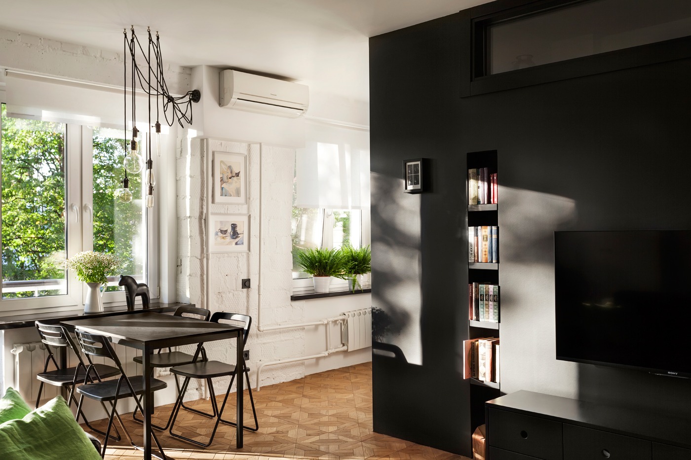
- 11 |
- Designer: Solo Design Studio
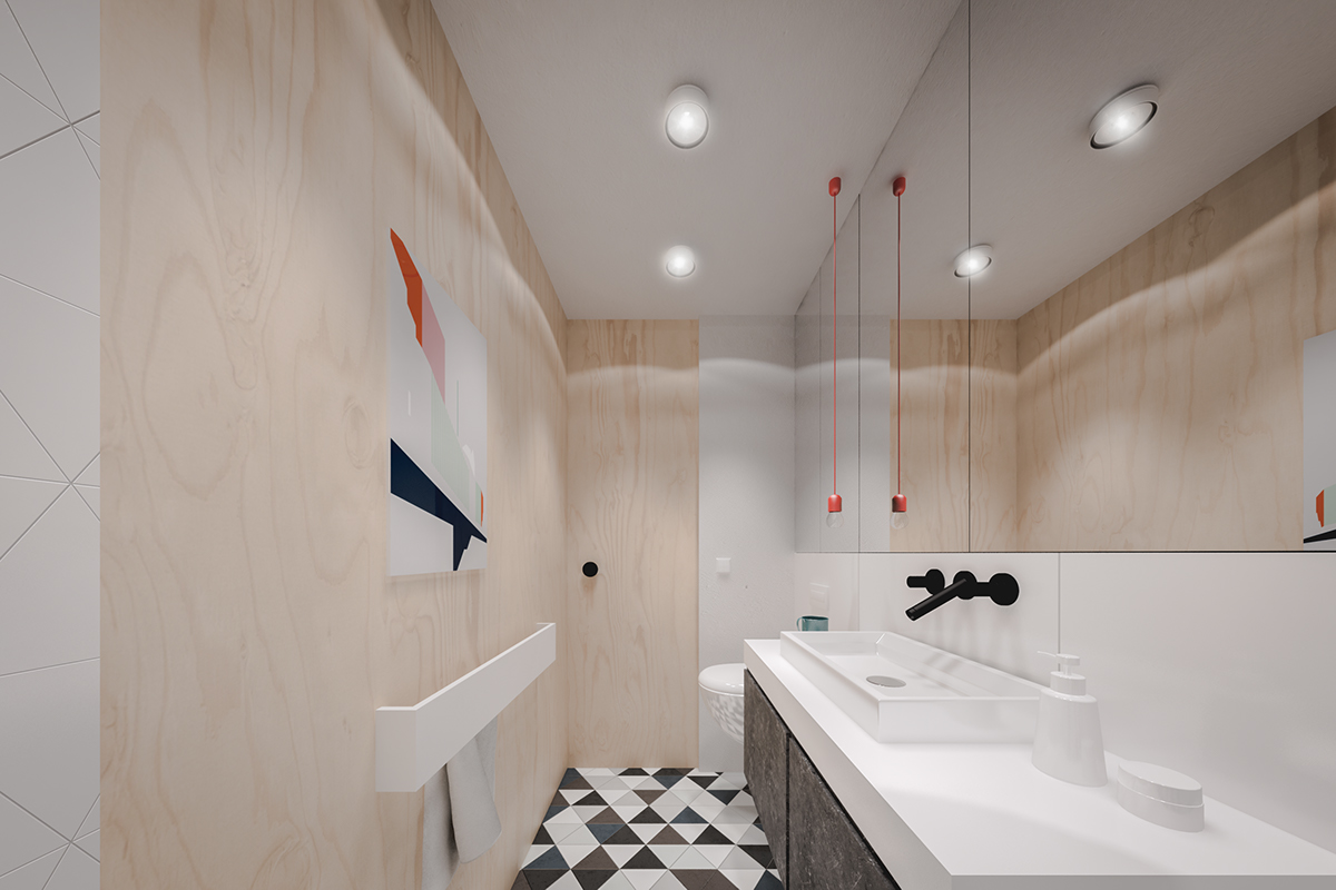
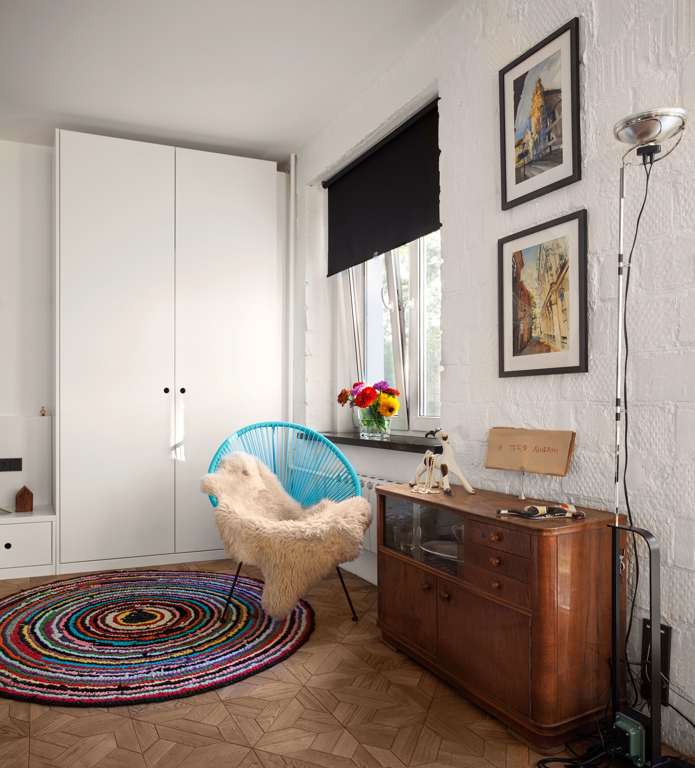
- 12 |
- Designer: Solo Design Studio
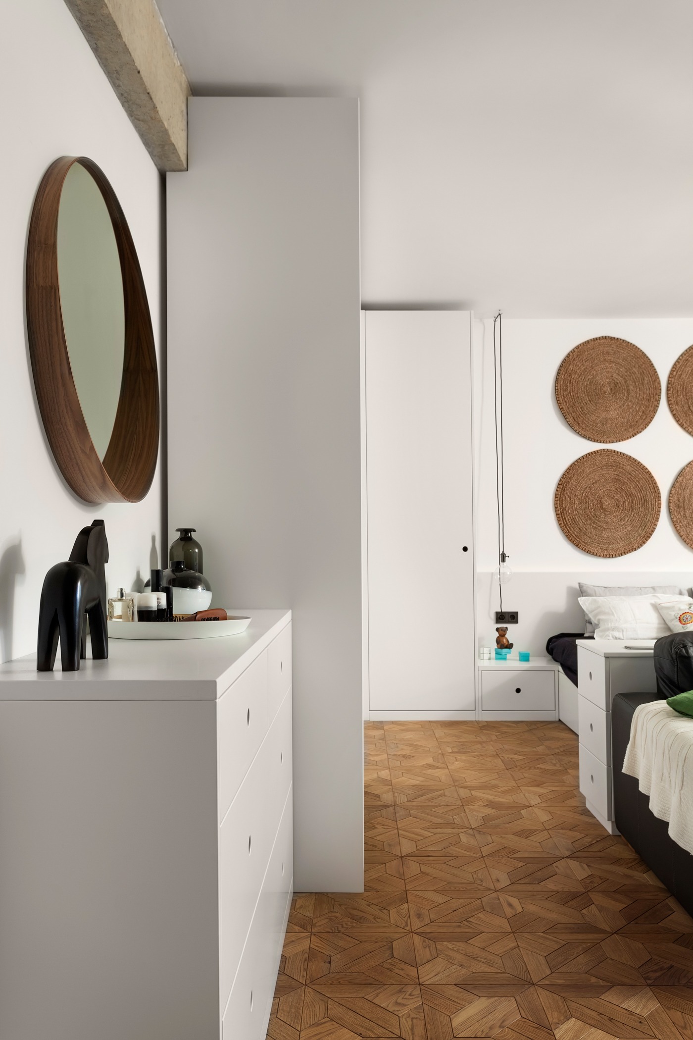
- 13 |
- Designer: Solo Design Studio
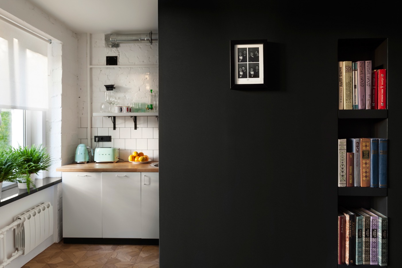
- 14 |
- Designer: Solo Design Studio
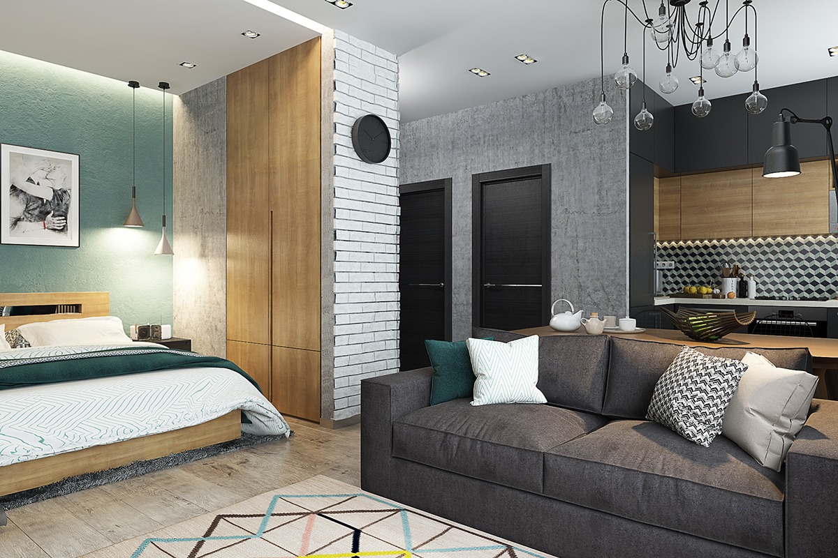
- 15 |
- Designer: Solo Design Studio
- 16 |
- Designer: Solo Design Studio
- 17 |
- Designer: Solo Design Studio

- 18 |
- Designer: Solo Design Studio
- 19 |
- Designer: Solo Design Studio
- 20 |
- Designer: Solo Design Studio
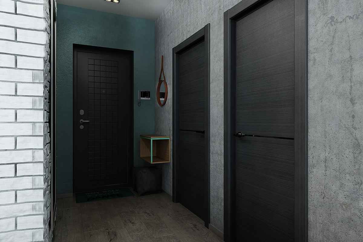
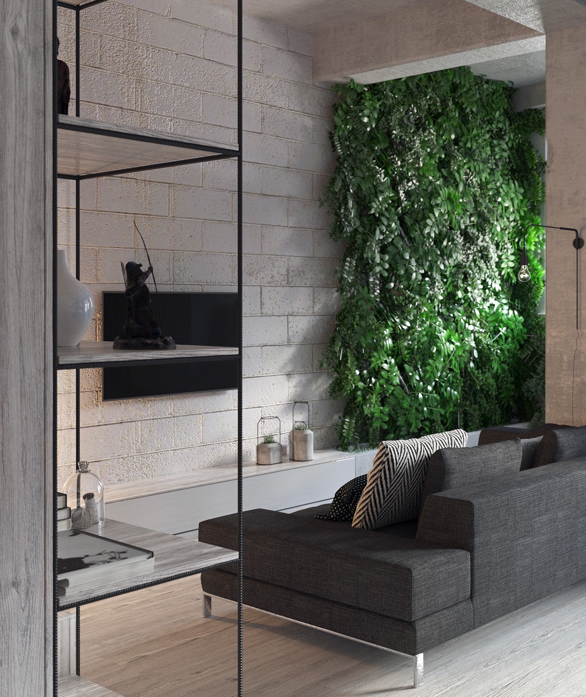
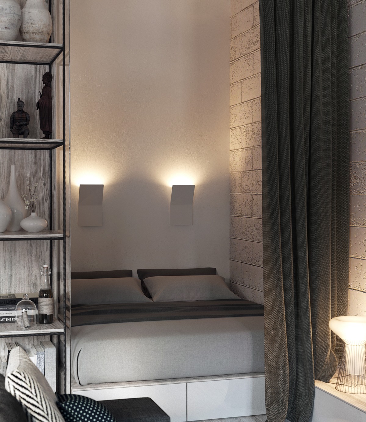
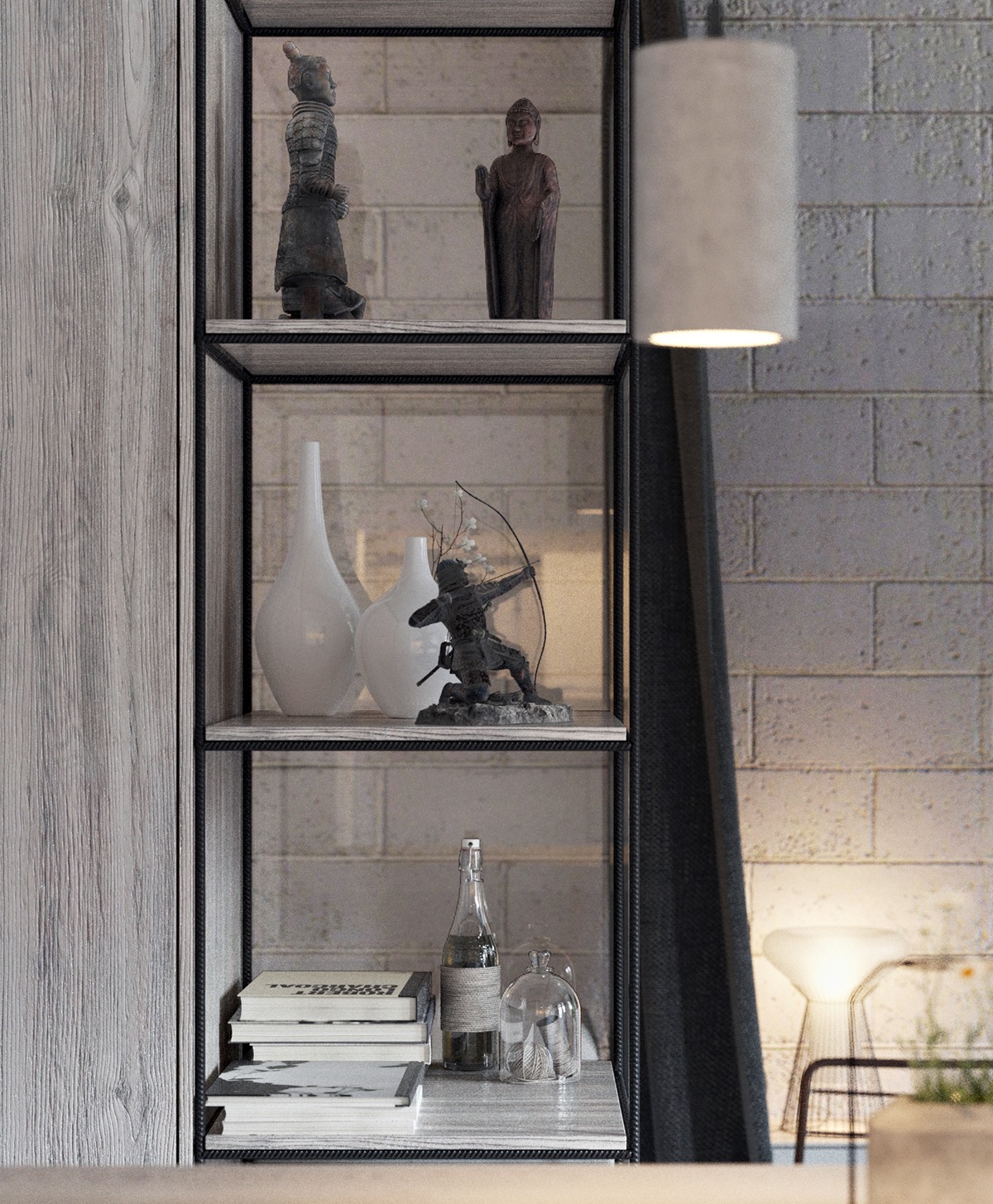
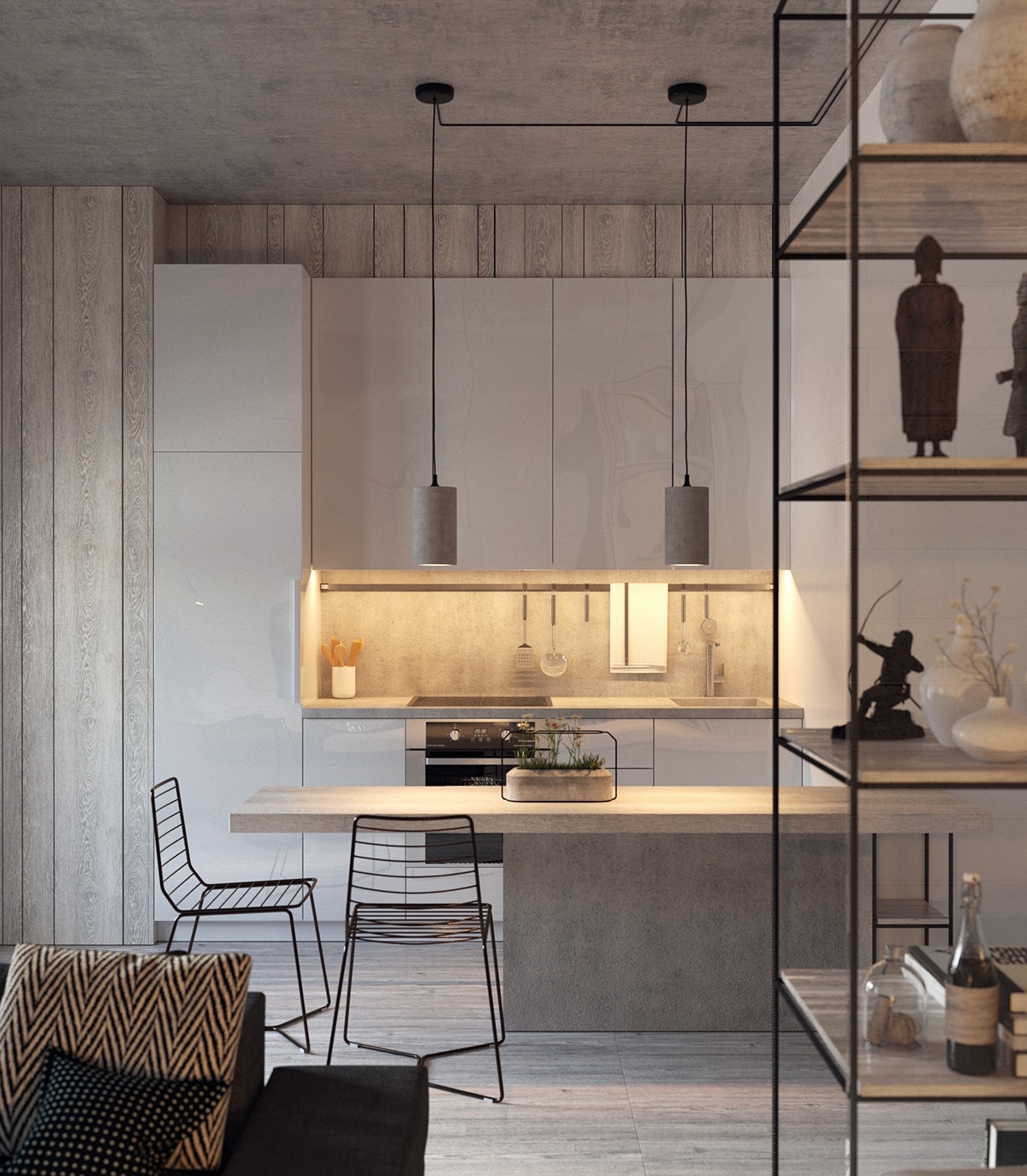
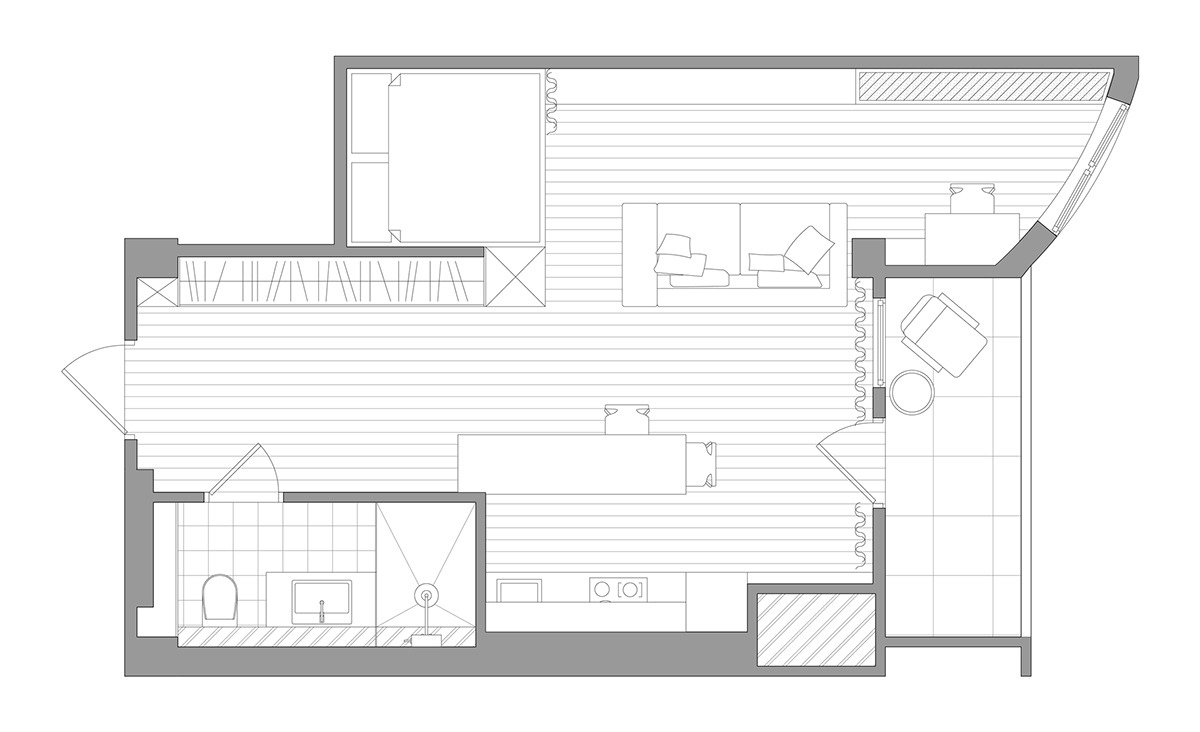
- 21 |
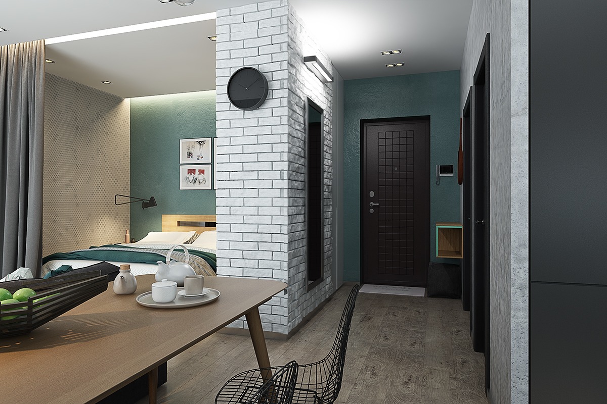
- Architect: Nastya Antonyuk
- Visualizer: Anya Garienchick
- 22 |
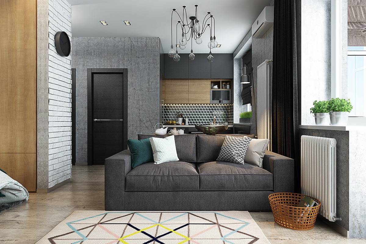
- Architect: Nastya Antonyuk
- Visualizer: Anya Garienchick
- 23 |
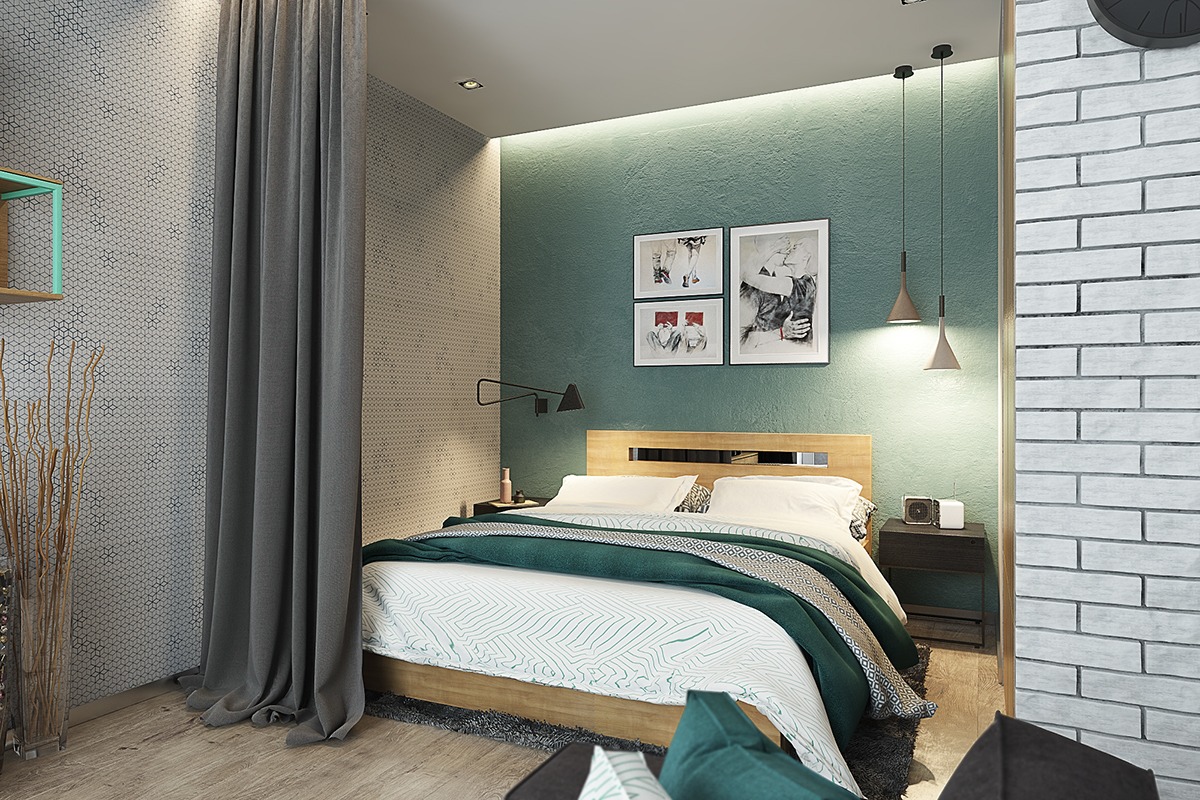
- Architect: Nastya Antonyuk
- Visualizer: Anya Garienchick
- 24 |
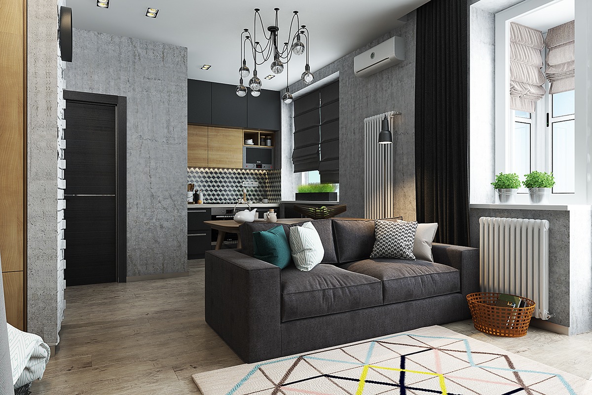
- Architect: Nastya Antonyuk
- Visualizer: Anya Garienchick
- 25 |
- Architect: Nastya Antonyuk
- Visualizer: Anya Garienchick

- 26 |
- Architect: Nastya Antonyuk
- Visualizer: Anya Garienchick
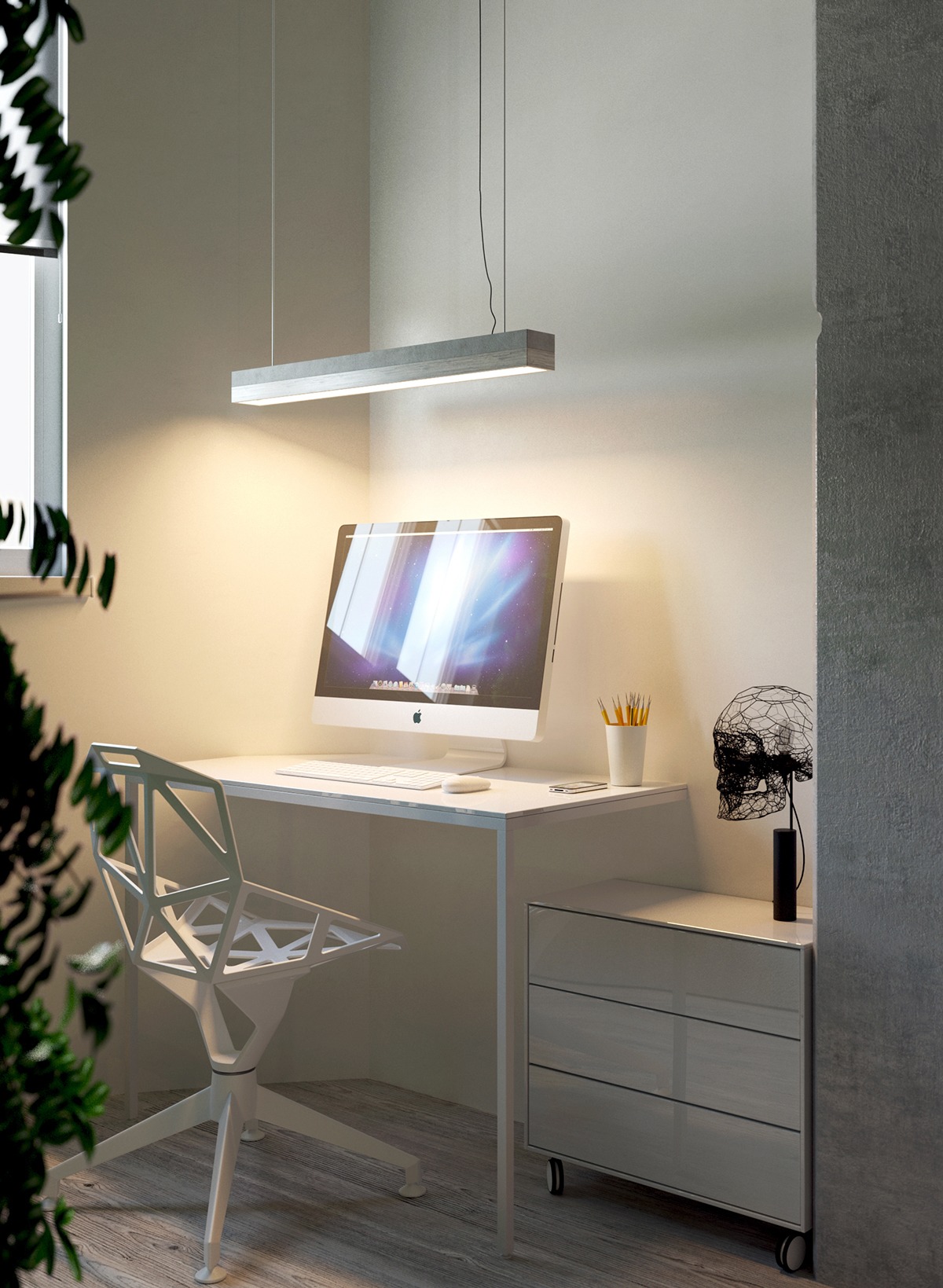
- 27 |
- Architect: Nastya Antonyuk
- Visualizer: Anya Garienchick
- 28 |
- Architect: Nastya Antonyuk
- Visualizer: Anya Garienchick
- 29 |
- Architect: Nastya Antonyuk
- Visualizer: Anya Garienchick
- 30 |
- Architect: Nastya Antonyuk
- Visualizer: Anya Garienchick
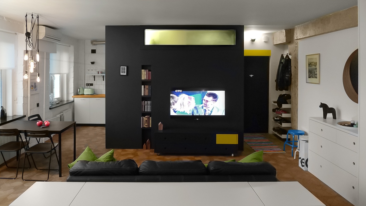
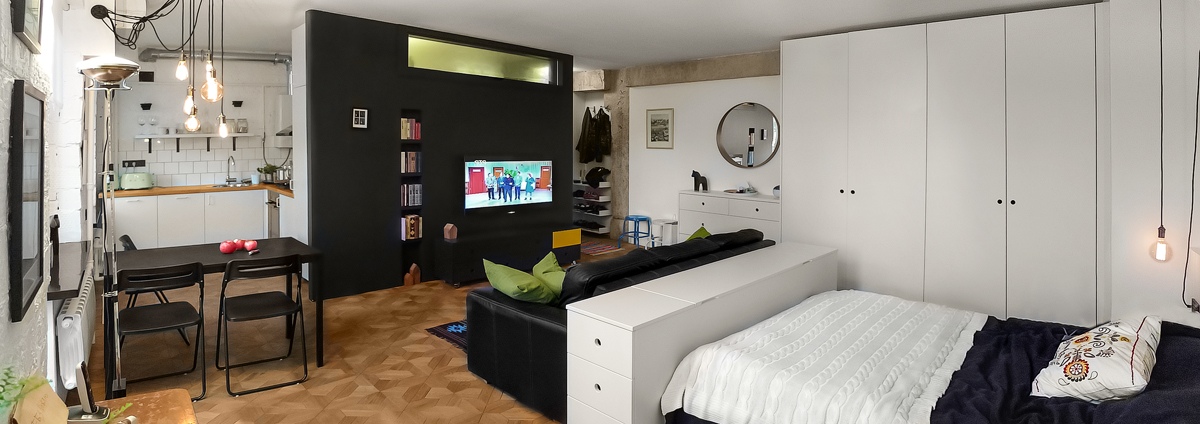
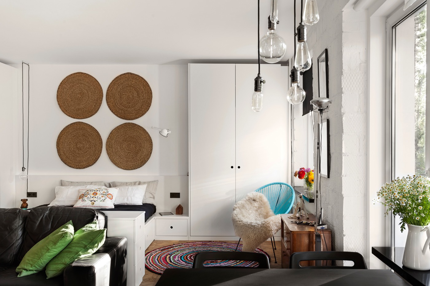
- 31 |
- Designer: Michael Temnikov

- 32 |
- Designer: Michael Temnikov
- 33 |
- Designer: Michael Temnikov
- 34 |
- Designer: Michael Temnikov
- 35 |
- Designer: Michael Temnikov
- 36 |
- Designer: Michael Temnikov
- 37 |
- Designer: Michael Temnikov
Written by admin
![]()
