Lorem ipsum dolor sit amet, consectetur adipisic ing elit, sed do eiusm

25 Beautiful Examples Of Bedroom Accent Walls That Use Slats To Look Awesome

  • 1 |
  • Visualizer: Studio 34
This room makes use of light wooden slats with an interwoven pattern. This achieved by a lighter pattern, so that the darker wood and pattern stands out.

  • 2 |
  • Visualizer: Tu Nguyen Hoang
In this room the slats adorn only the top half of the wall, a contrast to the pristine white walls.

Advertisement

  • 3 |
  • Visualizer: Lê Hoàng Nhật Nam
These particular slats match the base of the bed, and taper down to meet panels made of the same wood. A framed picture complements the entire look.

  • 4 |
  • Visualizer: Adi R Indra G
Here slats are a dark contrast to the rest of the light colors of the room. A ledge acts as a shelf for an array of ornaments. What catches the eyes though, is the clock with the interesting frame. Love this room? Want to see more? Take a tour!

  • 5 |
  • Visualizer: Julia Bryzgalina
This room’s accent wall fits in with the rest of the decor. Allowing space in the middle for personal photographs or compelling pieces of art, lets them become the focal point of the wall.

  • 6 |
  • Visualizer: Igor Grigoriev
This accent wall adds texture to the entire room by forming 3-D triangular patterns.

  • 7 |
  • Visualizer: Maxim Nizovkin
These slats also form triangular patters, but are complemented by strategically placed lights and LED lights.

  • 8 |
  • Visualizer: Linh Nguyen
Meanwhile, this wall’s white vertical slats are used to contrast the dark horizontal stripes of the photograph creating an intriguing effect.

  • 9 |
  • Visualizer: Alexandr Golynski
Slats with different shades are used to create an alternating pattern that grabs your attention.

  • 10 |
  • Visualizer: Hoàng Long
This designer used more widely spaced slats to complement the white wall. Wooden panels create a decorative headboard making the design more attractive.

  • 11 |
  • Visualizer: Elena Anikina
This unique design makes the ceiling part of the accent wall. By choosing a color that’s just a little darker than the wall color and by not taking up the entirety of the wall, the slats are an elegant feature. The light grey pillows and light fixtures are a pleasant touch of color.

  • 12 |
  • Visualizer: Fatih Beserek
Sometimes you can work with what you have. In this room the wall is slightly curved, so the designer chose to highlight this by partially covering the wall with dark wood slats, and letting the wooden panels lead the eye to the gentle curve of the wall.

  • 13 |
  • Visualizer: Kyde
There are many different design elements in this room, and they’re all tied together by the slats partially covering the wall over the headboard.

  • 14 |
  • Visualizer: Dudinec
The plaster was removed from the bottom half of this wall to reveal the bricks which were then painted over. The dark grey slats contrast to the light brickwork and provide a pleasant background to the beautiful framed artwork.

  • 15 |
  • Visualizer: Ilkin Gurbanov
In this bedroom, the dark grey slats work together with the engaging grey and white photographs to create a unique and lovely focal point.

  • 16 |
  • Visualizer: Freedes Studio
These dark slats are contrast to the white walls of the rest of the room and match the bed. The two mirrors add depth to the room. While the light fixtures are an exquisite addition to the dignified atmosphere of the room.

  • 17 |
  • Visualizer: Arch Ants
Widely spaced black slats are an integral part of this room’s design plan.

  • 18 |
  • Visualizer: Lyudmyla Dumin
Colored slats are a delightful accent to this fun, homely bedroom.

  • 19 |
  • Visualizer: Nevi Studio
By using different colors and types of wood this accent wall turns what would otherwise be an ordinary wall into an intriguing work of art.

  • 20 |
  • Visualizer: Inna Shapovalova
Although the main focus of this room is the gorgeous stencil bed, the slats provide a charming background that complements the bed. Like the bed? We’ll help you find something similar that matches your personality.

  • 21 |
  • Visualizer: KDVA
This room is meant to soothe the nerves after a long day. The LED lights highlight the wooden panels, while thin wooden slats provide a subtle accent to the left of the room.

  • 22 |
  • Visualizer: Twin Hongtruc
The main focus of this room are the dark wooden panels and framed picture, but the lighter wooden slats complement the panels and prevent the ceiling from being too bright and distracting from the focus point.

  • 23 |
  • Visualizer: Lê Hoàng Nhật Nam
This design unites the rest of the room by tying the wooden elements together, preventing the wall from looking clinical and being the background to a simple yet interesting image.

  • 24 |
  • Visualizer: Pavel Alekseev
A grey and white print works together with light wooden slats. The contrasting positions of the slats take the wall to another level without looking overdone.

  • 25 |
  • Visualizer: Mohamed Terko
The warm wooden slats work with the floor and potted plants to keep the room from looking colorless and indifferent.


Read more

6 Simply Amazing Museum Interiors

These high-design museums invite visitors to get lost within their walls. For more inspiration, check out our Institutions board on Pinterest.


1. Hongkun Museum of Fine Arts by PeNDa


The Hongkun Museum of Fine Arts by PeNDA is defined by an intricate system of arches and counter-arches, references to the mountains and valleys in the museum’s landscape paintings and the ancient caves on which stories about people, events, and traditions were once painted. While the forward-thinking museum is intended to be an anchor for an arts district that is expected to develop in the neighborhood, it maintains some sense of convention. While complex curves encircle the entry, staircases, and cloakroom, the art hangs in standard, rectilinear exhibition spaces.


2. International Wine & Spirits Museum by Shanghai Godolphin
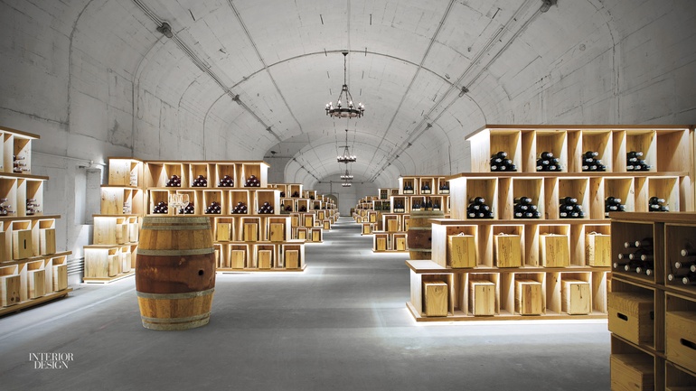


In their __design for the International Wine & Spirits Museum in Shanghai, China, the architects at Shanghai Godolphin embraced the history of a vaulted, 32,000-square-foot venue. No significant structural changes were made to the 1930’s-era bunker, which was initially built to hold military equipment and cultural treasures. The museum now boasts a botanical garden, tasting bar, VIP cellar, and more. The concrete structure is softened by a sculptural swoosh made with crates that once contained bottles of Château Malmaison.


3. “Van Cleef & Arpels: The Art and Science of Gems” Exhibition at the ArtScience Museum by Jouin Manku

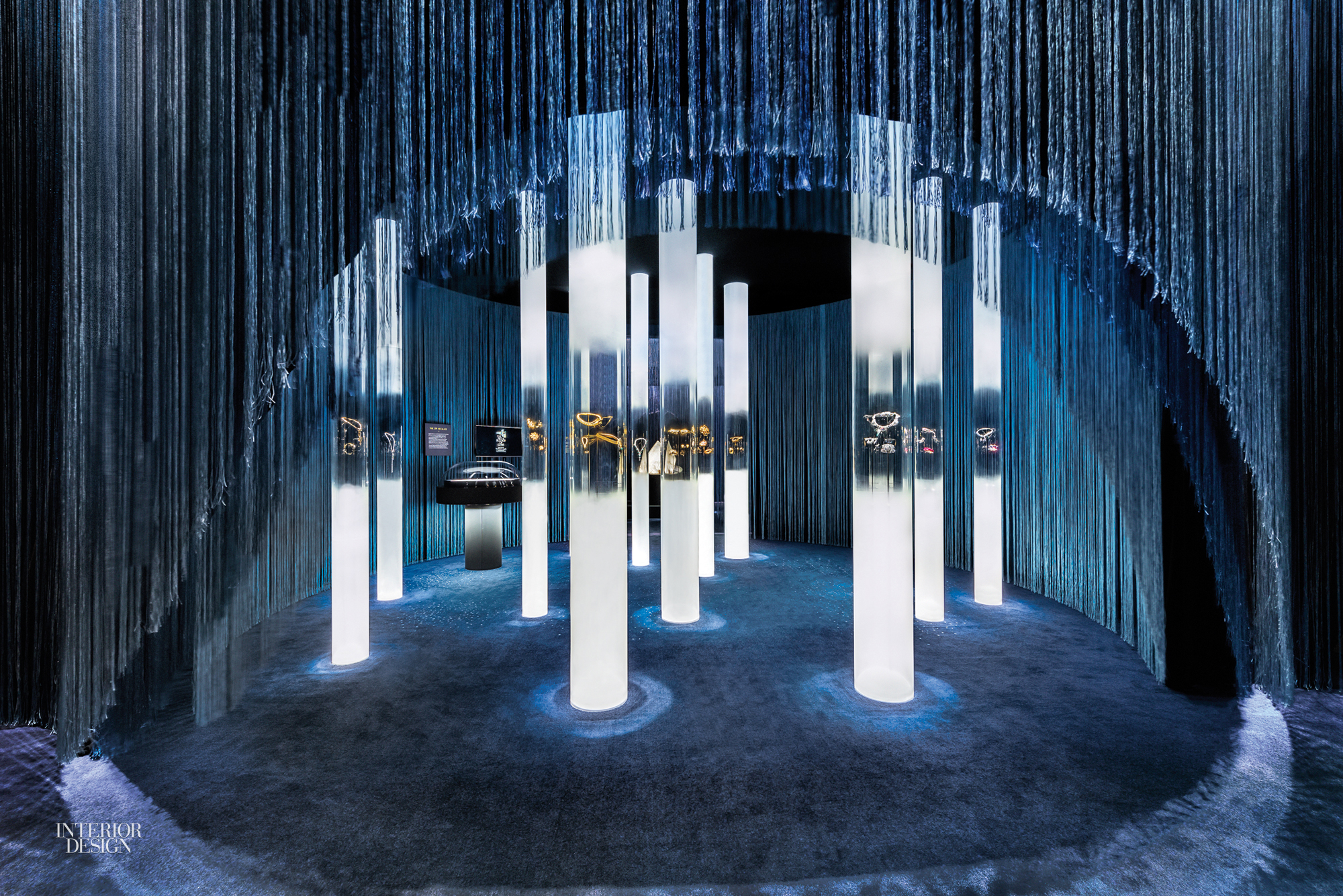


Visitors at the ArtScience Museum in Singapore can admire 450 historic pieces and 250 mineral specimens from France’s Muséum National d’Histoire Naturelle in a transformative exhibition designed by Patrick Jouin and Sanjit Manku of Jouin Manku. Spread over nine galleries, the exhibition features cascading lengths of cotton lit to create an impression of traveling through space.


4. Museum of Tomorrow by Santiago Calatrava


Every two years, the Olympics brings unprecedented global exposure to its host city. This attention inspires architectural innovations, one example of which is Rio de Janeiro's new Museum of Tomorrow by Santiago Calatrava. Featuring massive pergola-like cantilevers, adjustable solar panels, and science-oriented exhibits, the museum will help revitalize its neighborhood, Porto Maravilha.


5. The Centre d’Art Diane-Dufresne by ACDF Architecture


Named after singer, actress, and painter Diane Dufresne, the Centre d’Art Diane-Dufresne has diverse aspirations. The streamlined glass and steel structure holds a 15,000-square-foot gallery and performance space, both floored in diamond-polished concrete. The museum is part of a master plan to activate an underutilized park in Repentigny, thereby transforming the Montreal suburb into a cultural destination.


6. The Michal and Renata Hornstein Pavilion for Peace at the Montreal Museum of Fine Arts by Atelier TAG and Jodoin Lamarre Pratte Architects


Part of the Montreal Museum of Fine Arts, the 4,958-square-foot Pavilion for Peace in Montreal is home to the museum’s international art collection. The building's transparent facade, shielded only by a veil of aluminum rods, forges a connection with the outside world. The wood-clad lobby features an “event-stair” centerpiece, which functions as a hub for social activity.


Read more

Light and Modern Sophistication In A Two Bedroom Apartment

  • 1 |
The tour opens to a cozy living room outfitted with a mix of contemporary and mid-century inspired furniture. Abundant sunlight filters through the breathtaking floor-to-ceiling bay windows, casting shadow and enhancing the depth of the molded architectural accents used throughout. This union of traditional and trendy is best showcased by those gorgeous chevron floors in dark wood – a great modern take on the herringbone so treasured in older buildings.

  • 2 |
Because of the unique __home layout, separate living and dining spaces would have felt like a restriction to both rooms. This sliding glass partition helps shield noise without breaking up the line of sight.

Advertisement

  • 3 |
Of course, while entertaining guests, a simple slide of the door makes it easier for visitors to mingle across each space.

  • 4 |
While the functionality of the space is worth admiring, so are the furniture choices. Olive green accents bring tremendous character to the space, especially to reinforce the mid-century Danish influence that went into the statement chair design. What a beautiful piece!

  • 5 |
The satin brass floor lamp is called Heron, a design by Michael Verheyden.

  • 6 |
When taken together, the green and brass and chocolate brown floors come together to foster an almost spring-like atmosphere. It’s a fresh and inviting theme with plenty of warmth.

  • 7 |
And the dining room! Fun design offers plenty to admire about the table and chairs, but in terms of first impressions, the brassy hoop pendant lights influence the rest of the space with their Art Deco flair.

  • 8 |
The kitchen itself remains relatively compact – an arrangement that highlights this area’s role as a social space rather than a utilitarian one.

Advertisement

  • 9 |

  • 10 |
Marble is an interesting choice for the hexagonal tiles – a timeless material in a trending form.

  • 11 |
The entryway makes a stately impression with its high ceilings and eye-catching molding. A modern pendant instantly draws all eyes and offsets the classic appeal of the subtle brassy details.

  • 12 |

  • 13 |
Distinctive retro-inspired green chairs create a very garden-like setting on the enclosed patio.

  • 14 |
In the master bedroom, an interesting take on classic wall panels continues the mixed-era theme.

  • 15 |
The side table lamps are from the IC Collection by Michael Anastassiades, a series very popular with brass fans and a perfect match for this elegant space.

  • 16 |
Hans Wegner’s famous Wishbone chair sits at the well-accessorized cantilever vanity. The fully mirrored wall is a luxurious asset for getting ready in the morning, but it also pulls double duty to reflect as much sunlight as possible back into the room.

  • 17 |

  • 18 |
Color palette, furniture arrangements, and overall style make the guest bedroom appear strikingly similar to the other one – the major difference being the use of rounded furniture accessories rather than linear ones.

  • 19 |
Iconic AJ Floor Lamps by Arne Jacobsen flank the bed to either side.

  • 20 |
One bathroom tries its hand at industrial influence, continuing the brass vanity pipes toward the left to serve a second purpose. It’s a clever addition to an otherwise already-handsome space.

  • 21 |
The other bathroom makes an exceptionally bold impression thanks to hexagonal tiles with dark, eye-catching grout.

  • 22 |

  • 23 |

  • 24 |

  • 25 |

  • 26 |


Read more

Arper Opens Tokyo Showroom

Inside Arper's new Tokyo showroom. Photography by Nacása & Partners.


Italian furniture manufacturer Arper has opened a new showroom in Tokyo’s high-end Aoyama district. Designed in-house by Arper, the bi-level space boasts an outdoor terrace, where the brand’s extensive product line is showcased.
 

The showroom's roof terrace. Photography by Nacása & Partners.


Arper’s product collections, which blur the boundaries between residential and contract sectors, include chairs, sofas, tables, acoustic panels, and accessories. Along with receiving HiP recognition from Interior Design at NeoCon 2016, Arper recently won the Best of Year award in the partition/wall system category for the Parentesit Freestanding system designed by Lievore Altherr Molina.
 

Arper's Parentesit wall panels. Photography by Nacása & Partners.


The 3,200-square-foot showroom represents a milestone for the company, which the Feltrin family founded in 1989 as a small leather manufacturing business. “We have always looked at the Japanese culture as a source of inspiration for our approach, the pursuit of the essential,” says Claudio Feltrin, Arper president and CEO. “This philosophy comes from a deep respect toward the Japanese culture, master of these values.”
 

Arper's Saari lounge chair and sofa. Photography by Nacása & Partners.


The new Tokyo flagship is Arper’s twelfth, joining other locations in Milan, London, Cologne, Stockholm, Amsterdam, Oslo, Copenhagen, New York, Chicago, Dubai, and Treviso. The company’s most recent showroom opened in November 2015 in SoHo, New York.
 

Arper’s Catifa chair collection. Photography by Nacása & Partners.


Exterior of Arper’s new showroom in Tokyo’s Aoyama district. Photography by Nacása & Partners.


Arper’s Colina chairs. Photography by Nacása & Partners.


Arper’s Catifa Sensit chairs surround a Meety table. Photography by Nacása & Partners.


Read more